Zero 7 video by click3x


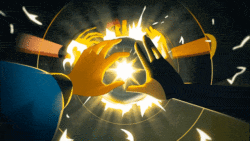
If we are talking about design, I’d have to say that this video exemplifies two of the best little pieces of advice when it comes to design. First is KISS, which we all know means ‘keep it simple stupid’, and the other, which may be more obscure is, ‘if it’s not working, turn it upside down’. You will know what I mean when you watch the video. I thought this video was really interesting. There’s not a ground breaking wow-factor gimmick to the visuals, it’s just a nice concept, with a clever visual twist that I hadn’t really seen used, which all makes for a refreshing little piece of work. Using actual objects to throw the shadow in the shot, and then tracing the shape with flat color was a nice and subtle effect worth noting. The animation is somewhat unique also. Somewhat broken, definitely irregular, but consistent enough that it’s not distracting, and holds your attention. I like how there seems to be surges of photo sequences resulting in almost smooth motion, and then not. Click 3x said they put almost 8000 images into this. Yikes. That’s quite a task. Not to mention rotoing the shape in all 8000 of those images.

I’d love to get my hands on of those oddly shaped aqua thingamabobs. They’re hot, especially upside down.

watch

13 Comments

jan

Reminds me the ebay campaign

mike gottschalk

Nice production on top of it.

Might be an homage to Hipgnosis for their contribution to Led Zeppelin back in the Stone Ages of 1976. See the Presence LP.

quintu

More than the actual visuals, the concept is great. The whole “flavor of the month” idea reduced to an abstract shape meaning that it could be anything.
A great concept always works better than stunning graphics.

Greg Mitchell

If you enjoyed this piece, you should definitely check out this short titled “More” by Mark Osborne, released in 1998.

https://www.happyproduct.com/more1.html

fiercecurry

This is nothing more than a complete rip-off of the Ebay “it” campaign.
Which was a lot more entertaining and fresh.

mamurphy

you think they roto’d all those shapes? Wouldn’t it make sense to paint them green and then just make a key that you can fill with the flat teal color?

That’s what I would do.

Great piece to showcase, btw. I laughed out loud at the end.

tread

good point with the keying. would be much easier that way.

Yeah, I guess the concept is similar to the ‘it’ campaign. Oh well.

dkong

great student film.

SZUMSKI

The object was a piece of foam painted digi-green but we learned
quickly that depending on which flame artist worked on the video (there was three artists) that the “thing” would change its shape and contours.
Also roto-ing it out gave it a graphic look that I thought was important to
the piece.

The Led Zeppelin album cover was a source of inspiration and not the
E-bay campaign. Which came out a week after we were done.

Thanks for all the intersting comments. :)

mark

ebay is a fucking ripoff

i got a bill of $50 today for listing an item that i wasn’t able to sell because of the reserve fee. it doesn’t state clearly enough that it’s non-refundable.
oh yea, plus all the hoax spam & hackers…

damn ebay

oh this video, what about it. hmm. yawn. sleep time.

mark

oh btw: kinda but only kinda reminds me of the much used designers republic theme for some of their clients (like this warp remixes album design for example: https://static.last.fm/coverart/300×300/3262.jpg)

David Lewandowski

Here’s some “reference” material from 2002 or so.

https://www.pleix.net/films.html
Futureshock Pride’s Paranoia + Plaid ITSU

New

8000 images is overstating it.

Def think the motion could have been refined alot farther.

Comments are closed.