Want to be on Motionographer? Submit your work now!

Get a daily digest of Motionographer's posts in your inbox. Subscribe now.

Shy the Sun: United Airlines “Sea Orchestra”

QuickTime version

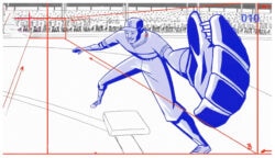
Shy the Sun, a new commercial studio founded by South African design/art collective The Blackheart Gang, splashes onto the scene with a beautiful spot for United Airlines. Backed by Gershwin’s “Rhapsody in Blue,” Shy the Sun’s Hieronymous Bosch-like paintings in motion are brimming with lush, organic details that make “Sea Orchestra” a joy to watch again and again.

Here’s a breakdown of StS’s team for the project:

Ree & Jannes act as a directing duo. Our producer is Nina Pfeiffer. Lung’s Claudio Pavan and Arri Reschke joined in to animate the 3d characters and Carmen Ziervogel to help Ree with the illustration. As usual, Ree illustrated and coloured all the elements. She also designed all the characters that would then be modeled and animated by Lung. Jannes would prep and composite the plates, shoot live-action and then composite all these elements to form the final picture.

If you’re not familiar with Shy the Sun’s founders, The Blackheart Gang, make sure to watch their amazing debut, The Tale of How. You might also want to read our mini-interview to get a better understanding of how this quirky collective works.

Client: United Airlines
Agency: Barrie D’Rozario Murphy

Exec. Creative Directors: Stuart D’Rozario, Bob Barrie
Copywriter: Phil Calvit
Art Director: James Zucco
Agency Producers: Holly Stone / Jack Steinmann

Directors/Animation: Jannes Hendrikz and Ree Treweek (Shy the Sun)
Production Company: DUCK Studios
Exec Producer: Mark Medernach
Producer: Nina Pfeiffer

Music Arrangement: Trivers & Myers
Sound Design/ Mix: Ken Chastain, Pixel Farm

Posted on 9 August 2008 by justin

Tags: , , ,

1 Star2 Stars3 Stars4 Stars5 Stars (36 votes: 4.08 out of 5)

RSS feed

13 Comments »

Comment by Deocliciano
2008-08-09 17:47:22

Mesmerizingly awesome!!

Makes me feel like crap!
I can never be this good!

 
Comment by Chloe
2008-08-11 04:25:47

Although this is a much more lush and intricate animation this does remind me of the opening scene of ‘the little mermaid’ (especially with the crab conductor)

 
Comment by Priyesh
2008-08-11 04:44:47

It`s a great piece of work but reminds me way too much of their “The Tale of How” , if you`ve seen that it doesn`t impress you all that much - nonetheless I gave it 5 stars…

 
Comment by BaconIsGood4You
2008-08-11 07:35:55

Fantastic virtuosic work. My one criticism is that there’s really too much highly detailed stuff going on so at times it becomes visually overwhelming and flat.

 
Comment by joeyb
2008-08-11 09:43:28

This is pretty awesome. They have the rest of United’s spots up here.

 
Comment by joeyb
 
Comment by Sean Pecknold
2008-08-11 11:31:56

That SSSR Gaelle Denis one on the youtube site, is nice as well!

 
Comment by Sao_Bento
2008-08-11 11:40:26

Amazing from an artistic point of view, in terms of the agency behind it - it’s pretty lame from an advertising point of view. Does Hieronymous Bosch make anyone want to fly? It’s not like I need help to associate flying on United Airlines with hell - United takes care of that every time I do business with them.

 
Comment by Tillman
2008-08-11 11:43:14

there’s a link to a higher-rez of this commerical on cartoon brew. the details really bring it out.

 
Comment by Jim
2008-08-11 11:45:16

Somebody’s played <a href=”http://amanita-design.net/samorost-1/”Samorost.

Comment by Jim
2008-08-11 11:46:21

Sorry. Samorost.


Comment by henrykillinger
2008-08-11 12:02:52

Love their overall focus on gorgeous illustration. United has really been wowing me ever since the Dragon Commercial a year ago. Great mix of whimsy, romance, and adventure.

 
Comment by fanboy
2008-08-11 13:12:30

After watching 3 thirds of this spot i was ready to call it a failure because it didnt advertise United at all. I feel they did pull it back at the end, and brought the message in nicely.
As far as the artwork and design goes, i think that its overly done, and there i a lack of composition and focus per shot. Its just a ‘pile as much stuff in as possible’ approach. I thinks its just too busy to look and see anything, so you end up seeing nothing, which is a pitty becuase there is SO much work that went into this by the looks of it.
Overall its a good job, but hopefully next time they will compose the shots and focus attention visually a little better.
Great job guys!


You must be logged in to post a comment.