

London based Mainframe recently showed what they are capable of with an epic rebranding of Nickelodeon. Unusually for Nick, they let the design take the centre stage, with their flagship characters tagging along to enjoy the ride.
I had chance for a quick catch-up with Mainframe’s Managing Director Adam Jenn and team Mainframe for a little Q&A session:
What tools did you use to create the spots?
The main tool of choice was Maya for all the 3D modeling, rigging and animation. Each shot was tracked using SynthEyes and outputted to Maya for the main scene work and also to After Effects for the later compositing stages. Once the animation was completed, an average of 5-6 different render passes were outputted allowing a greater level of fine tuning within the composite. Final colour grading was all handled within After Effects.
On a project of this magnitude you must of had to please a lot of people. Could you please give us a little insight into the whole creative process?
When the process started we were commissioned by the UK team to create the idents just for the UK channel. As the project developed other territories got behind the work but at present we’re not allowed to talk about which other countries will be using the idents.
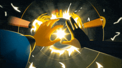
The idea devised by our client—the creative director at Nickelodeon, Peter Drake—was to try and really connect with the fantastical side of kids’ imagination. Mainframe was brought in to work with in-house Art Director, Akin Akinsiku, to produce all of the idents from Akin’s ideas and the commissioned illustrators’ sketches.
It was never the intention to create something for other designers to marvel at; it was always about something that would blow the kids away. Akin is a very exacting guy to work with, but I really think the results merit all the hard work everyone put into the project.
Technically, working for so many markets was pretty challenging with each ident having to be reversioned with kid, without kid, Nick branded + Nickelodeon branded, HD, SD 4:3, SD 16:9, PAL and NTSC frame rates. That’s quite a number of variations for each ident.
Each sting seems to have it’s own unique look to it, yet retains an element that keeps it all under the same umbrella. Was this a conscious decision from the start? How did you go about coming up with the look / looks?
When the project started, the idea was to commission as many as ten different illustrators to bring their own look and feel to each ident. As the boards started coming in, it was clear that although there was some amazing work coming back it wasn’t really sitting very well together as a rebrand, and the work of Will Barras was really standing out.
It was a pretty tough decision to make but the client opted to proceed with Will’s illustrations for all of the idents. One of our major tasks was to bring Will Barras’s sketches to life and build environments that they’d sit comfortably in. Because of the sheer quantity of work, our 3D team also created a lot of extra characters and environments for the scenes from scratch.
Many of Nick’s well-known characters make subtle cameos in the these vignettes. This is unusual (and refreshing) considering the way most network rebrands (see Cartoon Network) put the characters up front and center under a blazing spotlight.
Did the idea to treat Nick’s characters in this way come from Mainframe? Or did it come from Nick?
Originally there weren’t going to be any of the Nickelodeon properties in the idents at all but in the end Nickelodeon felt that a subtle nod to the characters was the way to go. The clients wanted to connect with the audience and entertain them rather than sell to them.
CREDITS:
Channel: Nickleodeon UK
Nickleodeon Clients: Peter Drake (Creative Director+Original Concept), Akin Akinsiku (Director And Art Director)
Nickelodeon Producers Will Poole, July Knight
Mainframe:
Producer: Adam Jenns
Animation Team:
Marcus Moresby
Carl Fairweather
Arvid Niklasson
Jimmy Johansson
Mickael Abensur
Jerone Dernoncourt
Call Allman
Illustrator:
Will Barras
Sound:
Ian Chatham at Blue Post Production