

The original styleframe board which T&F presented.
What was the brief for this piece, and how did you approach coming up with the concept?
The creator of the event, Mark Hurst, came to our office and pitched us the opportunity to brand this year’s event about four weeks in advance of Day 1. There was not a written brief, it was verbal. Mark was clear about things he did not want (nothing sinister, dark or somber…the logo, of course, says everything BUT that). We began with a creative pre-brainstorm session with Mark. From there, we briefed one of our Art Directors, Kyle Miller, on GEL. Kyle immediately developed a rich, illustrative and vibrant treatment in which he created a handful of amazing frames. We presented this as a mood board to Mark. It was very well received.
Can you tell us a little about your process in making the piece? How did you work? How long did it take?
With the design aesthetic approved, we had to figure out how to flush out Kyle’s original board quickly. There’s power in numbers, so the entire T&F team spent a couple hours in a think tank session. Collectively, we came up with visual hooks to metaphorically describe each and every nook and cranny of this years’ GEL.
Mark was expecting primarily just a show opener and stills for each speaker. We decided to break the mold of the standard convention/trade show expectation and create several branded pieces for the 2-day event. We built a spreadsheet of T&F suggested elements that included timelines and scene durations to highlight what happens and when. Wrangling 17 custom experiences and 18 distinctively different keynote speakers equated to a beast that had to be controlled.
Ultimately, for Day 1, we recommended (and ended up creating) a :45 Welcome Animation that also introduces the first two speakers as well as Mark, and a 1:00 Events Film that highlights each of the 17 experiences. For Day 2, we designed and produced 4, :45 Speaker Films, each to be played 80 or so minutes apart to introduce the next batch of 4 speakers.
Furthermore, we designed 17 individual 24″x36″ posters (unique per speaker) that were mounted on the walls of the stage (GEL takes place in a great theater inside the New York Times Center). Last but not least, we didn’t think the experience would be complete unless attendees had something to take home with them. T&F Art Director, Guillaume Alix, designed an all-ecompassing “tapestry” poster that was rolled up in a tube and included in the GEL event bag takeaways.

The poster T&F designed for the event

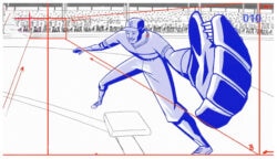
T&F’s breakdown of Day 1’s events
I really like the Pablo Ferro-esque type with the living holds. They give a really playful charm to the piece. Were they all hand-drawn and animated?
Yes, each and every one of them. It was important that the type did not look like a canned font. We never wanted to see the same letters (T, N, P, R, etc.) appear twice. Even though everything was compiled in After Effects, we treated this very much like a cell animation project except that everything was drawn with a wet brush in Photoshop. This allowed us to move with speed while still keeping an authentic look. We did not have the time to film or scan traditional analog media.
Who did all the illustrations for this? They tell the story of each speaker in such a simple and direct way. Was that difficult to boil down their focus to one image?
Kyle was the lead illustrator and Guillaume, who is also an incredible illustrator, adapted the style to create the second half of the batch.
Another thing we would like to point out is how much our animators brought to this process. Animators, often times, are pigeon-holed into execution roles. We really believe in the power that a strong animator can bring to the table and enhance an image with a given emotion. For example, the Eric Singer guitar robot segment was put on a completely different level after Ken “1K” Kreuger (one of the lead animators) touched it…he even did the sound design for that clip. It is always cool to see how a talented animator can push the envelope.
The color palette is so unexpected and refreshing. It’s very bold, contrasting and electric. Was their a particular effect you were trying to achieve?
Diversity. There were so many speakers and events that needed to be highlighted. It was important that each vignette stood out and to be void of hierarchy and/or monotony. If there is ever an opportunity to use a ton of color, we will often times as many of you know.
What’s next for T&F? Anything new that you’re working on that you’re really excited about?
We’re excited about quite a few things, some big some small (but we aren’t able to speak of them quite yet). Something we can say though, is that our new site will be launching in about a month.
Credits:
Media Strategy:
Thornberg & Forester
Creative Directors:
Scott Matz / Justin Meredith
Executive Producer:
Elizabeth Kiehner
Art Director:
Kyle Miller
Producer:
Javier Gonzalez
Design:
Kyle Miller, Guillaume Alix
Animation:
Kyle Miller, Ken Krueger, Dan Savage, Keith Endow, Rachel Yonda, Jaehyuck Lee
Music and Sound Design:
Michael Montes
Links:
GEL Conference