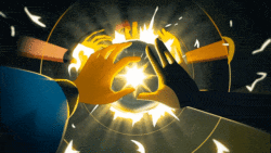
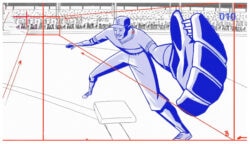
OFFF Barcelona 2011 Main Titles : Mischa Rozema and PostPanic

Director Mischa Rozema says of this piece, “We knew we wanted to make something that would unsettle and menace the audience.” Mission accomplished, Mischa.

Not only is the ambitious undertaking of this year’s OFFF Barcelona main titles beautifully crafted, and quite obviously a labor of love, but it is equally as captivating as it is intense and powerful. On the narrative front, we are instantly sucked into a post-apocalyptic world of darkness, and it seems no idea was left unturned.  Around every corner lies an unexpected twist for the awesome that might not be suitable for the squeamish.

PostPanic’s execution of the VFX is flawless on every front, elevating the piece as a whole to legendary status among main titles, but don’t take my word for it. Full screen it, grab your headphones, and see for yourself.

Tags:

15 Comments

Ruoyu1

se7en with a twist of children of men?

ruffmercy

that’s insightful …thanks

tonyT

This is a very visually impressive piece, but what is the concept? What does it have to do with OFFF? What is it trying to say? The statement “We knew we wanted to make something that would unsettle and menace the audience.” seems interesting but why? Why unsettle the OFFF audience? Do they need to be unsettled? Was “unsettling post apocalyptica” the theme of OFFF 2011? With no explanation of this It just seems like a cobbled together mixture of visually interesting ideas with no real narrative glue or true concept. It would be nice to hear more on what the real underlying concept was.. if one exists.

Despite that; it is still visually stunning :)

ilana

I agree with you tonyT.
It looks stunning, but I don’t think there was a real concept behind this. However this is what today’s motion graphic is all about.
The only important thing is that it looks fab, it is tasty, it ‘uses’ elements from Lynch to Fincher. And that’s it.
A very well decorated box, which unfortunately empty inside…

JimmyBean

Nicely said, agreed it’s beautiful. Feels like it’s trying too hard. Sorry I couldn’t really take it seriously

Ritron

…why everybody make the same?? …to make always the same is boring

monovich

There seems to be quite a backlash to “style” developing these days. I can’t wait to see where it all ends up.

Sean

The OFFF titles have never had structured narratives. That isn’t the point. It’s not a movie. The purpose is to introduce the speakers with a groundbreaking beautiful visual style. The subtle narrative is part of the design, because it creates more visual interest. The bigger problem here is that you can’t read any of the titles.

Brandia

Ops. Always have a minimal narrative and a “why.” As a visual style is suggestive, but without the support of the above loses much. Loses who already has potential. I repeat: Visually great, conceptually technologically brilliant and well … but lacks a soul, I believe, should have.

Sean

well said, “lacks a soul”

psalmplasma

a narative even remotely related to the event could have helped.

pgibso

OFFF really goes for pretty much the same style every year , huh?

safetyfirst

Thanks to Echolab I got to read the concept for OFFF2011:

“Year Zero. Year Alpha. Time to turn our back on the past. To just look forward. Upwards. Fearless of being blinded by the sun. It’s time to set up new rules, to invent new games. To forget about the “re-” and the “post-”. To become kids again and discover the world. Another one. It’s time to be revolutionary. There is no longer a present to determine us, because the present is us. We are the future. And the future will be just like we want it to be.”

Yet the title strikes me as something that has been created in the past. There is nothing new nothing revolutionary about it. To be honest, I think it’s one of the worst pieces I have seen in the past years. Probably ten years ago I would have thought a lot different but not today. It’s 2011.

Aesthetically spoken it is drawing a lot – too much – of inspiration from Kyle Coopers Work for Seven, Mark Romaneks work for NIN and of course Romain Gavras. The references weren’t elaborated, merely just repeated. How can something like this be good? Try to talk to people and just repeat what they said. I guess you won’t be getting anywhere in that discussion.

If just looked from an angle of concept, how does this relate to the official year zero statement by OFFF? I would love to get some insight. As stated in previous comments, no it doesn’t have to have a narrative. Just a feeling is great. But why is my feeling I get when I’m watching this that it represents the past. Just the past, nothing about tabula rasa and the great revolution.

And the best part is the whole military aspect. Guns look great. More guns look better! Yeah!

Even though it’s a different field, it’s a great read (including the comments) about contemporary dance music culture:
http://mnmlssg.blogspot.com/2011/06/d-we-need-to-talk-about-blandoscattered.html

As well a good article from Jonathan Franzen (linked in the above):
http://www.nytimes.com/2011/05/29/opinion/29franzen.html?_r=1

So much of what we are seeing today is just driven by technology and not by the ideas anymore. Not every effect can tell a story or transmit a feeling.

I said this in previous comments on Motionographer but I can’t help but repeat it. You don’t have to be cozy with everybody especially not always with the same people. Give us more critical feedback.

I’m ready for it and judging from the comments more people are!

Candyman

I don’t dislike this. Its nicely done.
But I’ve seen pretty much exactly the same thing too many times to be impressed.

The video in “The Ring” was amazing.
And even the first 20-30 copies that followed were still pretty good.

I think that if it had a clear reason or purpose it would have been better.
Now its just random images to “glitchy” sound…
(as far as I can tell)

Comments are closed.