

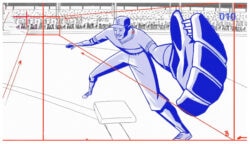
Mixed reality experiences blend digital and physical components, often at human scale.
By definition, mixed reality’s boundaries are blurry, extending to wherever bleeding edge technology will take it. Producing branded mixed reality experiences, therefore, requires a pioneering spirit backed by deep, diverse technical prowess.
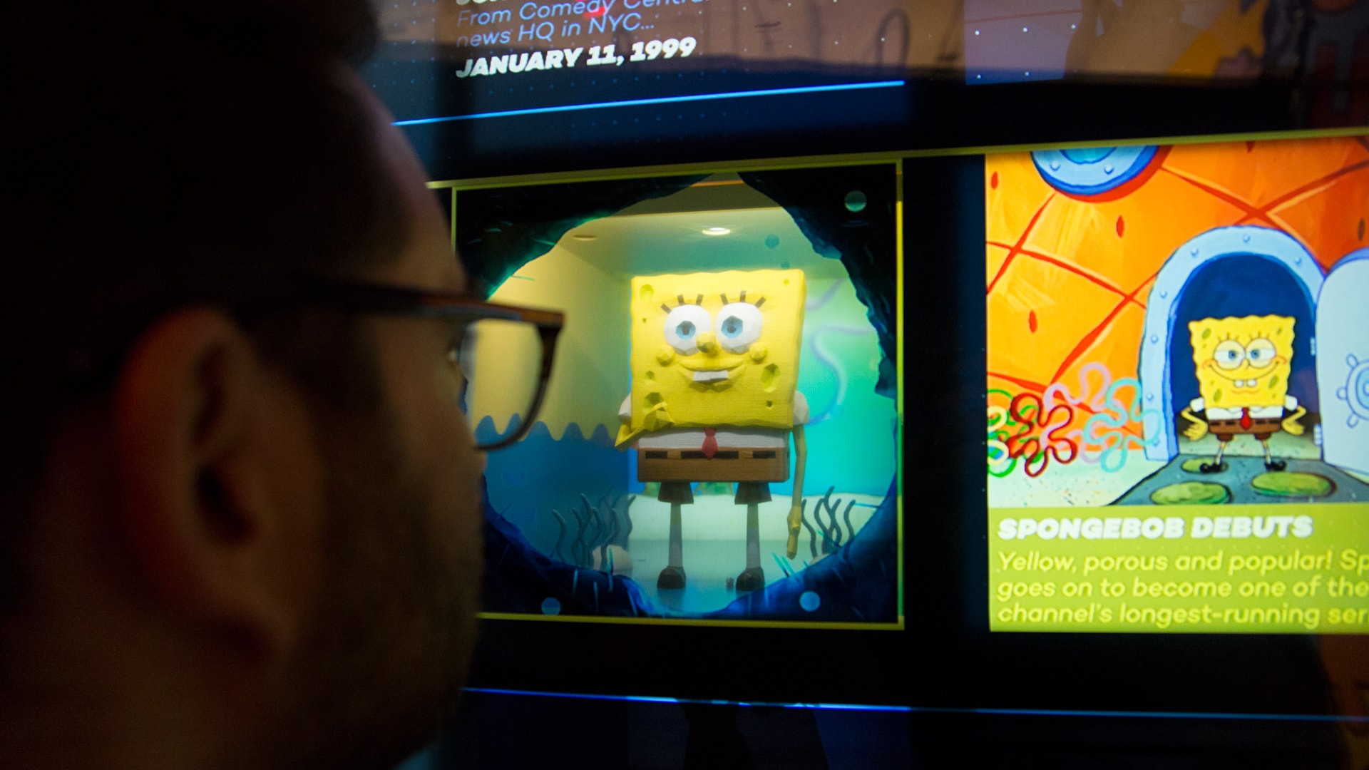
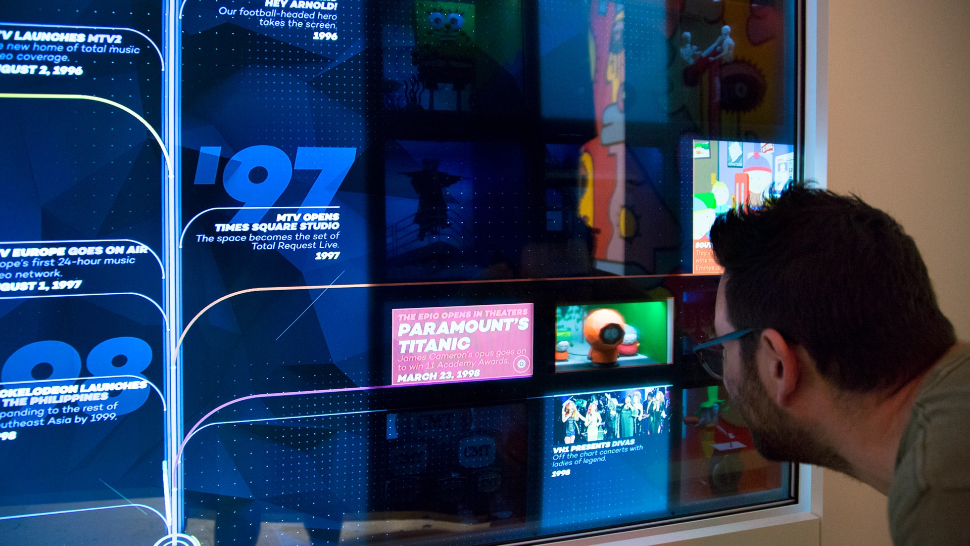
“Viacom: Past, Present & Future” is a superb case study for creating effective mixed reality experiences. As users explore an interactive timeline of Viacom’s history, they uncover physical vignettes portraying characters and intellectual property that have helped the company become a dominant force in media and entertainment.
Led by Catalyst, Viacom’s in-house creative agency, the interactive installation was crafted through intense collaboration with cross-disciplinary teams that included Slanted Studios, Hard Work Party and Gamma.NYC. We wanted to know how this magical creation came to be, so we asked the players for all the juicy details.
Deep dive: “Viacom: Past, Present & Future” interview
What caught my eye about this project was (of course) the integration of physical vignettes into a large-scale, digital experience. How did that idea come about?
Slanted Following the creation of Composition VI for Viacom, we were discussing potential future projects and an interactive retrospective of Viacom’s history came up.
Slanted Transparent displays were pretty high up on our hardware wishlist, following some samples Noah Norman of Hard Work Party had seen at trade shows and CES. Once we heard there was a museum-style project in the pipeline, we pitched the idea of using this tech to differentiate the installation from the more traditional screen-based timeline experience.
Catalyst After some research, we concluded that we wanted to center this experience around peek-a-boo, mixed-reality moments which send the user on a journey of discovery and delight.
Marcus and Gizmo of Gamma.NYC
Knowing Viacom wanted to leverage a wide range of flash points from its storied past, we started thinking of how to use this effect to create “Magic Moments” for key events, acquisitions and milestones.
slanted We included a Pepper’s Ghost test to showcase the compelling nature of mixing real objects with video on transparent surfaces. From that point to the final opening to the public took about a year of pre-production, production and install.
catalyst Can we hat-tip to Jeff Desom’s “Holorama,” too? That was a big influence and inspiration.
I’m guessing that gathering all the content and trying to tell a story must have been a gargantuan task. How did you go about it?
Catalyst After a tremendous amount of research was done, the information was categorized into three levels of varying priority. The team, along with Art Director Sean McClintock, began the task of culling, categorizing and contextualizing it in the form of a timeline, while working out the structure of the dynamic shelving system which lives behind the surface of the screen, housing the dioramas.
For the timeline as a whole, we needed to make sure that we were balancing all of Viacom’s brands and identifying unique moments. For each of the peekaboo moments, we brainstormed a lot about what they should be and how we should represent them. They needed to be mini-narratives that captured the feeling and vibrancy of these great cultural touchpoints, while maximizing the technology and bringing them to life in an authentic way.
Let’s talk about the technical challenges, because I’m sure there were many. First, please explain the basic setup. What are the main components?
Catalyst The biggest challenge was that until everything came together, the whole project was theoretical, in a sense. While we felt strongly that it would work, this was a first of its kind installation and there were no roadmaps to success.
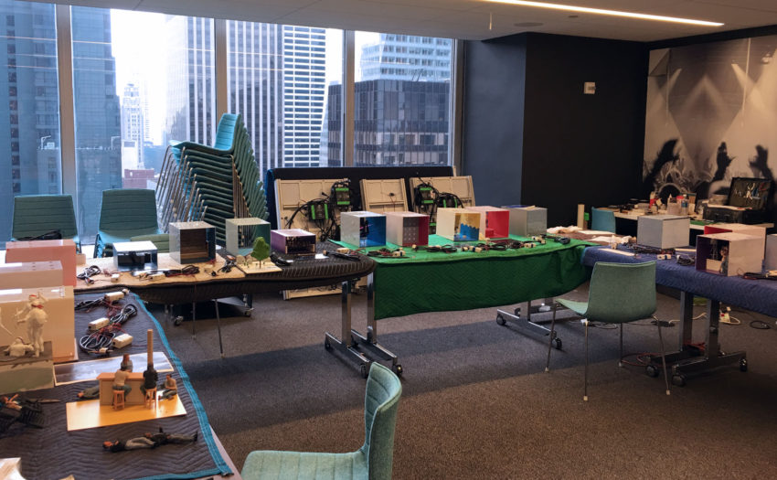
The installation space
The nonlinear nature of this project meant having to figure out how everything fit together while being developed simultaneously. Sometimes solutions would beget problems, and there’s always a chance that a solution implemented early on will lead to another component being compromised in the future.
There are 5 key components:
1. The Display
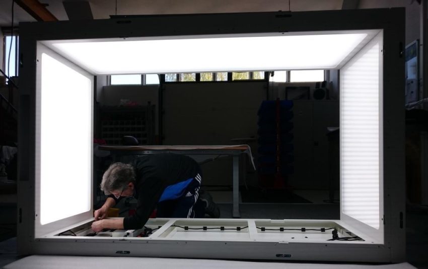
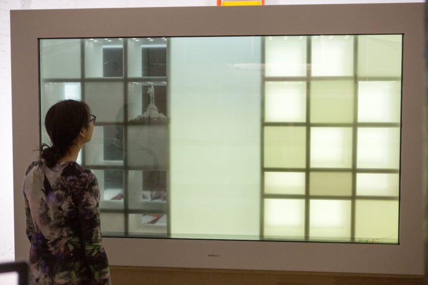
Slanted The main component is the eight-hundred pound HypeBox. To describe it simply, it’s a diorama-style enclosure with a UHD 84” transparent touchscreen on the front.
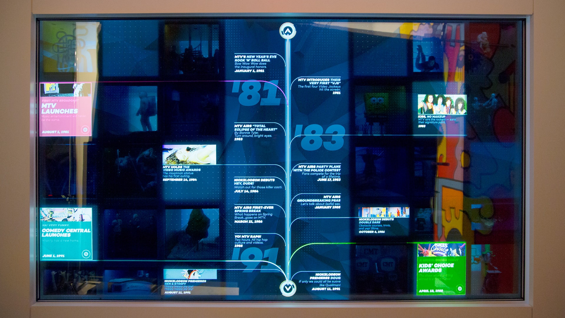
When the HypeBox is empty, it looks like a normal, albeit gigantic, screen. Once you place objects inside of it, you realize that black pixels are opaque, while white pixels are transparent. Color pixels fall somewhere in between, depending on their luminance.
Catalyst We needed to develop a method to play traditional content onscreen without revealing the dioramas. We felt that current sub-optimal implementations of this technology often presented digital content unrelated to the physical elements that were presented inside the box.
It became clear that to prevent such a disconnect, we needed to find a way to display video without revealing anything behind it.
Hard Work Party Something about transparent LCDs gives manufacturers the dickens when they try to actually scale to market. I’ve been told that one of the biggest challenges for manufacturers and resellers is getting customers to understand the need for intense, even backlighting in order to achieve a decent image on the screen.
So, in a sense, operator error sinks a lot of products. As we can attest, though, it’s a holistic design challenge to do this right — you can’t just put a widget in the box and run your animation on top.
2. The Shelving System
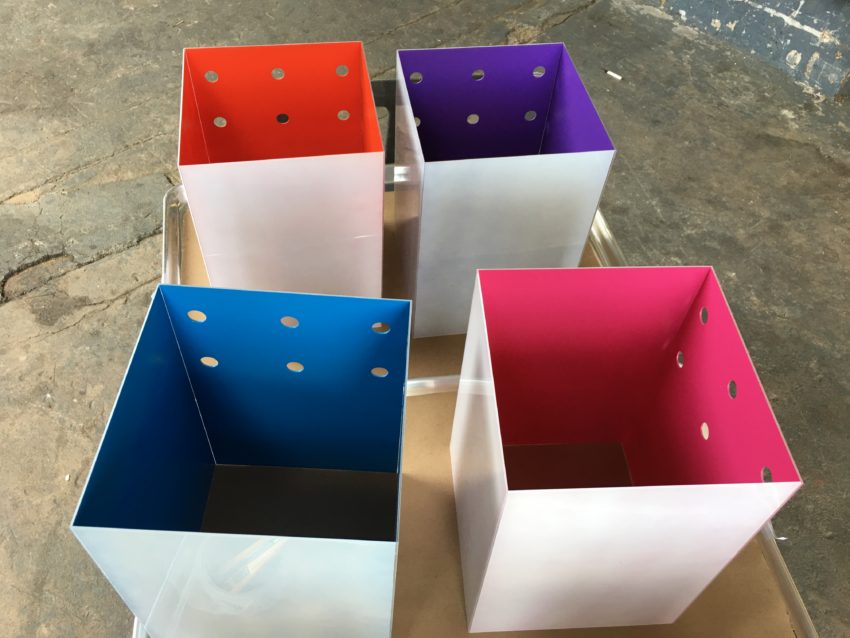
Slanted On top of the display, we placed custom shelves inside, fabricated by Gamma.NYC, to meet Viacom’s diorama-filled vision.
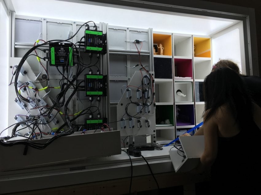
Unfortunately, these shelves necessarily blocked all of the built-in HypeBox lighting, so it contained its own bespoke LED system with addressable spotlights and fill lights, courtesy of Gamma and LED specialist FutureWife.
Catalyst The programmable lighting needed to accomplish two things:
1. House a variety of individually-lit physical vignettes, each with their own slightly variable look and feel.
We also needed to make sure there was enough light bouncing around to make everything in the box visible and render the on screen graphics crisply. After going through a few iterations, we landed on six overhead bright white LEDs and a front facing light panel, all controlled by QuickTimes in TouchDesigner.
2. Establish ‘safe zones’ within which we could play content with no transparency.
These safe zones display information, act as touch-sensitive activation points and solve the issue of displaying content without transparency.
The safe-zones took the form of software-controlled, backlit, frosted plex mounted on the front of the shelving system in strategically selected locations. This effectively countered the transparent qualities of the screen by creating a solid bright white plane behind the surface of the screen, which mimicked the backlight of a traditional LCD screen.
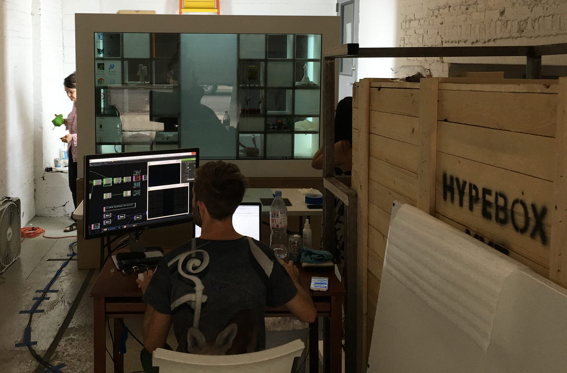
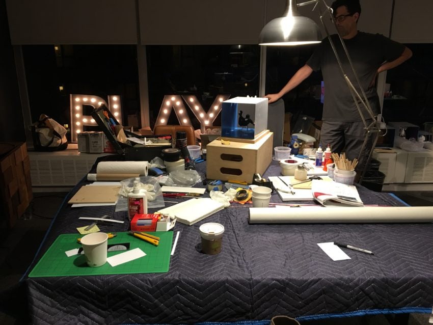
It took 3 months for the screen to make its journey from China → Germany → Chicago → NYC and the much smaller demo units we were using for prototyping prevented us from testing at scale. To compensate for this, we built a life-sized foam core version of the box, and used our in-house resources to print our design at a 1:1 scale to make sure everything was legible, accessible and impactful.
Intense, even backlighting is needed in order to achieve a decent image on the screen.
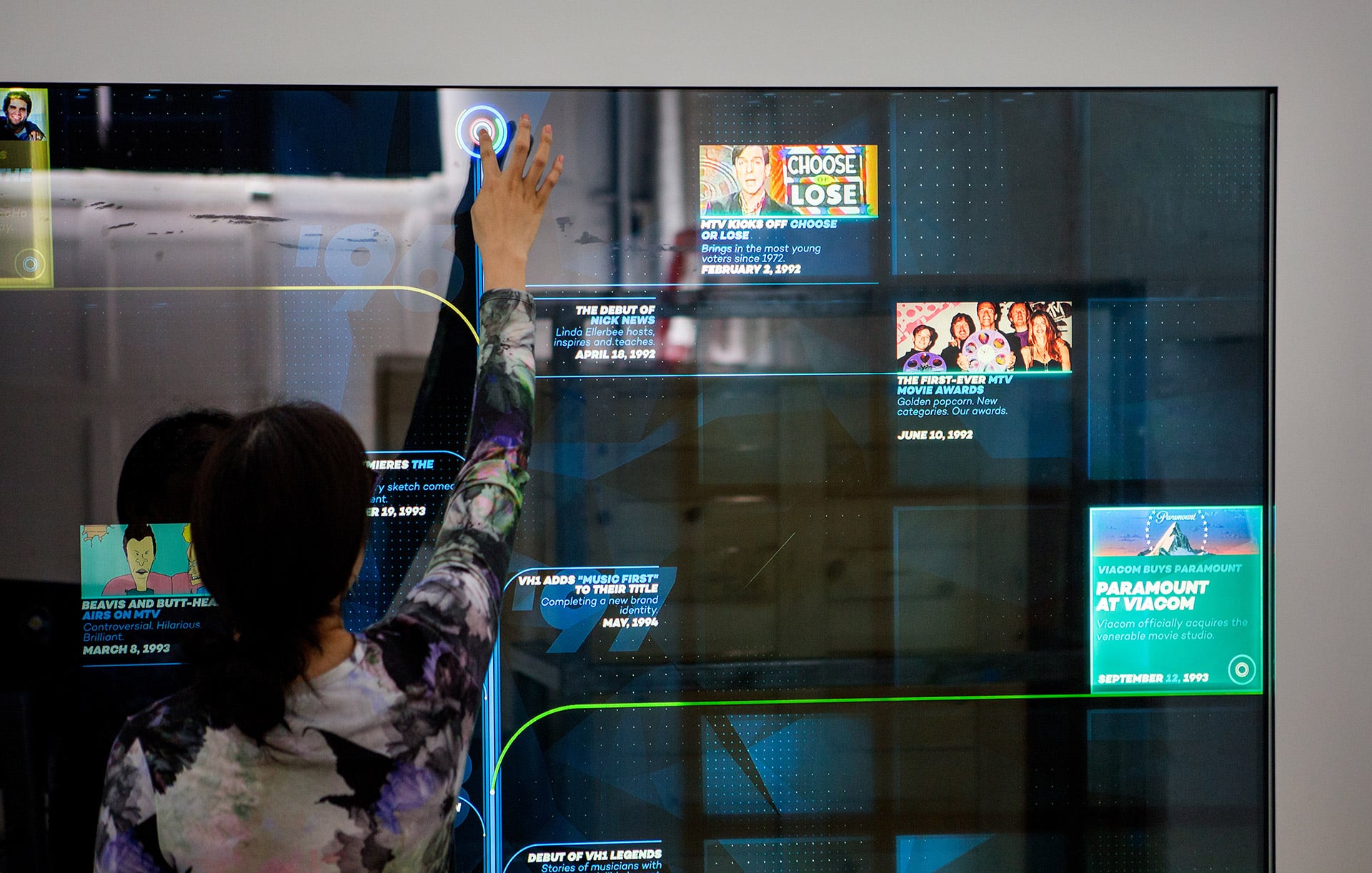
3. Screen Content
Catalyst Using the shelving system and its safe zones as an armature to support our design process, we began to assemble a fairly complex design puzzle by breaking the timeline down into six chapters.
Slanted On the screen itself were animations created mainly in After Effects. The final screen deliverables came in at around 100 separate QuickTimes, with many files coming it at over 10gb a piece. The organizational structure required to keep everything clear, as well as monster final render times and QC, were a big part of the process.
Catalyst Once the initial motion tests for Chapter One were approved, we began to iterate on each chapter, add some bells and whistles and create all of the on screen “magic moment” content. Animator Josh Lindo was critical to the success of that process, switching between revising and quality controlling chapter content, testing new ideas and making sure everything stayed tidy, modular and aligned with our physical structure.
4. Interactivity
Catalyst Since the strength of this project is the “a-ha!” moments that occur when revealing the vignettes, not the act of getting there itself, we didn’t think it was necessary to reinvent how a timeline works. In fact, there was so much going on that the simpler and more transparent the interactivity, the better the experience would be.
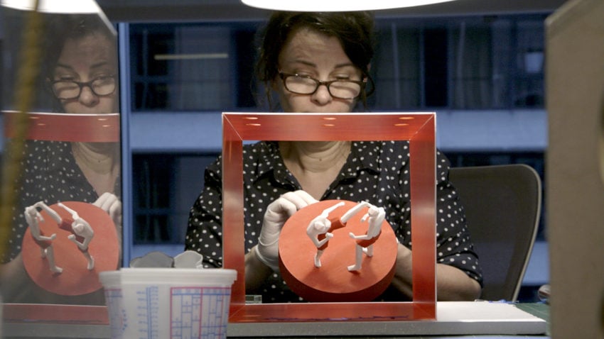
5. The Physical Vignettes
Catalyst After locking in the 20 moments we wanted to celebrate, we began sketching and modeling the concepts out in Maya and C4D to create virtual representations of what we were going to make before embarking on the 3D printing phase.
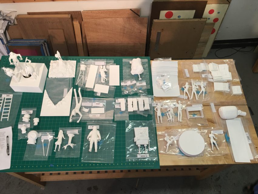
We used our in-house 3D printer to make prototypes of all the models, which were then placed in Gamma’s proof of concept shelving unit inside the small demo box. This is how we were able to present our final tests before going full speed ahead on the remaining vignettes.
Around this time, Slanted introduced us to Elise Ferguson and Tim McDonald, who were responsible for overseeing and executing the fabrication phase of this project.
Together, we designed acrylic sleds within which our scenes would be physically constructed. This enabled us to easily slide our scenes in and out of our shelving system, without having to remove the entire shelving system.
We enlisted the help of modeling/3D printing pro Scott Denton. We created dozens of models in a variety of materials from an array of vendors, while making sure that they all conformed to the proper size to fit within each individual scenes boundaries.
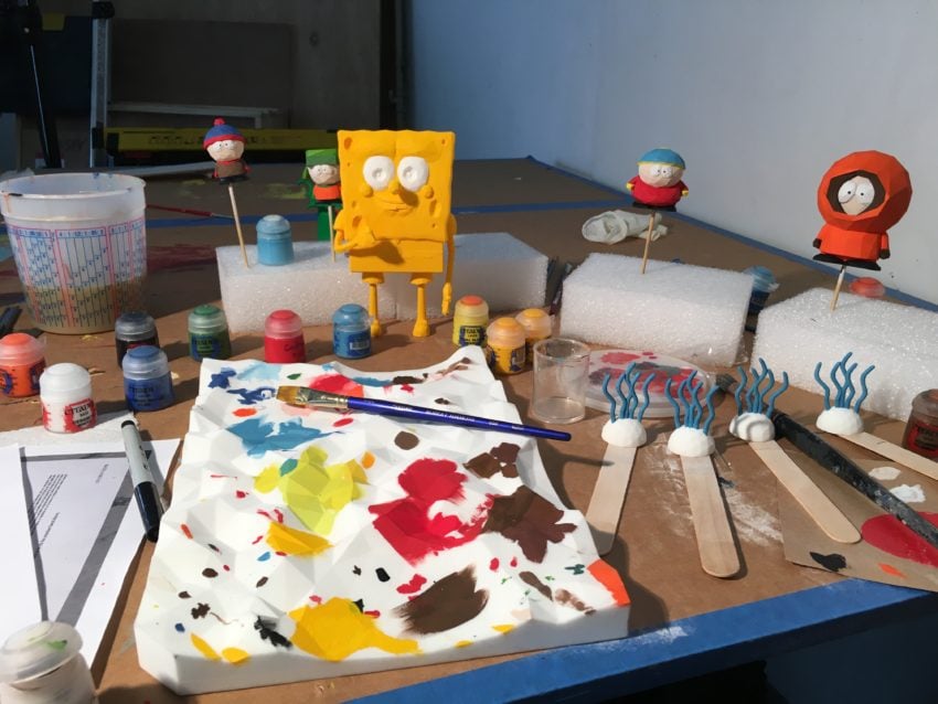
We delivered all the physical models to the fabrication team, who prepped the prints and set pieces for hand-painting, created new ones from scratch and rigged everything for long term stability inside our sleds.
After the entire piece was assembled and functional, we were able to test the magic moments properly. We went through a wide variety of lighting, content, and alignment test modifications and revisions to get everything right.
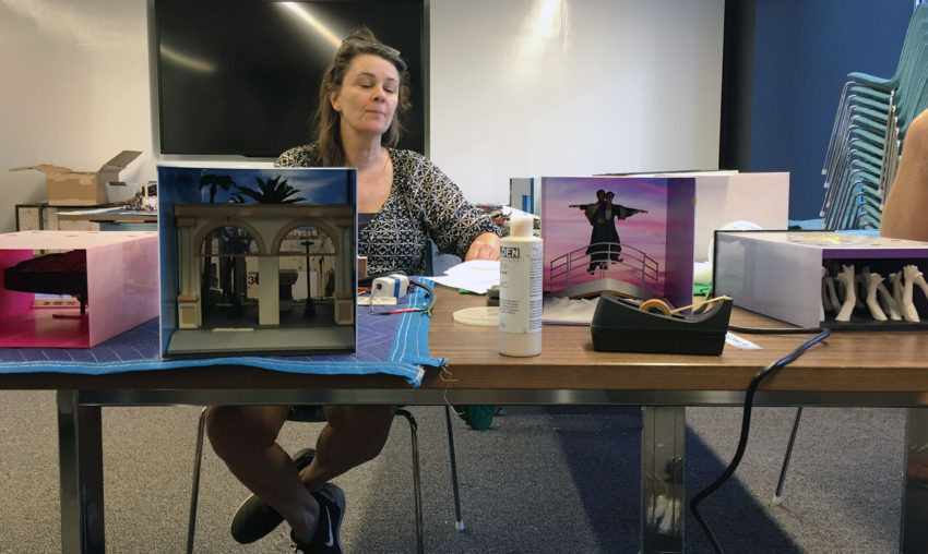
Elise Ferguson
I’m assuming TouchDesigner was involved. Describe that aspect of the project. Any unforeseen curveballs or new challenges on the software side of things?
Catalyst TouchDesigner was the backbone of the entire project.
One of the biggest challenges was finding a way to integrate dozens of QT assets, many as large 12gb that get launched on the fly with no noticeable latency, stutter or tearing, which play in sync with our lighting control Quicktimes and user-triggerable Magic Moment content.
Slanted One of the aspects we’re proudest of is we conceived of the entire TouchDesigner framework as a tool so the designers and animators at Catalyst would have maximum freedom and not be tied to the programming team to iterate.
The chapters and Magic Moments were built modularly so if Catalyst needed to update any content, they would just re-render their projects and swap in the Quicktime files in the designated folder on the production PC.
In addition, the spotlights and fill lights within each diorama were controlled via grayscale Quicktime movies. We sampled the Quicktime pixels and used their luminance to control the LED strength, allowing Matt and his team to design and play with the lighting within After Effects and not be constricted to a separate unfamiliar lighting UI.
Side note: After years of being PC-only, Derivative just released an experimental beta for TouchDesigner for Mac!
Any motion graphics artist who wants to try interactive should look into TouchDesigner, especially if they are comfortable with node-based workflows (like you find in Nuke, Xpresso in C4D and Houdini).
What role does audio play in the experience?
Catalyst Due to the usual constraints, we punted on the audio, which we were all ok with. There were more than enough solutions that needed to be worked out without having to implement multi-user audio.
Slanted That being said, if anyone wants to try making a v2.0 with audio, we’re down.
Zooming out a bit: after many years (a decade?) of promises that human-scale interactive experiences would become ubiquitous, we’re actually starting to see them, at least in densely populated urban areas. Some studios are actually turning a profit off of them.
Clients, meanwhile, seem to have figured out how to make business cases for them (and therefore justify budgets) for them.
Slanted For clients that want to create memorable or “selfie-able” experiences, interactive installations offer a lot of opportunity.
The best installations result when clients and studios collaborate and there is space for trust in the process. A lot of these experiences have never been tested before or are combining technologies for the first time. If there is an understanding that there needs to be time and resources spent doing proper research and development, great things can happen.
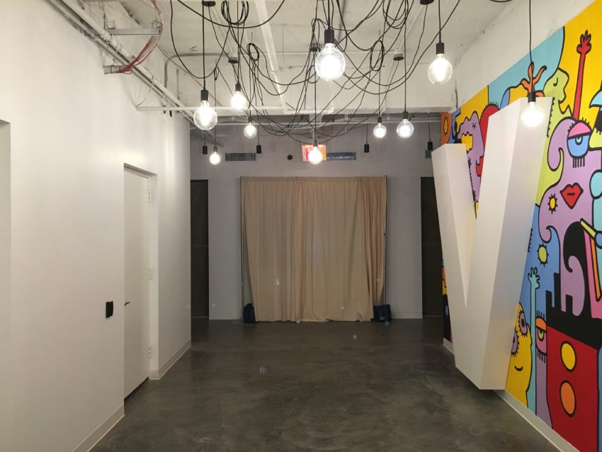
Catalyst This was a best-case scenario where we had an ambitious project that aligned perfectly with the company’s larger goal of building a fans-first, creative culture for our employees. The installation sits right outside our orientation room and is such an inspiring way to engage new people from day one. We were so excited to unveil it and see the reaction.
Slanted For anyone looking for an idea – FlipDots are high on our hardware wishlist to implement. :)
What’s next in this space?
Catalyst The tools to lay the groundwork for what’s next are all around us, and by effectively finding ways to apply the skills, techniques, learnings and thoughts from a variety of industries, we can unlock some significant doors down the road.
Slanted As tools progress, we’re looking forward to a wider range of visual styles expressed in interactive work. Similar to the boom of hand-made visuals in commercial work in the early 2000s, we’ve reached the point where interactive work doesn’t belong solely to traditional computer-generated visuals. Stop-motion animation, cel animation and illustrators with a strong point of view can all give interactive work a fresh look.
Elise Ferguson at work
Hard Work Party I think — as has always been the case with marketing ideas that involve new technology — the biggest challenge remains thinking beyond ‘new is cool enough.’ Simple deployments of new technology for marketing purposes can associate a client with ‘edgy’ or ‘techy’ in some people’s minds, but it’s really not enough to just stop at the tech.
"VR" isn’t an idea. "Projection mapping" isn’t an idea. "Social integration" — also not an idea. They’re media.
“VR” isn’t an idea. “Projection mapping” isn’t an idea. “Social integration” — also not an idea. They’re media.
You have to work backwards from your idea to the implementation — what do you want people to feel? What do you have to say? What’s your space like and how big is your audience? What’s your budget?
Together, those answers will make an outline of your experience, and our job as creatives is to read the Rorschach and make it real.
It doesn’t have to cost more to do these things the right way around — it’s just a matter of using these experiences in service of a story or a feeling, not as a plug-in buzz-builder. The tech changes but that part stays the hardest about the job of doing commercial work at that scale.
Credits
Slanted Studios/Hard Work Party
Executive Creative Director: Michelle Higa Fox
Technical Director: Noah Norman
Producer: Jennifer Vance
Programming: Beau Burroughs, Mary Franck
Production Assistants: Ana Kim, John Hughes
Digital Fabrication: Gamma.NYC
Fabrication Designer: Marcus Swagger
LED and Wiring Specialist: Aaron Lobdell
Transport/Art Handling: Crozier Fine Arts
Viacom Catalyst: Creative & Strategy
SVP, Brand Strategy & Creative: Cheryl Family
VP/Executive Producer: Matt Herron
VP of Brand Strategy: Tori Turner
VP of Design: John Farrar
Director: Matt Hanson
Art Director: Sean McClintock
Animation Lead: Josh Lindo
Animation: Ross McCampbell, James Zanoni
3D Modeling: Scott Denton, Sean McClintock, Michael Berger, Ryan Kittleson, Casey Reuter, Tom Cushwa, Scott Hubbard
Fabrication: Elise Ferguson, Tim McDonald, James Zanoni, Benjamin Kress
3D Printing: Shapeways, New Lab, 3d Hubs, NRI
R&D Design & Animation: Carl Burton
R&D Prototyping: Michael Boczon
Video Editor: Jared Smith, Alex Zagey
Archival Footage Research: Jason Yorke
Copywriter: Tanya Davis
Copy Editor: Tory Mast
Research: Jen Li
Case Study
DP: Chris Willmore
Music: Ketsa “Within the Earth”