
This week, Ubisoft launched “Watch Dogs 2.0,” the hotly anticipated sequel to the cyberpunk-themed franchise it birthed in 2014. (The first “Watch Dogs” has since sold over 10 million copies.)
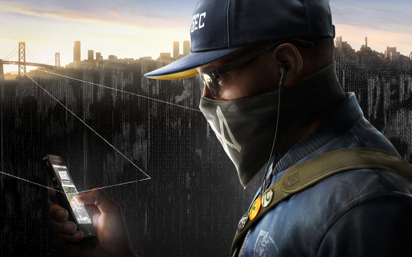
“Watch Dogs 2.0” promotional image featuring the new protagonist, Marcus Holloway
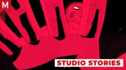
Kansas City-based MK12 crafted the expository opening cinematic for the game, painting the narrative backdrop against which a new plot line unfolds.
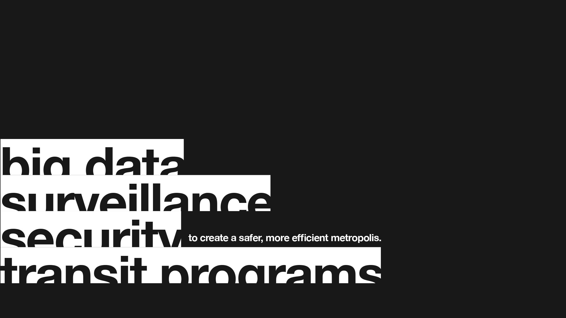
While “Watch Dogs” took place in fictionalized version of Chicago, “Watch Dogs 2.0” takes place in San Francisco. In both games, a city-wide operating system, ctOS, is exploited by players to manipulate the environment and generally wreak havoc upon society.
We got the inside scoop on MK12’s process from studio co-founder Ben Radatz.
Making the “Watch Dogs 2.0” cinematic with MK12’s Ben Radatz
Based on the making-of materials I’ve seen for MK12’s other projects, I’m betting you guys went deep into R&D on this one. What was that process like? What did you discover along the way?
This was probably the most fun we’ve had on R&D in a while!
There were two tentpoles that were established early on: the sterile, Helvetica-driven theme of the first trailer, which the creative team at Ubisoft wanted to keep, and the post-punk, anarchistic hacker aesthetic of the new game.
To bridge the two, we referenced a lot of early ‘70s design, when computer and counterculture art first began to erode away at the clean modernism of the ‘60s.
It’s not a particularly memorable era for design, but it did produce a lot of interesting experimental material.
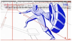
An MK12 experiment in arrow flow animation
We looked at artists like Aaron Marcus and John Whitney along with more established designers like Paul Rand and Robert Brownjohn.
Another experimental test
We also looked at a lot of real-time tech like face/flight/weather tracking and flight guidance systems to add a layer of machine thought to the piece.
Graphics animation test
In some places, we’d finish a shot and then run it through tracking software and use that data and other artifacts in the final build.
Assuming the sequel performs as well as the first title, your animation will be seen by a whole lot of people. As a studio that’s created titles and content for blockbuster films, how does the experience of creating game content compare? Are the expectations/pressure similar?
The sequel will go over like gangbusters. It’s an open-world sandbox on par with GTA and looks beautiful — and the themes couldn’t be more current.
Animation test for point cloud-inspired graphics
Having been privy to some of their R&D material, I know they’re going out of their way to stay true to hacker culture and ground the game in what’s possible with today’s tech. In fact, all of the scenarios described in the cinematic are based on real-world precedent.
The pressure to do well was very high, but self-imposed. Elastic’s original trailer went over so well that we felt like we had to make “Empire Strikes Back” to best the original Star Wars.
Glitch tests
The creative team at Ubisoft gave us tons of support and creative license and even included us in the scripting and development phase, so we felt very invested in the project and thought of it as one of our own short films — almost to our detriment, as our internal projects don’t have schedules.
We are often given the same kind of license on feature films, but not to the extent we had here.
Given how tightly the cinematic is tied to the storyline of the game, I’d love to hear what the collaboration process with Ubisoft was like. How much did the script/visuals evolve over time?
I don’t know how many revisions the script went through before we came on, but once we got involved it went through another seventeen rounds.
The Ubisoft team were very keen to use only real-world examples to make the game more relevant, so it took some time to not only find the right case studies but also weave them into the larger narrative of ctOS 2.0, the all-knowing, all-seeing NSA equivalent in the game.
Testing an approach to dither animation
Much of the hacker art had been established before we came on, so that didn’t evolve much from where it was, though we did end up creating a lot of our own artwork to complement it.
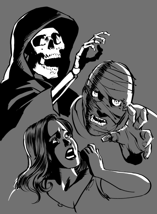
Character exploration
The visuals evolved less from feedback than a need to add more complexity and layers to the scenes to support up the narrative.
The WD2.0 cinematic has some beautifully seamless transitions. How much effort went into crafting those, and do you have a favorite one?
Why, thank you! It’s always been a fallacy of ours to go out of our way to avoid edits and instead focus on what transitions can bring to a story.
We wanted to use transitions to illustrate how all of the information communicated in the narrative is intertwined and interdependent.
Susan E. Morse, Woody Allen’s editor of choice, often talked about the potential of a careful edit, and the meaning it creates between two shots. We’re often on the opposite end of the spectrum, championing good transitions as a way to give more context and impact to a scene.
Specific to Watch Dogs, we wanted to use transitions to illustrate how all of the information communicated in the narrative is intertwined and interdependent.
I think my favorite transition is around 1:45, when the voiceover explains that “going dark is no longer an option”, and we move from the sterile, ctOS-themed world into the underworld of hackers and anarchists. It’s a very simple-yet-visceral transition.
Let’s talk type. How did you decide on the typographical system and motion language?
Yes, let’s!
Type tests
The typeface and its character (no pun) had already been established in the Watch Dogs I trailer. Ubisoft liked the sterility and ubiquity of Helvetica, and it made sense to carry it over, as this cinematic is meant to be a continuation of the first.
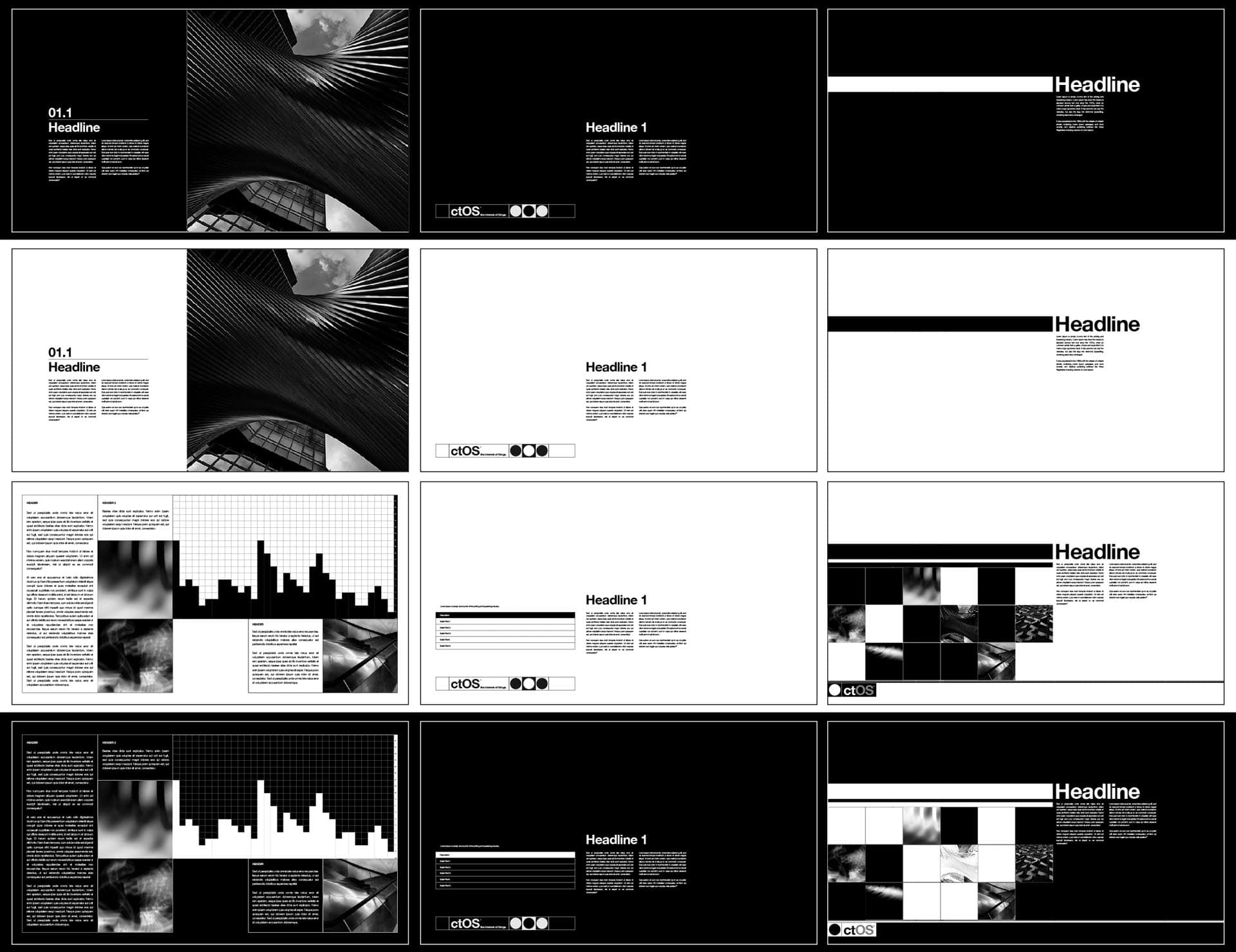
What we brought to it was more context and reason for being; since ctOS is effectively a utility, we thought of Helvetica as its branding system, the same way that the New York Transit Authority not only uses it in theirs, but puts it right at its center.
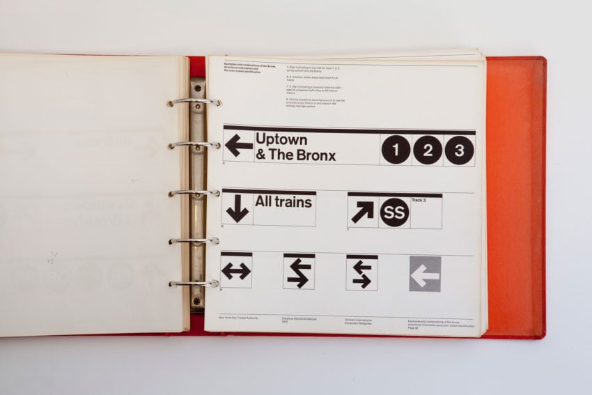
Page from New York City Transit Authority Graphics Standards Manual
To that end, we referenced their branding guidelines and philosophy pretty often but also added our own touches to differentiate it both from that and the original trailer.