


To kick off the FITC Tokyo 2015 conference, a superteam of artists working around the world (and sometimes around the clock) created a sublimely glitchy homage to the culture of Japan.
The way this team met and worked together is just as interesting as their finished project. Their globally distributed workflow is a testament not only to the power of collaboration but also to the way technology has allowed like-minded people to find each other and create amazing things, regardless of geographic distance.
Check out the process reel, and then dive into our exclusive interview with the team below.
“Tokyo” Process Reel
Making “Tokyo,” behind the scenes with the team
Who are all of you, and how do you know each other?
We are a group of creatives, directors, designers, artists, animators and programmers. Some of us are long-time collaborators and others coming together just for this project.
Ash Thorp: I am a freelance Director/designer/artist working out of my home office in San Diego.
I have known some of the members on the team for many years like my long time friend Alasdair and others like Albert Omoss and Andrew Hawryluk through The Collective podcast. I am lucky to have met some of the other epic talents on this project for the first time through Andrew or friends of friends.
Andrew Hawryluk: I’m a freelance animator and compositor that just moved to Los Angeles. I met Ash through The Collective Podcast, which we co-produce. Ash and I have also worked together on a couple of design and animation projects in the past, including the OFFF Barcelona 2014 Main Titles.
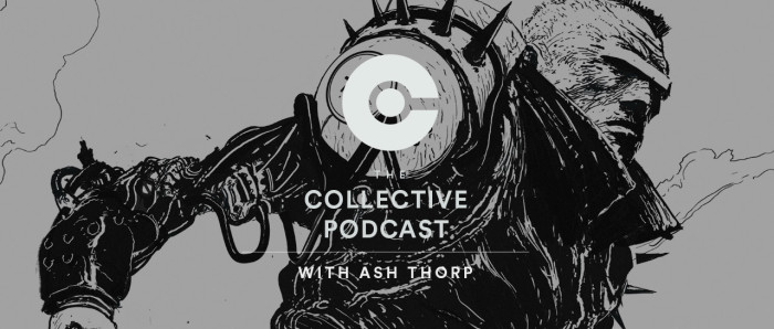
The aptly named Collective Podcast brought together many members of the team
Michael Rigley: I’m a freelance motion designer, animator and occasional art director working in LA. This was my first time working with this group, aside from Chris Bjerre, whom I had freelanced with on a number of projects in the Bay Area.
Andrew stumbled upon my site and struck up a conversation. A few weeks later, he was telling me about a potential job with Ash for FITC. From there, the three of us got rolling on the project, and Andrew built out the rest of the team.
Albert Omoss: My name is Albert Omoss, and I’m a computational artist. I know Ash and Andrew through The Collective Podcast. They asked me to be a guest on the show, and we’ve stayed in touch ever since. I didn’t know any of the other guys before this project, other than by their work.
Chris Bjerre: My name is Chris Bjerre, and I’m a motion designer from San Francisco. I knew Michael from having worked together on several projects at different studios in the past few years. Everybody else I only knew by reputation, which in all cases is very impressive.
Alasdair Willson: I’m Alasdair Willson, a freelance motion designer now based in Berlin. I met Ash when we worked together at Prologue some years ago. Ash and Andrew invited me to contribute some type animation for the project.
Nicolas Girard: My name is Nicolas Girard. I’m a graphic designer based in Toronto. I think Ash randomly found my work online, and it just so happened that I was an acquaintance of Anthony Scott Burns. We both worked at MTV Canada around the same period, but never had the chance to work together.
Franck Deron: I met Ash while we were working at Sony in San Diego a few years ago. I became his go-to editor for his various reels.
We’re good friends now, and through him I met some of his other collaborators, like Alasdair and Andrew — all really cool and passionate guys spread all over the globe.
What was each person’s role for this project?
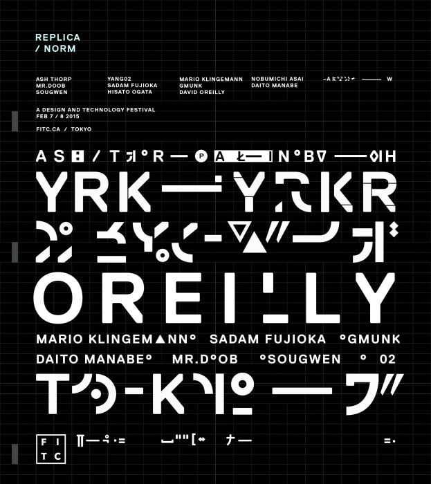
Andrew Hawryluk: In the beginning, Ash determined the mood and feeling he wanted to convey in the piece based off of his initial poster design.
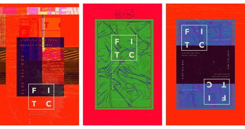
A selection of posters designed by Ash Thorp for FITC Tokyo
At this point, everyone involved in the project began pulling a ton of design and motion reference from around the web, which we thought fell in line with his direction. From there, Ash and Michael led the charge in terms of creating style frames, developing a cohesive look, and nailing the creative direction.


Nicolas developed a custom typeface with kanji-inspired glyphs for all of the artists’ names. From there, Alasdair and Nic started churning out all of the foreground typographic animation, and Michael, Chris, and myself were responsible for the background glitch animation.
When Albert jumped on board, he began creating code-powered simulations based off of Nic and Alasdair’s work to give the piece an added layer of complexity and detail. In the home stretch, all of us began tackling any remaining odd-jobs involved in giving the piece its final touches.
As we neared the end, we got Franck involved to help us cut a process reel in an attempt to shed some light on all of the hard work we put into the project.
Self-organization and working in the cloud
How did you manage your workflow with so many people involved?
Andrew Hawryluk: All nine of us were working remotely from three different countries and time zones.
Normally, this would have been a tremendous stress on everyone involved, but with the help of Dropbox we were all working out of the same folder hierarchy, sharing references, project files, and assets without any headaches. We then used Basecamp to store inspiration and references, coordinate everyone’s availability, set deadlines, and share our thoughts on progress made along the way.
Overall, I believe everyone involved felt very much a part of the team, mainly because we were all super passionate about making this piece something special. With the unique opportunity to collaborate with such a dedicated and talented group of artists on the title sequence for a conference that typically doesn’t have one, this project seemed to be a perfect excuse to try something groundbreaking.
How did this opportunity come about?
Andrew Hawryluk: When the conference was announced in November, I was immediately inspired by Ash’s striking and complex poster design.
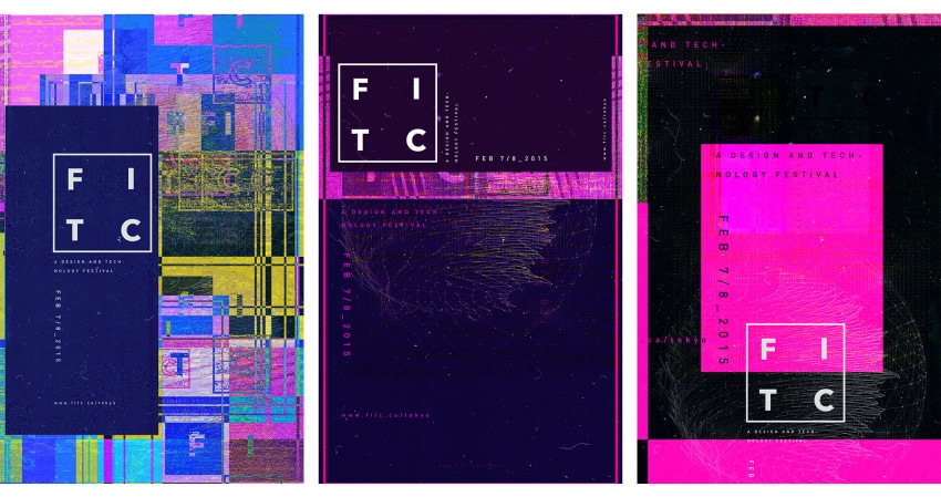
A selection of posters designed by Ash Thorp for FITC Tokyo
I reached out to Shawn Pucknell (who organizes the conference) — armed with Ash’s blessing — and proposed the idea of doing the titles.
Even though FITC doesn’t normally do titles for its Tokyo show, Shawn’s reaction was really positive, and he gave us the go-ahead. Soon after, Ash and I quickly realized we’d need some extra hands on deck, so we began reaching out to a few artists and friends to see if anyone would be interested.
Channeling Tokyo: chaos and control
Can you tell us more about the concept behind the design?
Ash Thorp: As Andrew mentioned, the project came about from the poster comps that I helped Shawn with. Those posters were built on my obsession and appreciation for Japan and the feeling and energy that I get from a city like Tokyo.
“Those posters were built on my obsession and appreciation for Japan and the feeling and energy that I get from a city like Tokyo.”
I then began focusing on the key themes behind what FITC is all about as an experience and tried to pull it all together. As the iterations began to build, the project’s true form revealed itself and it took on a life of its own.
Michael Rigley: Two themes that emerged from Ash’s posters were the contrasting harmonies of traditional Japanese culture and the pure madness and over stimulation of a city like Tokyo.


These binaries really laid the foundation for our design development and guided our decision making process throughout. This is part of the concept behind contrasting elegant and intricately key-framed typography with abrupt and abrasive glitch.
Were there any specific people that inspired you?
Ash Thorp: I am influenced by so many creatives from around the world and through time. It’s hard to bring up one and leave out any but I know that I was personally influenced by what my friend Patrick Clair and his team created for the show title Halt and Catch Fire, which is perfectly stunning in its own right.
Early on, I brought up the title sequence to Gaspar Noe’s film, Enter the Void, mostly due to its rule breaking format and its abundance of stimuli. As the project progressed I pulled muse from various designers and minds, like Paul Rand and Galileo Galilei, which helped me as a director to develop and foster the growth and potential of our team.
The design process
Did you guys iterate on the design process with FITC, or was it entirely up to you?
Ash Thorp: Since we had a basic starting point with the rough poster concepts I made, we built on those by using design cues from the colors and various shapes and style languages.
We did a few rounds of style frames and shared them with one another to see what was resonating with us most. We focused on those key things and continued that process until we had a decent visual roadmap to move into motion. The process was amazing and highly collaborative, consisting of many group Skype calls and fun Basecamp discussions.
Michael Rigley: The design process was very collaborative within the group, but we shared very little with FITC. Shawn had great trust in Ash and Andrew and allowed us to create uninhibited. With projects like this, everyone is contributing their time for the sheer passion of the work and it’s an amazing opportunity to work with a client that has so much trust in the artists and collaborators working on the job.
Experimentation and software
Given the experimental nature of the design, how did you go about production? Did you find yourself using tools in different ways in order to produce the effects you were going for?
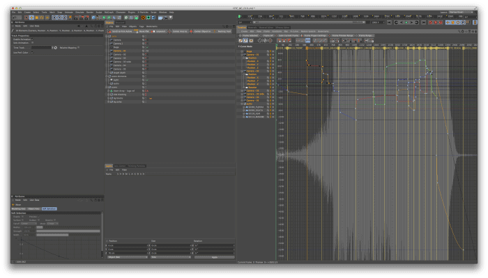
Michael Rigley: The key tools we used were Creative Cloud, After Effects, Cinema 4D, Houdini and Processing.
“We used Cinema 4D primarily to set up the environment and do all of the camera moves in 3D. “
We used Cinema 4D primarily to set up the environment and do all of the camera moves in 3D. We imported that data as the base for our timeline, which served as our initial edit. We also used it to animate particles for the logo reveal.
The bulk of the work for this piece really happened in After Effects. Nicolas designed all the type in Illustrator and imported it as hundreds of shape layers for him and Alasdair to animate via thousands of keyframes.
Typographic explorations
Nicolas Girard: After testing out a few faces, I designed a typographical one-sheet to experiment further with Norm Replica. That became my main reference for the language I was going to build.
“After testing out a few faces, I designed a typographical one-sheet to experiment further with Norm Replica.”
The way some of the letters are sliced worked really well with our plan to typeset each name into a strict grid system, which we’d planned to navigate with a 3D camera.
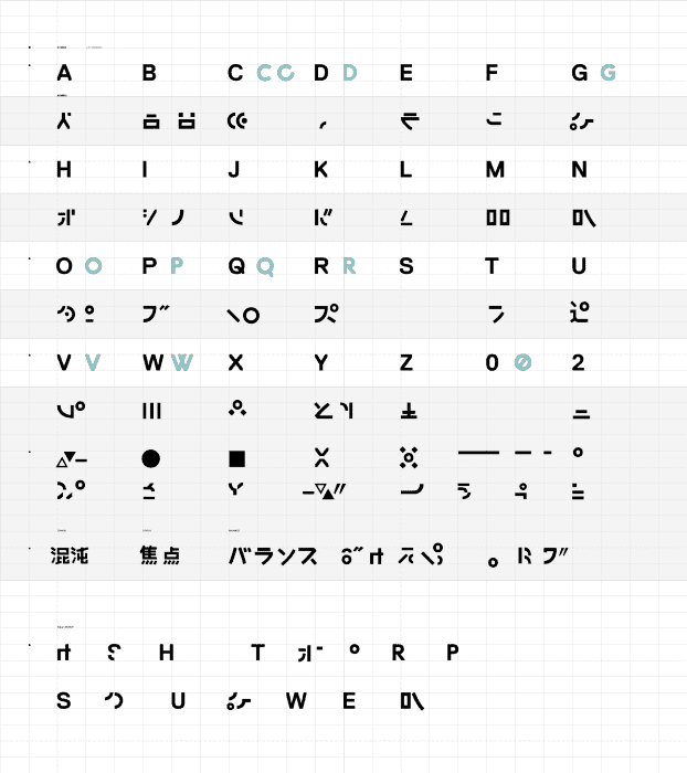
“Each glyph is a blend between slices of Roman letters and Japanese characters”
I simplified a few of the original characters and designed a large set of custom glyphs based on Replica’s geometry. Each glyph is a blend between slices of Roman letters and Japanese characters: abstract on their own, but legible when contextualized and combined.
Once we had a language and a motion test that felt right, I designed all the name cards following Michael’s camera work. Alasdair and I then started to cut and animate the glyphs individually. We animated almost around the clock for two weeks — him being in Berlin and me taking over later on Toronto time.
A glitch is not a glitch
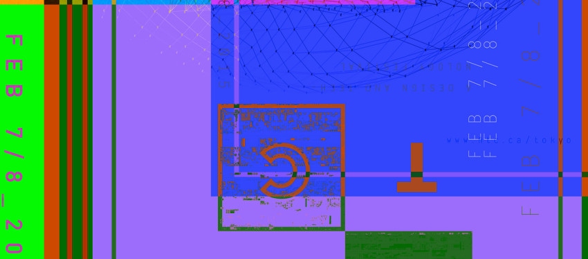
Michael Rigley: The biggest part of producing the glitch effects was really just building up a massive library of textures and mattes that could be repurposed throughout the piece.


The “glitch” here isn’t really a glitch as you would think of it in a traditional sense — distortion or degradation of source content. This is more of an editorial-style glitch. Building the feel of a glitch with sequencing and layering of textures and simple graphic shapes that together create more complex compositions.
The challenging part of this approach is that it’s almost entirely a manual effort, becoming more of an edit than anything else — cutting together thousands of layers that may only be on screen for a frame or two. We really wanted the glitch to be a controlled chaos that relied on some kind of underlying logic or grid system and not just wild pixel manipulation. It was important for us to elaborate on the textures and not use them as the default mattes we had originally built.
A lot of this was just crunching alphas, coloring, layering and combining to generate unique assets that distinguished itself from our library. This gave us an almost endless set of combinations that wouldn’t feel overused in the spot.
For the most part, building up our library of assets happened pretty early during the design phase of the project. We used a lot of Form to serve as a grid system and fed a variety of particles through various noises to generate the textures.
For some of this we were experimenting with kaleidoscope techniques that yielded some pretty interesting results. While the majority of these tests didn’t make it into the final spot, they’re still rather beautiful experiments on their own.
Color was also a really important part of the project. We used Ray to manage our color workflow inside After Effects. I remembered seeing Sander van Dijk post a tutorial on working with color in AE. In tracking that down, I saw that he had just released it as a script, which made life a little easier.
Albert Omoss was kind of our wild card on this job — generating really interesting pixel-based procedural glitches in Houdini and Processing that we would cut into our AE comps.
Controlled chaos and the “Genetic Grid”
Albert Omoss: I think we all really wanted to create some unique effects that had never been done before.
I experimented in Houdini extensively. Through the course of research, I developed some custom compositing filters in VEX code to glitch video in a very controlled way. I also built a system in Houdini to turn video pixels into particles and advect them through various force fields.
We were really aiming to make every pixel come to life and act as autonomous intelligent agents. I prototyped a genetic algorithm-based grid system in Processing, where the video would drive the birth of ‘organisms’, that would traverse the grid, spreading their genes, mutating, and evolving.


After the algorithm was worked out in Processing, the “Genetic Grid” was rebuilt with Python in Houdini, to provide finer rendering control, and to take advantage of Houdini’s ability to cache the simulation data.
The role of sound
Can you talk about sound and the role it played for this project?
Ash Thorp: This was a huge topic of conversation. In my opinion, music is often times 80% of the experience, so we knew we had to nail this aspect.
We passed around tons of examples and all agreed that we wanted something very unique and classical in tone. We first shared a few really beautiful Phillip Glass tracks, along with some Nils Frahm and Max Richter — which ended up being the direct muse that we sent over to our composer, Pilotpriest a.k.a. Anthony Scott Burns.
He loved what we where building and although completely consumed with the various projects he already had on his plate, he agreed to help us out. Anthony and I had many discussions about the core themes and about what I saw in my mind and was hoping to achieve.
I loved the idea of something starting out silent and fragile and becoming this massively powerful experience, one large gradual build that released the moment it all came together. Anthony is such a phenomenal creative power and I feel he really nailed what this project needed.
What was the most difficult aspect of this project?
Michael Rigley: Getting to the rough cut. Definitely.
The animation process for both the type and the glitches were extremely intricate and time consuming. Looking at an empty two minute animatic is kind of daunting. Once we had a rough of everything, we were able to really tweak, refine and carve out the pacing we were looking for.
But for the most part, this was a project where things just flowed very easily, due to the skill level and dedication of the team. We kept a fairly loose process and everyone’s commitment really drove the piece to the place it is today.
What’s next for all of you?
Andrew Hawryluk: I’ll be flying out to Tokyo to see our work premiere at FITC, followed by a week exploring Japan, eating weird food, and sleeping in a capsule hotel.
After that, I’ll be back on my freelance grind in Los Angeles, probably rotoscoping a dog for a cereal commercial or something. Whatever actually ends up being next for me, I hope it’s something half as fun as this project was — and with artists as rad and inspiring as this dream team ended up being.
Ash Thorp: 2015 is a big year. I am currently developing a few film projects with my buddy Anthony Scott Burns, along with my massive project, Lost Boy!
I am thinking about creating a video game and maybe making tutorials towards the end of the year. I plan to continue making these passion projects as well; they remind me how important and amazing things can be with the right team and passion.
Michael Rigley: I just recently relocated to LA. So right now, I’m just enjoying meeting people and working with new shops. I’m hoping to fill the next year with exciting and engaging work and continue to collaborate with some of the talented folks I met on this job.
Albert Omoss: I’m a staff employee at Buck, so I will continue my day job as a creative technologist. I’ll keep making personal art, and I’ll never be able to turn down the opportunity to work on cool passion projects like this.
Chris Bjerre: I’m currently working on a short film in between freelancing. Otherwise, I would love to do more titles like these with any of the guys involved.
Alasdair Willson: I’ve just moved to Berlin and will be working on projects both onsite and remotely.
Nicolas Girard: I just opened a new studio in Parkdale, Toronto called WORSHIP.
While being a motion studio, its core focus will be on traditional graphic design. It’s a new challenge that allows me to keep working with other studios and directors but also gives me the chance to collaborate with designers on projects I would otherwise not be able to take on alone.
I also hope to get more into unconventional motion and design work — rather than your typical 30-second broadcast commercial.
Franck Deron: I’m directing a personal project I’m producing in Mexico next month. Looking forward to lots of new film adventures!
Buy the title sequence
The Collective Podcast has produced TOKYO, a series of hand-numbered, limited-edition art prints based off of select visuals from the FITC Tokyo 2015 Titles.
Shop the sequence on The Collective Podcast’s Store.
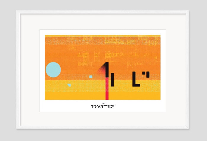
Framed stills are available for purchase at The Collective Podcast store
Links
The Team
- Ash Thorp
- Andrew Hawryluk
- Michael Rigley
- Albert Omoss
- Chris Bjerre
- Alasdair Willson
- Nicolas Girard
- Franck Deron
- Pilotpriest / Anthony Scott Burns
Discover more from Motionographer®
Subscribe to get the latest posts sent to your email.