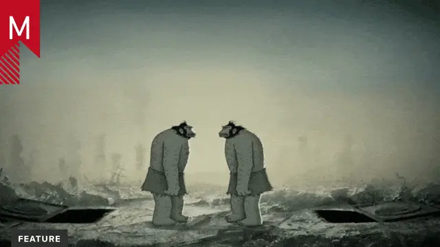
Director Simon Clowes shared some valuable insight on the title sequence with Motionographer:
The majority of these big budget movies have elaborate visual effects and a lot of the time clients request big anthem opening and/or closing title sequences to suit. Because we have the technology and extremely talented artists behind the software, there comes a higher expectation of polish and realism where looks can sometimes overshadow the concept. In this world of visual overload, it is very easy to piss away the entire budget with a large, or extremely tired and small vfx team working around the clock trying to make a title sequence that can hold up with the vfx in the movie. Projects in the studio are now more often requiring vfx pipelines as the complexity is increasing and the line often blurs between what could be considered motion graphics or visual effects. In some instances, it has therefore become challenging to retain a concept due to decreasing deadlines and increasing elaborate visual expectations.
In the case of x-men first class, it was interesting to read in the initial brief from the Director that he didn’t really want to follow the trend of the other x-men movies regarding the title sequences and it also seemed that the entire movie could end up being be a stylistic departure from the others in the franchise. It was clearly stated that he admired James Bond movies and he wanted the titles to feel as though they were created around the 1960s time period. I saw this as an opportunity to make something that stands out not for its visual complexity or photorealism but for its simplicity and sensibility.
From the very beginning there were limitations set, we were only given 90 seconds to fit all the credits (eventually increased to 100s) and I put a lot of restrictions on the design and typography which i think helped retain the integrity of the initial concept. The time allotted to complete the sequence was short and the lack of pressure to create a photorealistic 3D sequence requiring heavy render times even to see motion tests enabled myself more time to develop the concept and Alasdair Wilson (animator) time to spend on refining transitions and animation. It still took quite a bit of time to render at the later stages but intricacies and timing changes were now at a minimum.
The process of creating the final sequence was important as the initial reaction to making it ‘feel old’ was to add grain and a grungy texture essentially degrading the artwork in an attempt to make it feel retro. This is often a default approach and it was quickly kicked back as the Director wanted it to feel like it was made in the 60s and not made now trying to feel old and degraded.
The typography was also important to me to keep very simple as per the bond sequences the director was referring to. They ended up just cutting on and cutting off. Just because we have the ability to move type, it doesn’t mean we have to. Just because we have z-space, it doesn’t mean we have to use it. This restraint proved helpful as we really didn’t have enough frames to play with for animation tricks to bring on the credits.
I feel the outcome of this title sequence is important because it shows that simple two dimensional graphic design still has its place in these big budget movies and can stand out even though technology and software is advancing pushing the boundaries or realism.
Design Director:
Simon Clowes
Executive Producer:
Kyle Cooper
Producer:
Unjoo Lee Byars
Animator:
Alasdair J.T Wilson
Designers:
Ash Thorp
Ji Yun Ha


