


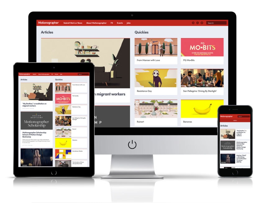
Welcome to a slightly gussied up version of Motionographer!
Go ahead and kick the tires. If you find any bugs, please send them to support@motionographer.com along with your browser and operating system.
Facelift? Why?
We’re calling the new look a “facelift,” not a redesign. We’re just trying to address a few specific issues with the old design that have been nagging us for the last couple years.
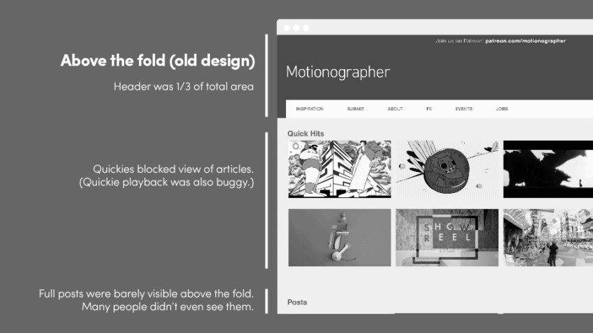
“Above the fold” poorly utilized
The area “above the fold” is what the user sees before they scroll. In our research, we found that many of our desktop visitors hit the homepage and never scrolled below the fold. (Desktop users account for 81% of total traffic, by the way. Most people visit Motionographer during work hours on their work machines.)
Check out this heatmap sampled from over 2,000 visitors to see how user activity drops off dramatically below the fold.
Obviously, it’s super important that the area above the fold accurately represents activity on the site. In our old design, it didn’t.
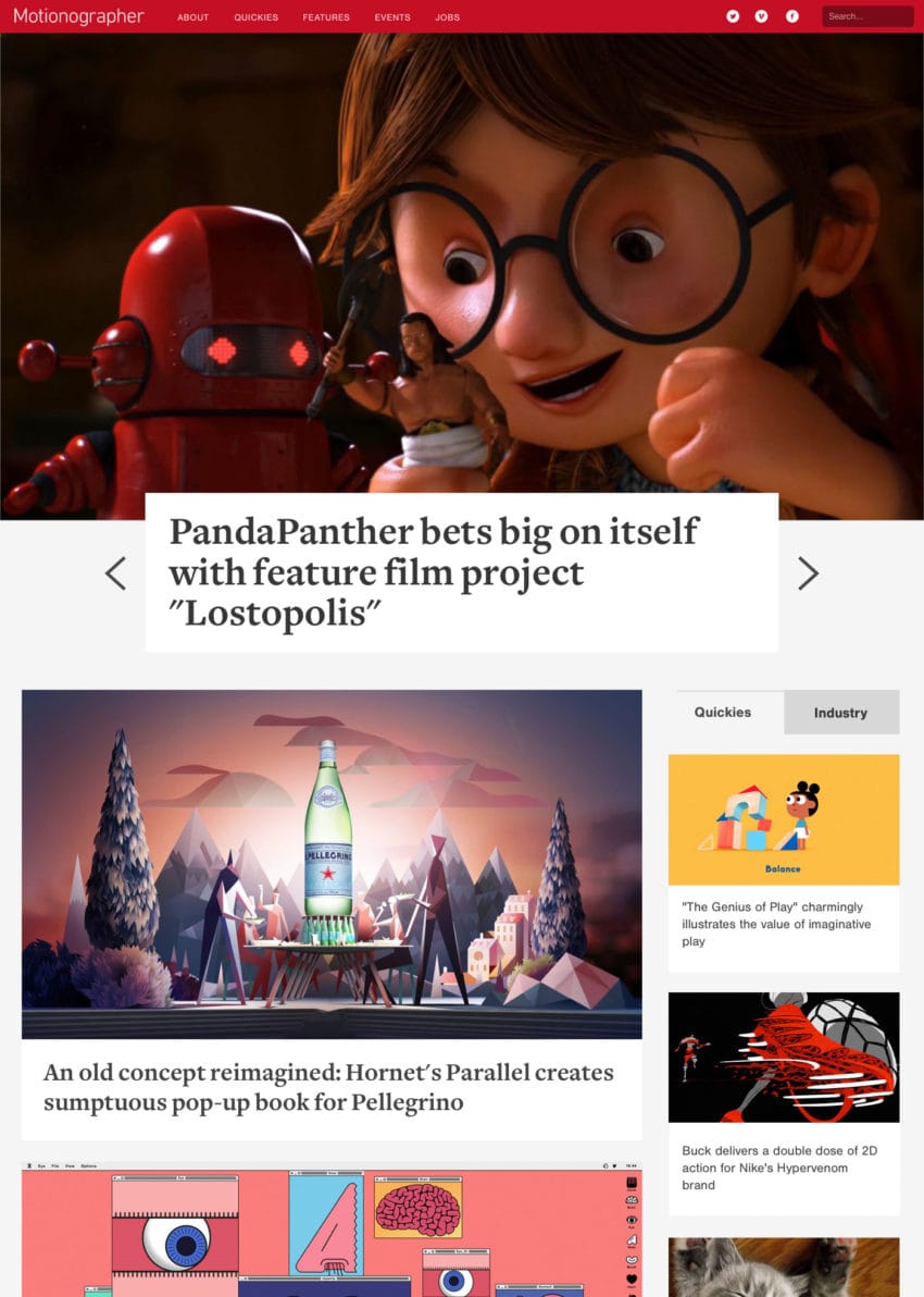
The new design gives more visibility to longer form articles while balancing the layout Quickies, which get updated more frequently.
What’s new?
Quickies
Long-time visitors will remember Quickies — quick hits of news, inspiration and other fun ephemera. Quickies replace the (fairly buggy) Inspiration feed from the old design.
Quickies also feature:
- Keyboard controls: ← / → for prev/next and ↑ for home
- Permalinks (for sharing and saving)
- Comments (for making noise)
- Inclusion in our database (i.e. they’re searchable)
Other stuff
- The lovely Sofia Pro has taken the place of the rather boring Nimbus Sans for headlines and headers.
- Mobile and tablet homepage layouts have been significantly reworked.
- CSS has been cleaned up (mostly) and the number of JS calls has been significantly reduced.
Process
The design process started as a series of internal conversations over a year ago. We even built a fully functioning demo (that no one saw) before realizing that it over-emphasized feature articles, effectively blocking all other content.
This aborted design direction was bold but fundamentally flawed.
Patreon for the win!
Our Patreon community was a massive help! We sent beta invites to everyone at the Beta Tester level ($5+) and got 56 detailed survey responses within a couple days.
We took their advice to heart, made further tweaks to the layout and added some great new ideas to our backlog for the future.
Infinite scroll, we barely knew ye
We had to leave behind infinite scrolling of content on the homepage. It was a valiant effort, but the split screen layout combined with the way our content is fetched from the database made this a giant headache.
We tried all sorts of ideas — on-demand loading (i.e. “load more” buttons), independent scrolling of the columns, window-based pagination, and more. Technically, we got things working, but the user experience was confusing, creating more problems than were solved.
Bug reports
If you find a bug, please send a message to support@motionographer.com. (Include your browser and operating system, too.)