


Give us a brief introduction to yourself and the studio.
My name is Braden Wheeler and I’m an on-the-box creative director (with a general focus on design and branding) at Roger. As a firm, we say we’re a creative studio. We act as an agency sometimes, and a production company other times, creating brands, campaigns, commercials, and so on. We started as a traditional Motion Design studio nearly 20 years ago, and have grown up in every which way. In general, we like to think our clients come to us for something different. We’re always looking to one-up, yes-and, and make it weird.
Fill us in on your Motion Design background and what led you into the industry
I sort of stumbled into the Motion world, coming from an editorial focus in film school. I took some editing jobs and they needed some simple Motion work. My friends and I had been noodling with After Effects, so I knocked out some epic lower-thirds and immediately changed the game (sarcasm). I was cutting corporate videos, but I could see where the Motion Design rabbit hole went (partly because of Motionographer, tbh). I was barely dipping my toes, but I was seeing what the big studios (“Cream of the Crop”) were doing and I knew right away I wanted to do THAT (points to screen).
Tell us about the team behind your project.
The team question, I’ll split into two answers: the Roger team and the Nick internal team. Both sides were integral in all this. I can elaborate more on that.
Without having to do the full credits list, I’ll drop a couple of names. Our ECD/Founding Partner and major collaborator on this was Terry Lee. Terry is a proper yin to my yang. Wherever I get lost in design systems and the overly pretentious stuff, Terry is there to make sure we have enough farts and goo. While nudging and hyping on the design side, he also directed all the live-action production that accompanied the rebrand (a huge undertaking on its own). Our AD was the badass Rob Modini, who never thought twice about grinding on this one with me.
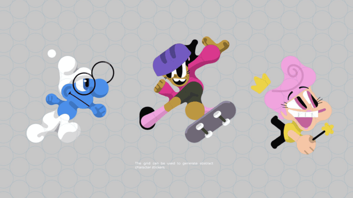
The greater creative team was a BIG mix. The project was largely rooted in 3D, so we had an extensive C4D squad for both design and animation. We also had a lead that focused a lot of his time on slime, which was such a big part of this. While we often tried to have him join other exercises, there was always another slime-oriented task, so he was largely dedicated to that. The project wasn’t entirely motion, though, so we also had a team of brand designers, illustrators, etc. that helped define how the identity showed up on digital, web, social, print, swag, etc. It can be said we had a lot of different specialists getting involved across the board.
The second half of the team was the Nick internal squad. This whole project could not have been pushed this far if it weren’t for the strength of the creative team on the client side: EVP, Global Kids & Family Marketing Sabrina Caluori; SVP, Global Creative Vincent Aricco; Executive Producer Danielle Jotham; and SVP, Design & Motion Michael Waldron. The leadership always looked for ways to keep elevating and never settled, and their capabilities from a design and animation perspective internally made it possible to tee up design directions for a package that no other network team I know of could handle. Not only that but the stuff they’ve been doing with it since has already pushed things for the better. The Nick folks are truly the other half of this (and not just over here trying to frost our clients).
How did you win the work in the first place? Was there a pitch? If so, what can you tell us about it?
There was a lengthy pitch process (~two months). Our first round was largely spent processing the brief, which included a lot of research and strategy. We tried to take all of that information and distill it into something that could help drive our exploratory phase. With that, we put the pen to paper more extensively for round 2, which was a shotgun exploration of all kinds of ideas around the brand. We didn’t aim for the traditional “3 Directions” approach for the pitch but rather put all of our eggs in one basket (something I tend to do with brand pitches). We felt really strongly about the core idea (splat revival), so we built everything around that. I like to approach brand pitches with modular thinking, so it’s not necessarily an all-or-nothing conversation. Designing and thinking so there’s enough breadth that you could, in theory, split it out into some separate directions, but they have enough connective tissue to also coexist as one. This works particularly well when you have a brand that is looking for a sense of variety and expansiveness, and maybe not as much when you have a much narrower or neater brand.
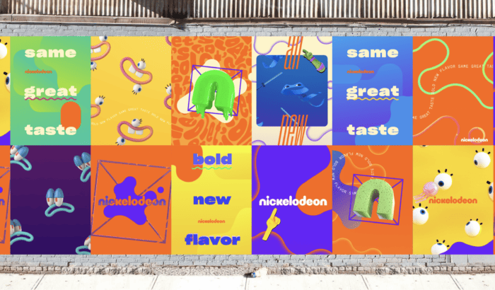
So, in the spirit of this, we bet the farm on bringing back the splat and then threw a lot of ideas and concepts in service of it. The biggest being the grid-based system. The folks at Nick needed more meat to their brand graphically, so we were in search of something that could give them more to play with while keeping things cohesive.
Take us through your process. How long did it take? What techniques did you use? What programs are you using?
The project as a whole started with the pitch phase in the late spring/early summer of 2022 and we delivered our last elements in March of last year. We started with a development phase that lasted about two months, during which we aimed to lay down the foundation of the brand, and also to get sign-off from the exec teams that would need to buy-in on the whole thing. This phase was essentially taking the pieces from the pitch that they liked (which, thankfully, was a good portion) and refining and expanding. Initially, given the scope of the project, we tried to push some of the aesthetics in some more 2-dimensional directions (trying to execute a giant brand entirely in 3D was…well… daunting), but it quickly became clear that Nick’s appetite was for a heavily 3-dimensional identity. While it certainly complicated the process, it was the right thing to do. It opened up a lot of doors creatively and made for a much more fun brand.
In terms of techniques, we ran the gamut. The majority of what you see went through a C4D / Redshift pipeline, with sims done in Houdini, X-Particles, and C4D2023 (for cloth). We also did some of the hero animations in cel, using Harmony. We then took those 2D animations, traced them in Illustrator, and ingested them as splines into C4D. We wrote some scripts to automate this process for the most part. There was definitely a moment where the workflow was already daunting enough for something at this scale, but then we were like, let’s start in cel and bring that into 3D… I had alarm bells going off in my head, but the result was exciting, so we just had to do it. I think both the creative process and the production pipeline tended to mirror my chaotic ADHD brain, which was a proper benefit of this project. Usually, you need to (at some point) stop playing the “what-if” game when you’re in production, but for this one, we tended to constantly introduce new ideas and directions throughout the whole process. We consciously allowed this to happen knowing that this eclectic and expansive vibe was essential for the brand. We decided to never shut off the pipe and were constantly pivoting and adding things. I probably drove my team insane.
In development, we had imagined mashing all these things together and had so many ideas, but it was still just a set of fun frames for a long time. The first time we showed it in motion to the client there was a collective sigh of relief followed by a buzz of energy (holy shit, this is going to actually work!). There’s always something exciting about that motion light switch, where you’ve been looking at design frames for a while and talking about what it’s going to do, and you finally do those first tests and the whole process ignites with a new flame.
Compositing and 2D animation were in After Effects, and we built toolkitting elements in Python for C4D alongside Xpresso and with expressions in After Effects.
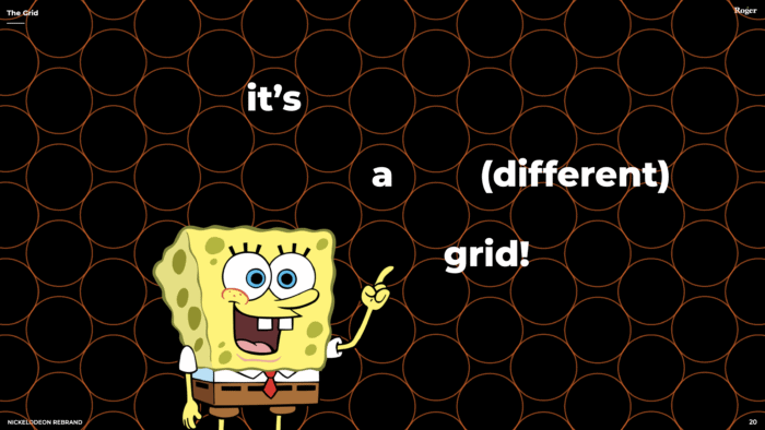
Tell us about your circular grid system: how it works, and why it’s important.
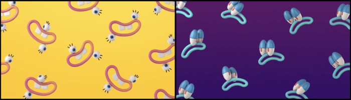
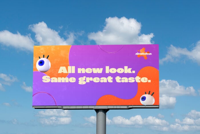
Functionally, the circular grid serves to provide a form of guard rails for what would otherwise be freeform organic shapes. By creating consistency in construction, we could build a brand of blobby things that still had some form of underlying thread. We found that there was a bit of tension between attempts to express the organic nature of “splats” and this geometric formula, but we decided it would be successful for exactly that reason. It’s not organic, and not geometric. It’s not exactly how you’d immediately draw these shapes, and that’s why we felt it might find its own little niche. There are lots of brands using the amorphous blob aesthetic in their identity (think Spotify) and we didn’t want to just disappear amongst those. We wanted to make something ownable. The oddness of the shapes feels (to us) like it accomplishes that. We wanted to be able to make shapes that could be seen in a vacuum and potentially be able to distinguish, “Oh, that’s a Nickelodeon shape.” This doesn’t just happen overnight, but if the brand sticks, with time, it just might.
The grid design itself was more of a discovery than a creation. We had first set out to design the splat, and in doing so, reduced it down until we could no more – when it stopped looking like something that “went splat” and started looking like just a shape. When we did that, we got to the core of “splat-ness,” what makes something feel like a splat. Unsurprisingly, that really just comes from it having a sense of liquid cohesion. For anyone who’s worked with metaballs or meshing particle sims (which is at the essence of what a splat is), you know that those shapes are defined by circles/spheres and some parameter of merging them and ultimately smoothing that. The circular grid at the base of this brand was basically a way to define those parameters in two dimensions. This is the only crowd I get to use that explanation (thank you for that). Essentially, when we broke the splat down as far as we could, we found that grid already there, so we defined it as a foundational element, and pressed on from there.
How did you pay homage to the history of the brand in this update?
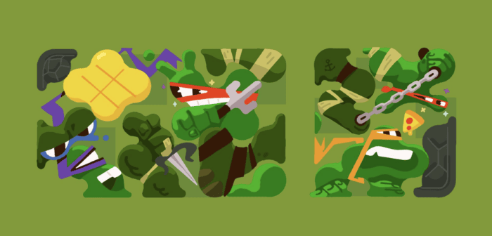
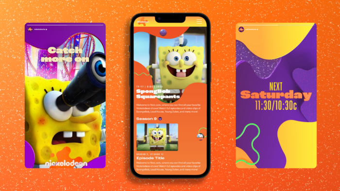
“Heritage” was a word that flew around a lot in the brief and early conversations. There was a strong desire to bring back the spirit of the old Nick without going nostalgic and alienating the kids today. To us, that meant we should try and make something that could flex with all the wildly eclectic and creative things the Nick team and their vendors would end up doing with it. That was priority #1, but on a more direct level, we did a few things that tried to directly nod to the past. Obviously, the splat itself was a direct reference, but we also embedded cel animation into the package as a nod to the classic Nick styles and pushed extensively for an eclectic palette of color and texture. This part, which others have called a “nouveau Memphis design style,” was less intentional and more so naturally unfolded in the process. The Nick team was really pushing us to embody the kid spirit, and that put us in this revisionist bad/good mashup style that ended up being fairly reminiscent of the OG Nick that everyone knows and loves.
What Nickelodeon shows did you watch as kids?
Ren & Stimpy definitely left a pretty big mark on me, a very strange mark. Legends of the Hidden Temple also inspired me to always be looking for treasure and setting boobytraps for my older brother. And of course, SpongeBob… the show still rocks.
What was your favorite moment or most fun part of the project?
The most exciting moment in the project was definitely when we just started going into Motion. We had spent so long talking about what it would do, and when we finally got to start moving the stuff, it was so thrilling. We had already been at it for months of design and that light switch just fired everyone up in such a cool way. I think I stayed up late working by choice basically every night after that point because I was just so stoked to see things come to life. The early animation phase had me over the moon and back.
The other great moment was around the delivery time when we got to bring our kids (my producer, me, and my AD each +1 little one) to the Kids’ Choice Awards. Our little ones were mostly too young to know what was going on, but for me it was incredible. To see the design system woven into this insanely rich visual experience for the first time gave me goosebumps. My kid still constantly talks about “the slime show,” so I think it was pretty special for him as well.
Did you have any other ideas you liked that you didn’t go with? What were they, and why did you turn away from them?
Wow, we made and discarded SO MUCH along the way. We had to toss so much work due to the rate and volume of exploration that we did along the way. In terms of larger concepts, at the beginning, we had a portion of the concept that was focused on “process.” We had elements of the “creative process” represented by a floating hand that would poke things, adjust things, change things, etc. The thought was to show how being a kid is about playing, learning, and making. We also thought the hand could have some fun acts of subversion (drawing mustaches on people, bunny ears, removing elements from a photo, etc.). I still think there’s something fun there, but it wasn’t really necessary for the package, so it was shelved early on. Aside from that, there were countless individual explorations in iconography, character abstractions, and patterns. We were constantly playing “what if” all the way through, so very often, we would throw entirely new ideas into the mix. A lot of things just couldn’t efficiently be “systematized” for the larger brand, so they ended up as a nice frame or idea for another day.
Did you face any difficulties along the way? If so, how did you overcome them?
The sheer volume of deliverables, given the decision to go all-in on 3D and in a relatively short period of time. I was worried about that from the onset. However, there was one saving grace. We had a lot of conversations about messiness and the resulting resiliency as a huge part of a kid’s experience. We thought a lot about failure and made a conscious effort to let ourselves fail in the work. For instance, as a time-saving measure, we used certain texture projection methods that worked great for designing a still frame, but in motion didn’t necessarily work (cubic/tri-planar). The textures didn’t track with the motion of the objects due to the way it was moving, but we said “Hey, let’s make this ‘bug’ a ‘feature.’” We left it in, called it a choice, and moved on. There were other times we pushed that to the next level and made conscious “mistakes” but it started as a moment in time where we would normally stop and say “Ok, how do we make this perfect?” But in this case, we leaned into the imperfection both to cut corners and to bring more messiness into the brand. I’m a bit of a perfectionist, so the project became a constant exercise in “letting go” in the name of embodying my inner kid. There was also just a bazillion places where I wanted to tinker forever, but the schedule didn’t allow it, so that’s just part of it. It’s not perfect, and there’s beauty in that.
How do you deal with creative doubt on a project?
Wow, this is a biggie. I’ve accepted at this point in my career that self-doubt is sadly inevitable, at least for me. I imagine you get this answer a lot, but I do think it’s important to talk about it. It doesn’t matter how many successes you can have in your career, there will always be the voice that says you’re not good enough, the work isn’t good enough, you’re a fraud, and everyone’s about to figure it all out. This phase of every project is so consistent that my wife can tell when I’m in the development portion of something. She immediately reminds me that it happens literally every time, and that I’ll assuredly figure it out / solve the problem and it will all be okay (she’s fantastic, as you can tell). Inevitably, there’s a breakthrough of some kind, and the roller coaster of emotions goes the other way. Of course, longer projects tend to have enough time to creep back into the self-doubt phase again long after you’ve “figured it all out.” The design loses its novelty and you start to question if it really ever was good to begin with. I’d like to say I’ve also mastered this phase, but I haven’t. I still have to turn to my art director, producer, friend, etc., and say “Is it good?” I know whoever I ask is going to say “yes” regardless; no one would have the heart to torpedo my confidence mid-way through, but even the biased praise is enough to keep me pressing on.
This project had the unique 3rd stage of doubt, and that was once we were all finished, it was time to release the work. I was so personally invested and had poured so much of myself into the job, that the launch was nerve-wracking for me. I had no objectivity left at this point, so I had no idea what people were going to say. My AD and I chatted a few times specifically about the splat, and we were straight-up thinking “Are people going to like this thing at all?” There were moments where I was positive people were going to hate it, but this actually led me to a convenient realization (or maybe some mental gymnastics). It’s good specifically because it’s a little odd. It’s not the conventional approach to drawing a “splat” and that’s cool. I believed firmly in the functional reasoning for the design, and I knew that at one point I loved the form, so I convinced myself it was going to work. I was also consciously preparing for fandom backlash. I know that people have a tendency to knee-jerk when a beloved brand makes a change to something that has history, so I was readying myself for the pitchforks. We were honestly surprised when the launch happened and the audience reception was overwhelmingly positive. There was genuine excitement around it. That was a huge relief. Sadly, I’ll still have doubts throughout the next big project, and the one after that, but each time, I get a little bit better about assigning those doubts as an actual part of the process.
When you feel stuck or need inspiration, where do you find it?
I find that inspiration tends to be where you don’t expect it. I aggressively collect and surround myself with creative works (books, prints, objects, etc.) in an effort to keep my process energized, but often, I get unstuck by leaving my space. Running, for me, is a meditation where I tend to think about everything and nothing at the same time, and that kind of activity often jogs loose (sorry for the pun) a new idea or two. I can stare at my screen and try like hell to find an idea, but it’s almost always when I’m playing with my kid, running, or even sleeping when something clicks. The best way to get work done sometimes is to stop working.
Do you have any advice for creatives on how to pursue their dream projects?
I feel the biggest thing is to just make work in volume. Never stop making things and learning. I used to focus a lot on what I wasn’t doing yet, wishing I could be working at X studio on Y project. Perhaps that striving was beneficial in the end, but at some point, I just focused so intensely on my work that years blew by and I realized I was doing many of the things I had always wanted to do. In terms of “dream projects,” I think focusing on the genre or style that’s relevant to your dream is helpful, but I also caution against being too narrow in chasing that down. Keep an open mind and make work, and perhaps a dream project will materialize where you least expected it.
What does it mean to you to be featured on Motionographer?
This kind of thing was on my list of goals when I was a junior artist. Being featured here was the definition of “making it” in the industry. At some point, I stopped thinking about accolades or status and really focused on the work. From there, it’s been a proper time warp and now I’m like “Oh, cool!”
Money no object, what would you love to work on most?
Well, not the right response for a Motion-oriented outlet, but I would do more printed work. As someone who didn’t go to school for art/design, I’ve largely just been in the digital space, but making physical things is so satisfying. I think I’d make posters and zines and whatnot.
What were some ground-breaking moments in Motion Design that have shaped the way you think?
In my early years in the industry, we saw the explosion of online education and informal tutorials, which really shaped my experience. I was able (as everyone is now) to pursue any direction that piqued my interest at the time. I think that a variety of styles, methods, and media gave me a wide range of skills that helped me stumble my way through the industry. I can’t imagine going back to the years of learning software by reading a book. Woof.
What do you think we could do as a community to work together more and drive the industry forward?
I’m not the best person for this one as I tend to hide away and don’t contribute much to the community itself (outside of mentoring and teaching directly with my colleagues). I love the fact that people passionately build community, but I’m a bit of a hermit myself.
What’s next for you and your team
Since wrapping this one, we also put together the Nick Jr. brand as a sibling to “Big Nick” (we’ll share that once we’ve collected ourselves to present that work as a whole). On that note, we just wrapped a long overdue update on our reel and website (something, cobbler’s kids or whatever). That’s finally up and running (though we will be tweaking it forever, of course). “Work” -wise, we’ve been collaborating with various entertainment brands to refresh their visual identities and launch new entities (more on that when we can share!). Personally, now that I can check Nickelodeon off the list, I have my sight set on the last of my childhood tentpole brands (if anyone over at Comedy Central is interested in collaborating, give us a shout!). More importantly, though, we’re trying to build on our experiences in order to be better artist. producers, and overall humans. This particular project opened up a lot of new ways of thinking for many of us (on and off the computer), and we’re looking for ways to harness that and feed off of it for future work (and play, of course).
Thank you so much for being here. Before we let you go, is there anything else you’d like to share about your piece?
I don’t imagine you want to read any more at this point. Thank you for having me! It’s an honor!