


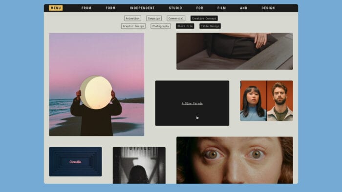
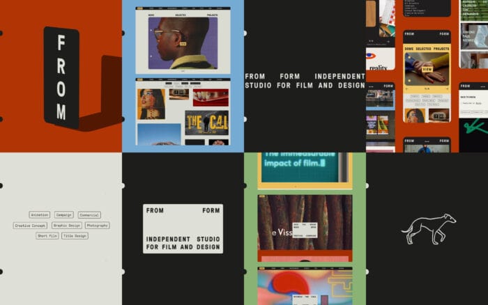
Film and design studio From Form has marked their 10-year anniversary by launching a new brand identity and website. Capturing the studio’s love of colour, film typography, and nostalgic aesthetics, this new look ties all their film, design, animation, and photography projects together.
The studio was founded by husband and wife team Ashley Govers and Jurjen Versteeg in 2013, to offer a playful and cinematic approach to film and design. The duo place a strong focus on art direction and carefully arranged colours & compositions in their work, with the outcome often reflecting their appreciation for the analogue and
imperfect.
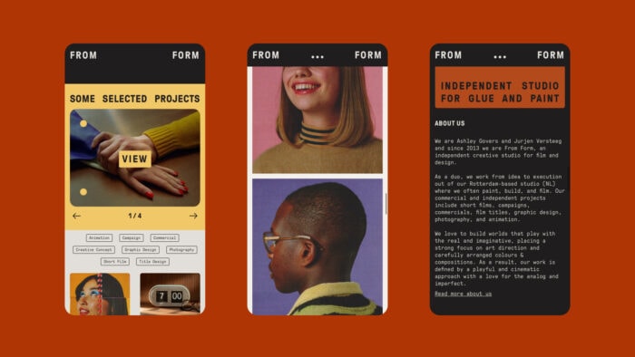
Their commercial and independent projects include short films, campaigns, commercials, film titles, graphic design, photography, and animation for clients such as Ace & Tate, Skoda and Hyundai and cultural organisations such as Amsterdam Museum Night, Cineville, OFFF festival and Into the Great Wide Open festival.
For the studio’s new website and identity, the duo took inspiration from film titles from the 60s and 70s – which is, according to the studio, “an art form where the worlds of cinema and analogue design meet”.
They looked at titles from French New Wave directors such as Agnes Varda and Jean-Luc Godard. Finding these titles to have a distinguished style and choice of typography, which often include slight imperfections in spacing and sizing, because of the analogue design process used at that time.
“The use of analogue techniques is essential in our projects as well as the textures and imperfections that come with it. We wanted to create an identity that showcased our love for the analogue and embraced the patina of time.”
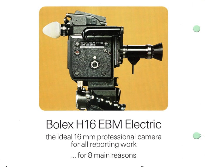
Expanding their research into analogue techniques, the duo looked at many old printed materials during their design process: booklets, magazines and manuals from the same era. In particular, they took inspiration from old Bolex manuals and the Bolex Reporter – a magazine published in the camera’s heyday.
Visually there are lots of little analogue references dotted throughout the studio’s new identity such as masking images with rounded corners as a nod to the image seen when looking through a camera viewfinder, monospaced fonts that reference typewriters – and when deciding on which font to use, the duo printed out test business cards to honour the traditional printing process.
“As a studio, we work on a wide variety of projects, ranging from film to graphic design and animation to photography. We knew we wanted an identity that would not get in the way of our work, which already has an outspoken visual style, but would remain intact and, better yet, elevates the work.”
You can see the new website and identity here.