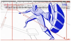
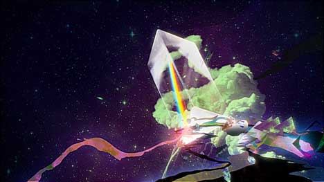
Lalivingston Productions and Miopia FX: “IMADE”
IMADE: a spot for Madrid Network directed by Lalivingston Productions with post-production by Miopia FX.
Brandon Lori • 15 years ago
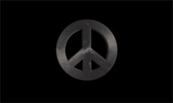
The Peace Rant Project
Get it off your chest. Take part in The Peace Rant Project. Download footage or shoot your own, create your own interpretation of the rant…
Read more
Justin Cone • 15 years ago
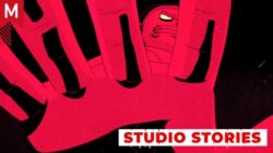
Current Affairs by Gal Shekdi
Current Affairs by Gal Shekdi with animation by Dirty Puppet. Farmerama is another film in the series.
Bran Dougherty-Johnson • 15 years ago
Takafumi Tsuchiya (takcom)
Lots of cool experimental projects over at Takafumi Tshuchiya’s (takcom) vimeo channel
Boca Ceravolo • 15 years ago
Will Goodan updates
Will Goodan (aka Prime) updates with loads of freshness
Boca Ceravolo • 15 years ago
See No Evil 1st Oct Reminder
A reminder to all the Londoner that’s See No Evil is on tonight at the Bodhi Gallery, click for more information. Free Event!
James Wignall • 15 years ago
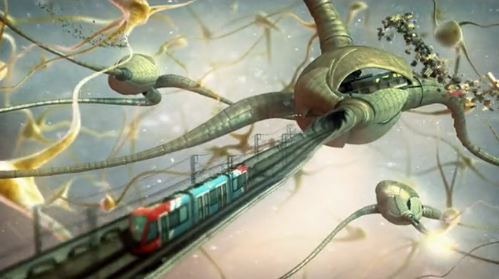
It’s business time; Blackfish for HEC
Not so long back, commercials for seats of higher learning were composed of shots of the less scruffy bits of a campus, where clean-cut bright…
Read more
Simon Robson • 15 years ago
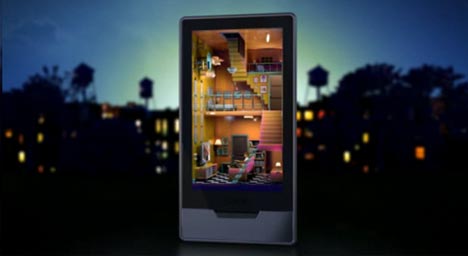
SpecialGuest/Vinicius Costa: Zune HD
1st Ave Machine‘s colorful alter ego, SpecialGuest, presents a new spot for Zune HD. This spot is Vinicius Costa‘s commercial directorial debut with SpecialGuest, following…
Read more
Michelle Higa Fox • 15 years ago