
The visual essay has become an increasingly popular format within the world of animation and motion design. Instead of focusing on spectacle, products, and end tags, the visual essay is the perfect vessel to dive further into storytelling and convey dense information.
All that being said, this format is typically plagued with lower budgets, shorter timelines, and increased duration. Often times the end result is multiple minutes long, not a mere 30 seconds.
Depending on the circumstances it can be hard to break out of your mold in this medium. That definitely isn’t the case for Moth. While they have seemingly mastered the visual essay, they continue to pave new ground and are definitely pioneers in this format of animation. Case in point, their latest work, Better Humans.
The following is a Q&A with Moth about the making of Better Humans.
First, how did this project come about?
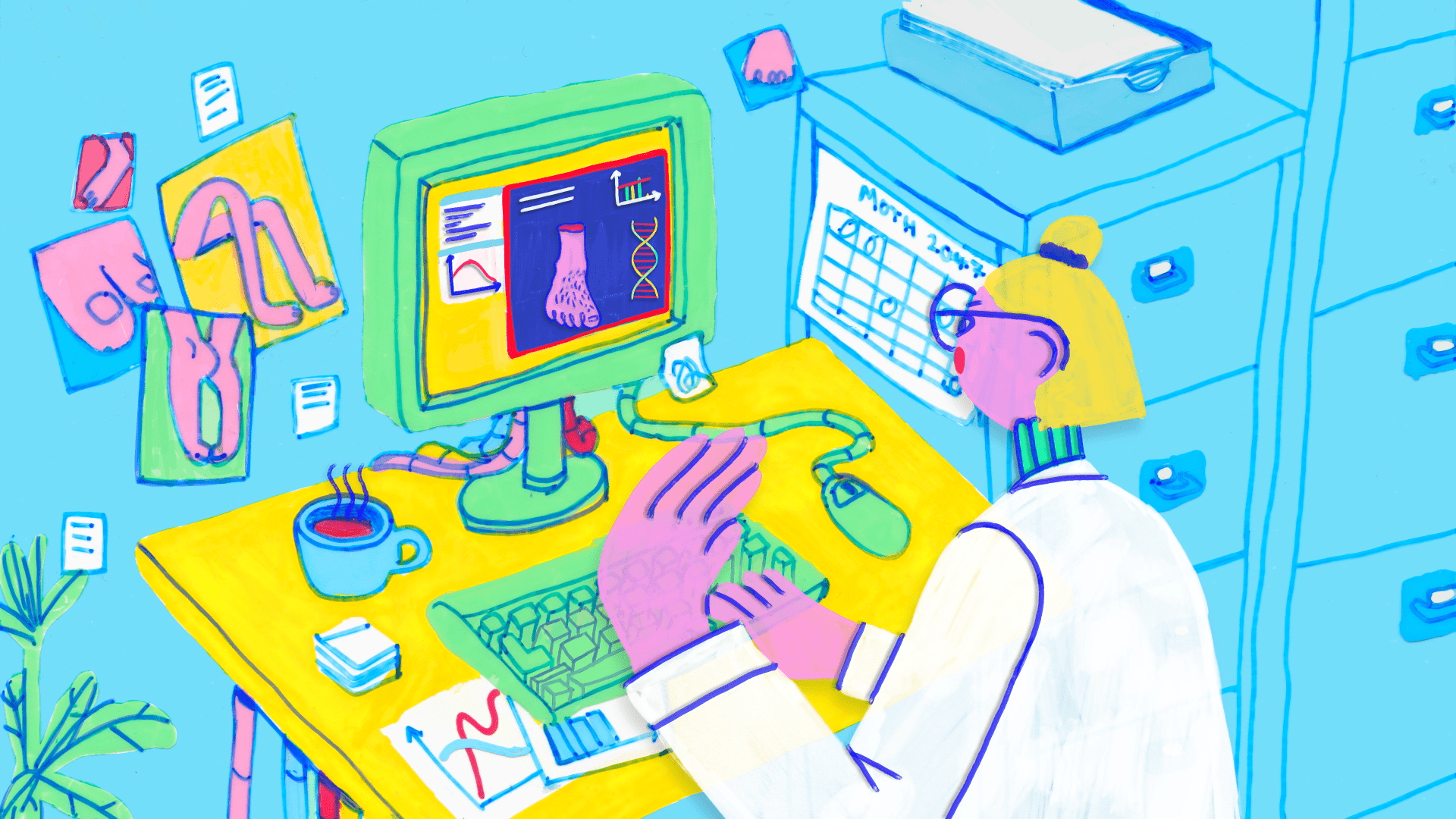
We were approached by Nadja Oertelt from Massive to create a short film on the possibilities of gene editing technology and body augmentation. The film was to be episode five of a seven-part animated series that asked some of today’s scientists to re-examine the ideas in Mary Shelley’s Frankenstein.
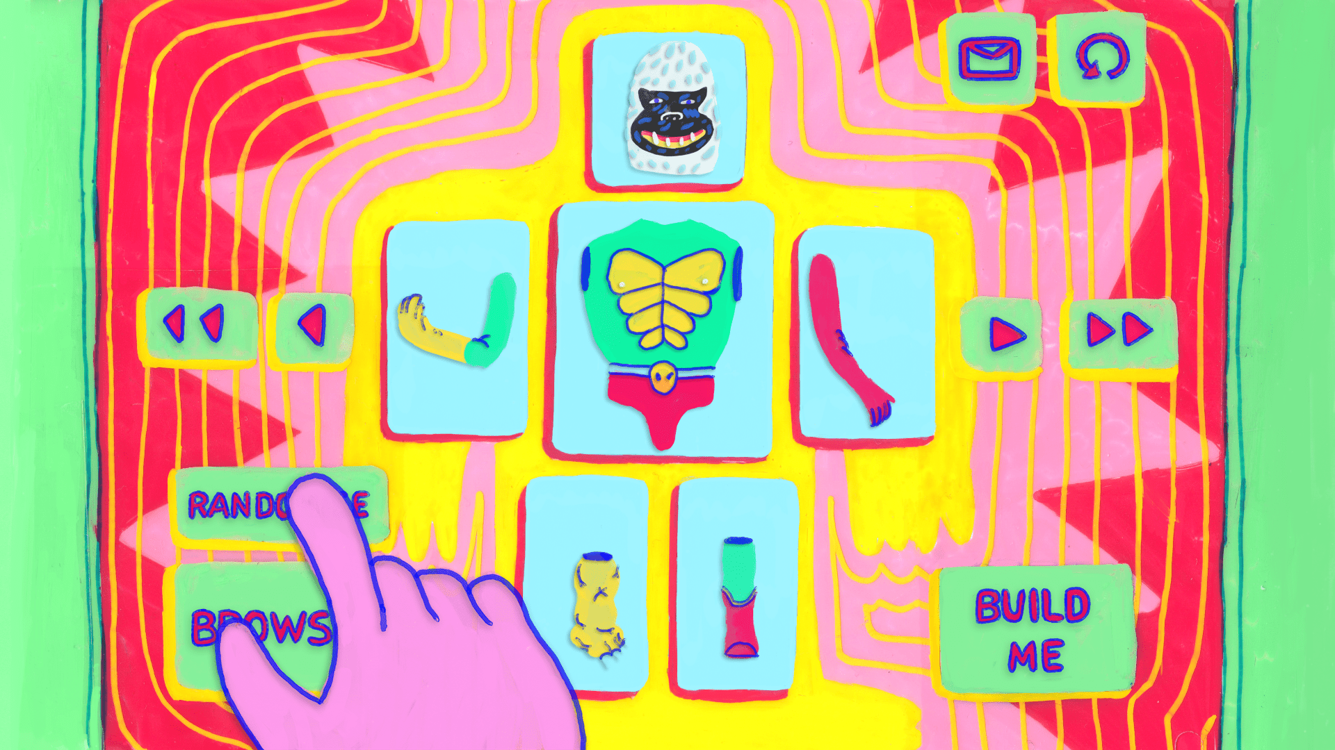
Massive gave us the recorded interviews with the scientists and a heaped spoonful of creative freedom to take the VO in whatever visual direction we wanted, the only caveat being that they did not want the visuals to feel diagrammatic. So, we went crazy and went for the loosest and most fun look we could think of!
The amazing Skillbard were already attached to compose the music and an ensemble of animation superstars made the other 6 episodes which you can check out here. (https://massivesci.com/articles/reanimated-collection-frankenstein-science-videos/)
The look of this film is really unique! What was your process like making this film?
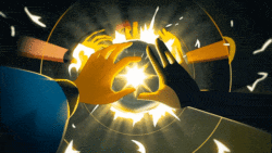
Jen Zheng, who led this project, was fresh from a trip to Japan so she had 80’s vinyl monster toys, Akira and bright neon colours filling her brain and desk.
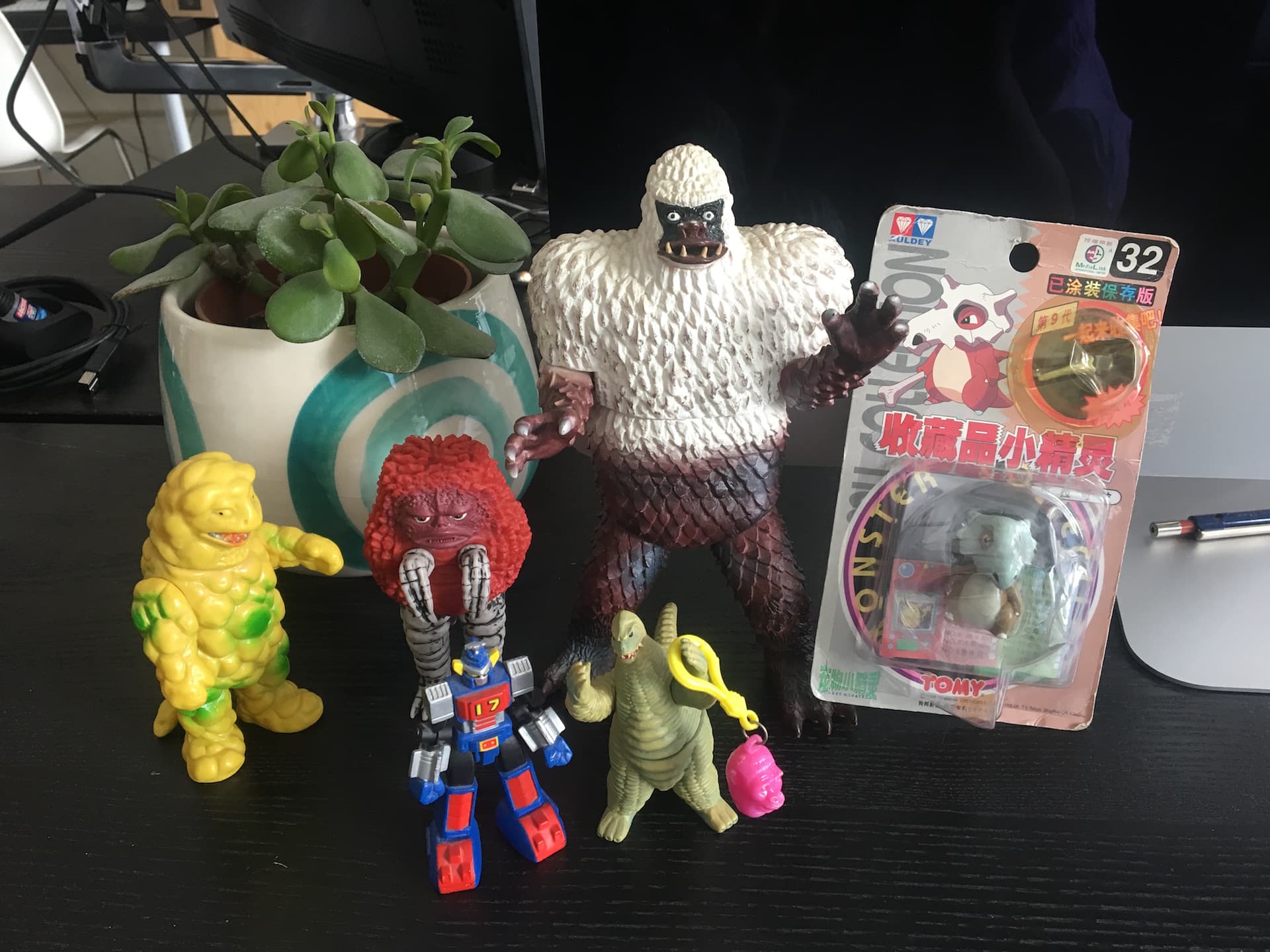
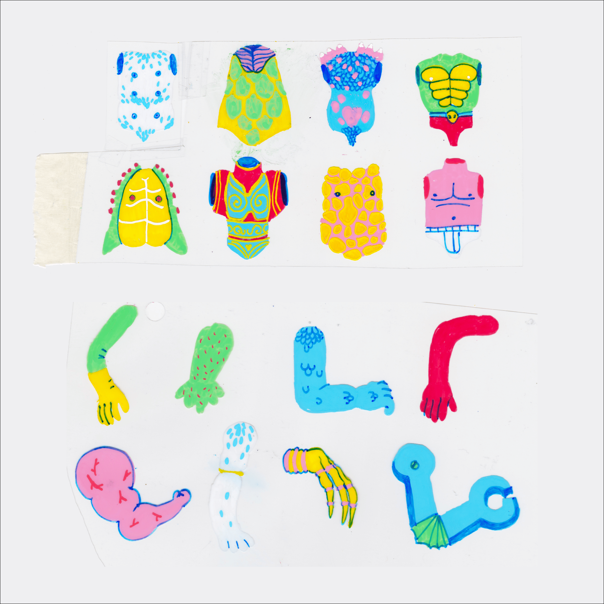
We knew from the beginning that we wanted to create something loose, fun and wobbly, and we started experimenting by using Posca Pens on plastic cels. The materials are super satisfying to work with, and layering those cells gave the designs a beautiful sense of depth.
Sticking to the colours that the pens came in gave us our neon colour palette and the physical limitations that these pens gave meant that you can’t be super precious and precise with your lines. Out of this soup of ideas and limitations came the look for Better Humans!
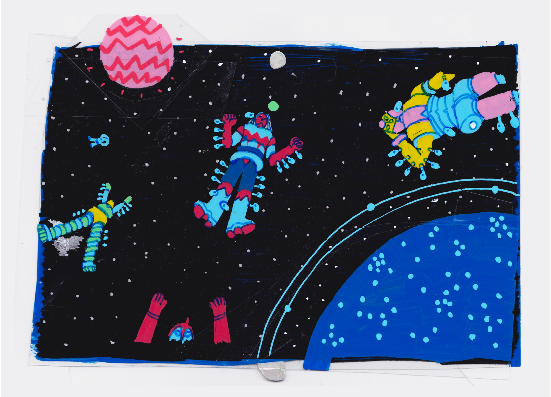
Ideally, of course, the whole film would have been drawn on those plastic cels. But due to time and project constraints, we limited ourselves to using the real cel drawings for the backgrounds only and created Photoshop brushes to recreate the Posca Pen effect for the hand-drawn animation. Adding a drop shadow to the animation layers, overlaying a boil of scanned dusty cells and injecting some 3D magic in a couple of scenes, allowed us to pull off a pretty convincing cel look! It was great to find a compromise between using our real drawings and some digital cheating, as we did not want to discard the cel drawings completely. They are intrinsic to the look of the film and the creative process, and no digital tool can quite replace them…
Story-wise, the VO split up pretty neatly into three different mini-arcs: gene editing possibilities, body modding and the future of mankind.
We focused on using fun and engaging imagery to contrast and explain the factual scientific voice over and used two main characters which we could keep referencing throughout the film, even though there was not a very linear narrative. Naturally, we managed to create some romance between them and bring them together in the end, as in every great story…
After we finished the animation we worked with the wonderful Skillbard to bring music to our neon world. They totally brought it to life with their cool wood percussion, romantic harps, and sick theremin sounds. We also had a brilliant crew of animators and compositors working on the film, making the whole experience even more fun for all of us.
How did this project differ from your past works and what is something you’ve taken away from the experience?
We always find that the most interesting things come out of weird constraints, so it was really fun to switch up our normal tools for something unfamiliar to us. When you start working commercially and under time limits, you can easily get sucked into the digital abyss and forget to use what is inside your pencil case. So, projects like this one are a brilliant reminder of how important it is to get yourself out of the Photoshop comfort zone sometimes and try something new (or old, ironically…!)
It also highlights how much external inspiration is important to our job. People sometimes feel guilty taking time off and going travelling, but some things will not quite enter your mind unless you are lost in a mental, super crowded neon-sign street on the other side of the globe.
Finally, what’s next for Moth?
We are currently working on a few 3D projects, one of which is a really cute ident for a British TV channel.
Also, another interesting science-based project that we can hopefully share soon!