We’re huge fans of self-initiated personal projects, and were delighted by James Curran‘s fantastic unofficial title sequence for The Adventures of Tintin. James was kind enough to take some time out of his schedule to answer some of our questions regarding the piece. Spielberg take note!
How did the project come about?
I originally had the idea to create a Tintin animation about a year ago, but my initial plan was a lot more complex. I wanted to fully animate Tintin running / driving / flying through different environments and scenarios from each of the books in sequence, but when I went back to read them it was obvious that it would be too difficult to pick out individual recognizable events from each story as there are so many to choose from. It was always the characters or key objects that stood out to me, so it made sense to focus on these instead and simplify the whole concept.
I ended up putting the idea to one side, but always intended to go back to it. Gradually as I saw more and more marketing for the Tintin film I was reminded to finally start working on it properly in my spare time just over a month ago.
Why Tintin?
I was a big fan of Tintin when I was younger, and I think it’s important that when working on non-commissioned projects it has to be a subject that interests you, otherwise you can easily lose motivation to complete it. With the upcoming release of the film it was perfect timing to create something Tintin related, and as title sequences have always interested me it was an obvious way to tie it in with the film. From the beginning I knew I wanted to feature elements from all of the books even though many of the characters won’t feature in the film, but I felt like it was the best way to introduce new viewers to the Tintin universe as a whole, and give existing fans a reminder of what may be to come.
About the Circle Motif
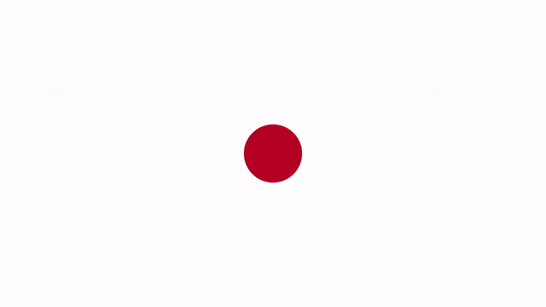
I had a completely separate idea for a series of short animations starting with a plain circle which then morphed into different things, but after doing a few tests I decided to merge it with the Tintin idea. The Tintin characters are already very simple designs, recognizable by just a few key features, so I wanted to break them down to just those elements. Tintin’s head is basically a sphere with a quiff even in Hergé’s style, so as he’s the center of the story that was the obvious starting point. Spheres / circles are also versatile in that they can represent a wide variety of 2D and 3D objects depending on the perspective, so it gave the most potential for taking you through the Tintin timeline without straying too far from the basic motif.
The Music
Early on I decided that I wanted to use the theme from The Adventures of Tintin TV series as the soundtrack, as it’s so recognizable to anyone who is a fan of Tintin. However, using the actual theme would have caused problems as it’s so short and fast paced that fitting in references to all of the books would have been very difficult. Using a section from the slightly slower full symphonic theme from the soundtrack solved this problem to an extent.
As the style of my designs is very different from the original artwork I thought it was important to have something that tied them directly to the Tintin that people remember, and using the music was the perfect way to do this. My background is largely in music videos and music-related graphics, so I always enjoy being given a piece of music to start with and exploring how to represent it visually.
Although I used the TV series theme, I decided not to use (or even watch) any of the TV series as reference, as I felt using the original books as source material would be more faithful to Hergé’s stories.
This seems like it too a LOT of sketching/planning to get everything in and to get the timing right. How much prep work was there?
Planning and prep was actually quite straight forward. Being limited by the length of the soundtrack I had to be strict about how much screen time I gave to each book, so I started by animating the background colors for each section. There were particular moments in the music that I knew I wanted to use for certain events, based on their rough timing related to the timeline of the series (e.g., the introduction of Captain Haddock, Castafiore singing, and the moon orbit) so I built the rest of the timing around these key events. From that point on the main prep work was to read through the books again to pick out elements that I wanted to use in the animation.
How did you decide which characters/icons to show in the sequence?
The easy choice was introducing each of the main characters as they appeared throughout the series, but beyond that I wanted to keep it an equal mix of iconic imagery that people with little knowledge of Tintin might still recognize (such as the rocket in Destination Moon), and more subtle references that only people who had read the books would notice (such as Rastapopoulos in The Blue Lotus or Ranko in The Black Island). I did very little experimentation with designs and the final result was often the my first idea, so the overall production time was much quicker than I had expected. I think this is as much a testament to the iconic nature of Hergé’s artwork as it is my design skills.
What are you up to now?
I’m currently working as a motion graphics designer in London.
Thanks again to James for the interview! We wish him the best on his future creative endeavors and can’t wait to see what he makes next.


