We caught up with MAKE’s Director and Lead Animator for “Palm Springs,” Andrew Chesworth, where he was kind enough to share some exclusive behind-the-scenes artwork and info on how the studio’s artists created the piece.
[qt:http://motionograph.wpengine.com/wp-content/uploads/2010/06/MAKE_PSISF_2010_Feature.mov 640 360]
The aesthetic of the piece seems heavily influenced by film noir and old Hollywood gangster films. Can you describe the development phase of the piece? Where you inspired by any films, in particular?
101 Dalmatians and Chinatown are the two films that likely had the biggest impact on the creative inspiration of this piece. The rugged, illustrative quality of the character animation in 101 Dalmatians preserves so much of the energy and spirit of the animator’s pencil, yet the animation is so tightly drawn and respectful of three-dimensional form despite the very graphic shapes that are favored. The art direction in 101 Dalmatians also creates a synthesis between the animated characters and the environments, where the world is unified and the characters don’t feel so much like flat images pasted on top of a painting. That animation style seemed perfectly suited to a high-contrast, whimsically bold and gritty film noir. Chinatown is such a stellar example of the genre, with a brilliant muted color scheme that can feel very monochromatic at times. It was a good jumping-off point to find a sort of faded and retro film aesthetic to the production design, without defaulting to black-and-white or Sin City. It would only be fair to also acknowledge the very spirited and entertaining comedy-noir feel of Who Framed Roger Rabbit, and we took several cues but wanted ultimately to have it evoke more of an homage to the other two films. So many other classic figures provided a wealth of influences to pastiche, from Humphrey Bogart to John Huston to the Coen Brothers. The never-made Brad Bird animated film concept for Will Eisner’s The Spirit was in the back of our wishful creative minds while working on this project.
It appears that most of the piece is made up of highly polished, traditional animation. MAKE seems like one of the only shops today that continually embrace traditional, hand-drawn animation. How did you determine that this piece would be best in 2d (as opposed to 3d) and can you describe your 2d animation pipeline?
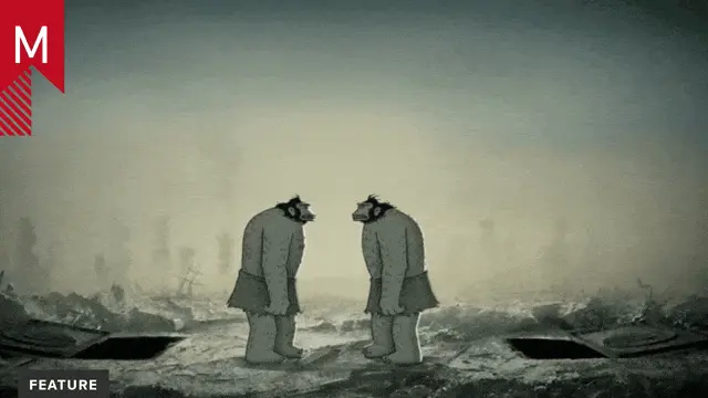
MAKE serendipitously became an assortment of highly versatile artists, many of whom are extremely passionate about the art of 2D animation in conjunction with their skills and passion for 3D. We understand that to stay relevant, traditional 2D has to distinguish itself from the look of razor-sharp shiny-smooth look of 3D, and I feel that hand-drawn animation should not look apologetic about being hand-crafted. Feeling the sizzle, the texture, the pulsing lines, despite the artists’ best efforts to control form and movement, is a really pleasing aesthetic to this group of animators.
Aiming the sights toward something controlled and sophisticated without running the clock out on tedious perfection is what allowed the project to really have momentum and energy in the creative process, and it only supported the style. We also try to keep the technical workflow flexible and up to date. This is completely paperless 2D animation. It’s all drawn via Cintiq into Photoshop using the timeline feature, with custom pencil and dry brush settings for the linework, painted animated textures and shadows. Just like traditional animation on paper, rough body gesture passes were followed by cleaner keys and breakdowns, and eventually tight in-betweening and erasure touch-up. Production artists straight-ahead painted the colors, shadows and textures along the Photoshop timeline once the character animation for a scene was completed. Everything was compositied in After Effects ultimately.
In 2d animation, everything starts from scratch and things become a lot more labor intensive, in contrast to 3d. I assume the crew must have been pouring a lot of blood, sweat, and tears into this piece. How long was MAKE working on it?
I concepted the idea last year over the course of a day and a half for the 2009 ShortFest, and it was shelved. A year later, it was resurrected for the 2010 ShortFest . I jumped right into re-designing the characters in mid-March, and within a few days had a script, storyboards, and an animatic with a scratch track. While searching for actors and getting final vocal tracks, layout began and backgrounds were done by early April. Animation production went from April to June with a few breaks in-between for other projects. There was a lot of offset crew availability, but everyone was very committed and very passionate to maintaining quality.
Blood, sweat and tears indeed when into it, but projects this exciting are rare and motivation came easily. It’s hard to say if doing the project in 3D with the same number of characters and environments would’ve taken longer. The production timeline may have been comparable with our small crew, especially considering all the movement and contact of hair and clothing throughout the piece. Sacrifices in production sophistication would’ve possibly happened in 3D, or else some kind of non-traditional rendering style would’ve been attempted instead. This project we only saw in 2D. It just felt right.
There seems to be a seamless mix of 2d and 3d in this piece. Can you elaborate on the methods in how you integrated 3d animation into this piece?
To get them to mesh as well as possible beyond just rendering with specifically arranged linework, the frame rates were manipulated (something on ‘twos’ in 2D should rarely be seen against something on ‘ones’ in 3D), flatter 3D lenses were used to get more of a drawn-looking perspective on the cel-shaded objects, and texture overlays with 2D rotoscoped effects were implemented to sell the integration. A clear example of this would be the illumination of the enemy car as the machine gun fires. The dimensionality of a 3D object shouldn’t overtly outshine or sabotage that of a 2D character in the same space. We tried to capture what worked so well about the dimensional vehicles from 101 Dalmatians. Organic things in this style seem to look better when drawn, and technical things (vehicles, ceiling fans, film projectors) that have much more mechanical and specific movements seem very pleasing when done well in 3D.
Credits:
MAKE
Director/Lead Animator:
Andrew Chesworth
Animation Production Team:
Justin Weber
Aaron Quist
Alec Mueller
Jordan Hill
Ben Bury
Niklas Norman
Joe Kim
Voices:
John Olive
Elise Langer
Nicholas Mrozinski
Music:
Steve Horner – Horner Music
Producer:
Danny Robashkin


