[qt:https://motionograph.wpengine.com/wp-content/uploads/2009/10/cirque-du-freak.mov 720 405]
Interview with Motionographer’s Brandon Lori:
How hands-on was Paul Weitz, director of Cirque du Freak, in the creation of the main title, and how much leverage did the filmmakers have in the end result?
The film director’s role in title design is to guide the direction of the design process. Paul directs every single aspect of his film. There are many aspects in the creation of a film that need attention from the director. As the title designer, we need to be in the driver’s seat in the development stage, showing Paul what we think the opening tone should be. Once the idea is sold to Paul, it is our job to run the whole creative process independently and show work in progress to Paul. I worked with my design team to make sure we worked towards the vision that Paul and I had discussed.
No directors will micromanage the design process. They all have other more important things to deal with during postproduction, especially when it comes to the end stage of making of the film. Directors usually are very busy in final audio mixing and dealing with studio reviews. Paul was hands-on at the end of the title design process. He worked with the composer making sure the music hits every single beat on our picture. All filmmakers have their final touch for the end result. Although title design is the work of the title designer, it is always the filmmakers’ film. We are always one of the many contributors to their film. The filmmaker is the soul of the filmmaking process.
How has working with director Paul Weitz compared to your experiences working with directors such as Steven Spielberg, Ang Lee, or Sydney Pollack? Does each consider the films title in a way that’s unique to their own directorial sensibilities, or do they take a more passive approach, in comparison to Weitz.
Paul is a young director compared to all the directors that you mentioned. In our first meeting with Paul, he said to me that he had no idea of what the opening should be. He left it up to me to come up with ideas, and I had no ideas at that time either. He invited me to watch his film and after some time passed, he called for another meeting. In that meeting he told me he wanted the story of the opening to be Mr. Tiny controlling the boys like puppets. I always try to think on my feet, and have a quick answer for the director on the spot. My response to him was: why don’t we create the opening sequence with shadow puppet animation. And he loved that idea. It sounds obvious, but he bought it and I think it turned out to be the right idea for the project.
I enjoyed working with Paul because there was a creative back and forth dialog with him. He was very receptive to all my ideas. All directors have their own directorial sensibilities. Sometimes they have clear ideas but sometimes they have no clue. As for working with Ang and Sydney, they are always very clear on what they want. They have a lot of respect for our work and they hire us to do what we are good at.
Most commercial productions are known for tight deadlines, where research and development of a work comes as an unfortunate sacrifice. With the main title for Cirque du Freak, how much time and effort went into development?
We had a decent amount of time to develop the concept and the design of the look. We also had enough time to execute it as well. Yes, on most of the commercial projects we don’t have time but film is a craft and that’s why we like to do it. When the room is dark and we are looking at a huge screen, we have physical space to enjoy the large image and longer time to appreciate details.
I always identify good projects for my design team and we put our best effort into them. A good project needs a good client as well. We had 2 months to develop the design and 2 months to produce. Paul was very supportive on what we wanted to do. Because of him, we were able to focus and put our best effort into his project.
Specifically, for Cirque du Freak, what was the most challenging aspect of distilling the film’s long-form narrative into the economy of time provided by a main title?
It is quite a challenge to condense the film’s long-form narrative into a title sequence. I normally do not over think too much in creating a complex narrative for the opening unless it is needed. The idea of a main title sequence is to set up the tone and mood for the audience to discover the story as the movie unfolds. The opening sequence needs to be metaphorical in content and impressionistic in tone. Unless there is a very specific prologue that the filmmaker feels strongly needs to be explained, I usually will try not to be too literal and keep it simple.
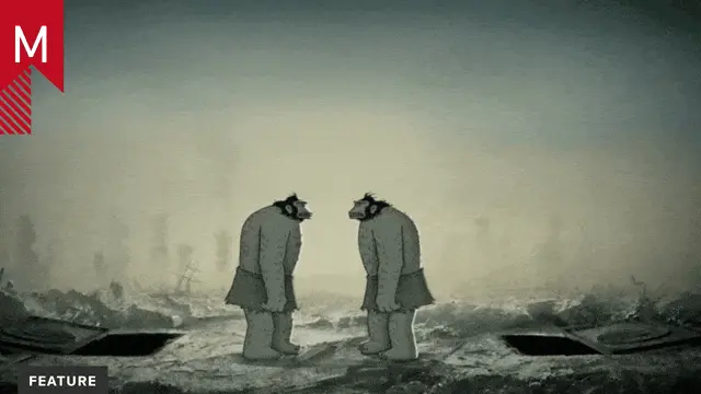
We don’t want to reveal too much about the plot of the film in the title sequence. As for Cirque Du Freak, it is a graphic opening. The idea is to introduce six freak show characters and bring them all together through the journey of two puppets. I wanted to let the credits play an important role in the sequence. They become the main actors throughout the sequence then the story becomes a backdrop. I think title design is about the titles and other elements are secondary.
With a work that displays such creepy characteristics and motifs, can you elaborate on who and what the studio looked to as a source of inspiration?
Cirque du Freak is a series of three books by a British writer named Darren Shan. The creepy characters and motifs were described in the book. When Paul developed his film, he worked with his art department to come up with the look of wood cut illustrations and also the look of German expressionist paintings. Those were the main source of inspiration for us to follow.
Can you explain the title’s typographic significance, and how you decided to have the letterforms serve a dual purpose in providing information, while also becoming interactive devices for the characters?
The typography is inspired by some older reference in graphic design history. I am particularly interested in Dada artists such as Filippo Marinetti in the way they use letters to literally illustrate the content. It becomes a figurative poem. And concrete poetry—the idea of seeing letters as actual objects, as well as Bradbury Thompson’s work in the 50’s and 60’s. All those are the original source of inspiration on what we did for the title.
I also wanted to invent a new way of seeing how the credits behave. If you see the credits as actors on stage instead of just titles in the foreground, then we can imagine them to do anything that you want them to do as long as you direct them. They can dance and they can interact with the characters. In this case, they are truly the actor on stage with the puppets.
With a title so heavy in design content as Cirque du Freak, the piece can seemingly be broken up into a series of graphic moments that effortlessly transition into one another, then resolve in an instance of visual resonance. In this, how was the decision to structure the title around slick transitions made, as opposed to camera cuts?
Great question. The determination of whether to use cuts or visual transitions is based on how the music drives the visuals. Within the overall story, there are many small stories to introduce each freak show character. There are about 6 different vignettes in addition to the intro and closing, a total of 8 short stories. Each story is connected by a visual transition. The idea is to maintain a flow to the piece instead of a fragmented sequence.
With cost-cutting being pushed as a remedy to the economic situation, did the production ever feel a squeeze? And broadly, do you see the economic downturn as a handicap to the advancement of film title design, in general?
Most of the time, the film’s budget has already been planned for, so cost cutting has not had a major impact on us. There is always an item on the budget for title design. Normally it will reference the previous film’s budget. For CDF, we had a pretty healthy budget to do it right.
Was the decision to forgo the creative involvement of an agency determined by yU+co, or the filmmakers? Likewise, has agency participation in yU+co’s history of working in main titles occurred at a greater or less degree?
Title design is a very specialized industry. Agencies would not know how to do it and handle the studios and filmmakers. We are different. I have not seen creative involvement from an agency before. Filmmakers and studios usually go directly to individual title designers or title companies.
Like most things, motion graphics is not immune to clichés, where certain visual cues like lens flares and pop-up books now spark contempt, once they where all the rage. With Cirque du Freak, how conscious are you of these variables, and with several film titles under your belt, how mindful are you to not repeat the ideas of others, and even yourself?
Film is about storytelling. It is very different from TV broadcast title design and commercials. The title sequence should be driven by the story. If the story doesn’t require those cliché visual cues, then they shouldn’t be there. We used the shadow puppet idea as visual metaphor is because it fits the story. I always try to use different metaphors for different projects. I never want to repeat myself on new projects.
For a main title, you have a captive audience, while for a main-on-end title, you have the opposite, in battling the prospect of people shuffling out, or leaving in mass. How do the creative processes and objectives differ in designing a main title versus a main-on-end title, and how do the motivations of the audience — at the beginning and end of a film — influence your creative decisions?
A main-on-end title is the credits. The movie is over. We no longer need to set up any tone or mood. The only objective is to engage the audience to stay in their seats and watch the credits. Therefore the title needs to be visually engaging. Any heavy storytelling will not work. The credit becomes the most prominent element in the sequence. For end titles, I usually build the graphics around the credits.
In 1995, the main title for Se7en ushered in what some consider a renaissance in film title design, which you yourself credit as a watershed moment in the industry. Now, over 10 years later, how has the business of film titles changed, and how have these changes affected your approach with Cirque du Freak?
When Se7en came out, music videos and MTV were the most watched things on TV. The look of the Se7en title was hip and progressive at that time and works really well for the film. I always try to identify the right opportunity to do something different and Cirque du Freak presented that opportunity. I will continue to push the envelope with my design team.
Finally, how do you see the relevance, nature, and changing technology affecting the continuing evolution of film title design?
I believe the medium that we use will change the end result of the product. With changes in technology, the look will change as well. With the help of technology, future title design will get more sophisticated in execution. However, film is about storytelling. The choice of medium to use will always depend on the need to tell the story. Films have many different genres in which to tell different stories.
Creative Credits:
Project: “Cirque du Freak: The Vampire’s Assistant” main title sequence
Client: Universal Pictures
Design/Animation: yU+Co., Hollywood, CA
Creative Director: Garson Yu
Art Director: Etsuko Uji
Designer: Edwin Baker
2D Animator: Wayland Via
2D Animator: Allen Yeung
2D Animator: Jill Dadducci
2D Animator: Chris Coogan
3D Artist: Pota Tseng
3D Artist: Stephen Delalla


