


There’s a lot of stuff I want to talk about, and I’m not sure if I should put it all in one massive post, or if I should break it up into single posts. I opted for the former approach, but I’d love to hear your opinion on the matter. Drop me a line at feedback@motionographer.com letting me know if you think it’s better to have combo posts or several smaller posts. Thanks!
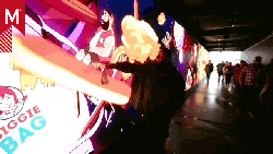
Eric Lerner: Mr. CityMen
When I was a kid, I was a huge fan of Roger Hargreave’s Little Miss and Mr. Men books. Each small book focused on a simply drawn character whose name described its one-dimensional personality, characters like Mr. Angry and Little Miss Bossy.
A recent graduate from the Bezalel Academy of Art and Design in Jerusalem by the name of Eric Lerner must have been fond of the same books. His Mr. CityMen series of movies follow five Mr. Men-type figures through their days with a child-like reverie reminiscent of Hargreave’s books. Eric puts his own poetic spin on things, though, with characters like Mr. DéjàVu, Mr. Fortune and Mr. Sunken, whose names refer more to a perspective on life than a particular personality trait.
Yes, these films use the same motion tracking techniques seen in so many short films over the last couple years (see 1st Ave Machine for some nice examples). But I’m less interested in the technical side and more interested in the little narratives centered on each character.
Eric does a great job pulling you into the worlds of his characters. Just as with the original Mr. Men books, the simplicity of the characters accentuates the appropriate aspects of their personalities, while leaving enough of a blank canvas for you, the viewer, to fill in your own emotional details. The result is a cast of likable characters that feel less like disparate entities and more like facets of our own daily existences.
Thanks Noam Gelbart!
Daily Color Scheme Generator
Mark Theriault recently told us about a nifty site that generates a new color scheme each day. Each scheme can be downloaded in a wide variety of formats, including Photoshop and Illustrator palettes.

I don’t know about you guys, but I get in color ruts and find myself using the same (or similar) palettes over and over. This site gives me a helpful nudge and encourages me to think outside my own box.
Head Gear: 48 Fest
Toronto-based Head Gear Animation has a long record of creating inventive work that’s clever and entertaining. Their series of films illustrating the poetry of Billy Collins for the Sundance Channel are some of my favorite pieces from the last year.
Julian Grey (who directed the Sundance spots and co-founded Head Gear) recently directed a rollicking opener for MTV’s 48 Fest, a 48-hour filmmaking contest designed to promote AIDS and HIV awareness.

Julian’s work has a hand-made quality that doesn’t seem faked (as it so often is in motion graphics), lending a sincerity to his work that I find endearing. The 48 Fest spot is a nice contribution to his (and Head Gear’s) awesome body of work.
Thanks, Shannon!
Jon Yeo: Beauty is the Promise of Happiness
I didn’t really dig this atmospheric new short film from John Yeo at first, but then it grew on me. It has an internal logic that, while baffling, is alluring. Jon also has a knack for creating a sense of environmental space with a minimum number of visual elements.
Don’t miss this supplemental page, which includes a few clues and helpful links. Hats off to John for daring to create something so ambitious.