Simon Robson and Nexus Save the Children

savechildren.jpg
Watch “Clever”

Nexus Productions director Simon Robson has done it again, this time for the kids. “Clever,” a promo for Save the Children UK, is full of Simon’s characteristic visual wit. Simon’s sensitivity to message combined with his penchant for fluid transitions and lucid metaphors make this latest project a fine addition to his growing body of brilliant work.

As one of Motionographer’s crew, Simon scooped us a little behind-the-scenes information.

So how much freedom did you have with this project?
In terms of freedom; I was asked to pretty much develop the ideas and storyboards from scratch. This all started in December which was the pre-production period. We were originally given rough boards from the agency, but I was asked to start from scratch.

They had certain prerequisites, like using some of the “Barry”-esque camera moves and keeping the design for the most part simple and iconic. The thinking at the agency was that by keeping a clean, iconic style we could be very “matter of fact” about the “simple solutions” the commercials describe that can make a huge impact on kids’ lives.

01board-balloons2.jpg

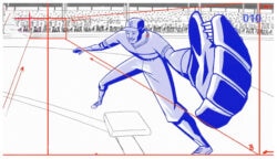
I developed loads of ideas for the boards, these often had to change due to creative preference at W+K and changes in the script. Unusually for me, i had a lot of conversations / interaction with the client as well as the agency. This was really useful as Joe at Save The Children is incredibly passionate about his position and was able to help a lot in terms of hitting the right tone.

01board-pb.jpg

What kind of assets did they provide you? Was it a completely blank slate?
Graphically, Save The Children already had their character, the kid with the smiling mouth you see in the spot. We needed to include him, along with sticking to a blue, white and yellow colour palette.


Also, all their print graphics have a rough degraded edge to them. We needed to develop a process that would allow us to create an animated degraded edge to the graphics in post, rather than frame by frame in the animation.

How did you pull that off?
We developed quite a complex setup in After Effects, using several layers of matte effecting and expressions that we all “learnt” to use and apply over the comps. Apart from the above, we designed most of the graphics you see in pre-production with lots of approval stages from the agency.

In your other projects, there are nods to stylistic movements or graphic designers from the past. Any homages in this spot?
The stomach to organs to kid sequence was influenced by Ryohei Kojima’s human body illustrations. Some of our graphic design will be taken on into further print campaigns by Save The Children.

What was the timeline?
For 2 x 30 second spots:
Pre-production time: 2-3 weeks
Production: 5 weeks

Any technical challenges?
In terms of technical challenges, we had quite a few of interest. There’s loads of 2D hand animation that marries up with 3D. The whole kids to balloons to world sequence includes a complex particle set up in 3DS Max, where particles reference animated sequences (kids holding balloons) which then change to kids disappearing and balloons going into their flying “loops.”

There is then a mix of 3D particles taking off and 2D hand animation. As the balloons cluster together and make the world, all the flying bumping and jostling was done by hand in Flash and then exported as layers to make a pretty complex comp in After Effects where we could add shadows and so on.

Watch “Clever”

Credits:
Director: Simon Robson
Producer at Nexus: Luke Youngman
Producer at sixty40: Libbie Doherty
Graphic design: Dave Hughes
Compositing / animation: Gillian O’Connor, Mark Facchin, Jason Morice, Daniel Fitzgerald.
2D Cel animation: Evan Newby
3D animation: Guy Jamieson

About the author

Justin Cone

/ justincone.com
Together with Carlos El Asmar, Justin co-founded Motionographer, F5 and The Motion Awards. He currently lives in Austin, Texas with is wife, son and fluffball of a dog. Before taking on Motionographer full-time, Justin worked in various capacities at Psyop, NBC-Universal, Apple, Adobe and SCAD.

26 Comments

skeletor

Alot of info there but a link to the animation would be helpful

justin

You can click the image or the title of the animation. I also added a link to the end of the post.

Ever been here before?

justin

Cool. I’m actually wondering if maybe the post was published before it was complete. Really strange.

Thanks anyways, though. Now the video is easier to find, I hope.

ochyming

The best of it?
It is CLEVER.
That is.

mutanthands

Great stuff Simon, looks awesome. Really nice insight into the whole process too.

barret

Question: It is mentioned that there are 2×30″ spots. Is there a link for the second?

KGB

Great job Simon and crew! For a good cause too.
Thank you for the “behind the scenes” as well, always interesting hear the details.

ociredef

Sorry, but i don’t see what sets this apart from any of the other broadcast orientated spots that are usually posted in the quickies section. Simon obviously has talent, and there are moments that are strong and original. But overall i don’t see what merits a featured post here…

Marc B.

@ociredef

It’s because of the friends and people affiliated with motionogapher thingy.

I like it but yes no reason to write a book about it. Could’ve been posted in the quickies section.

klyde

The Q & A and storyboard is a bit much.

As for the spot, it’s not bad, but also not main feature material. The “roughen edges” plug-in is pretty obvious – seams like there could be a better way to get that effect without a canned plug-in.

bjacobs

I second that, Marc B.

justin

@barret: According to my sources, the second spot will be released soon.

rothermel

marc, i hope you realize that this is someones blog and that they can post whatever they want. if you dont like it, maybe you should make your own site. checkout newstoday.com, half of the posts by the mods start with “my good friend ________ just updated their site”. try networking more, OR come up with a project, pull together some behind the scenes and submit it.

JimmyC

Saw the second spot on tv today (actualy, both in the same ad break). Probably prefered the second, has more particle type stuff going on.

But yeah, I agree about the roughen edges comment. Not sure what this “complex setup” he refers to is when it seems to achieve the same effect as a basic plugin.

nbody

that was solid, well executed work. and the process info made it easily worthy of the space on here… i’m sure most of the readers here enjoy and appreciate that kinda info. i think the cronyism accusations are pretty flimsy.

the “crowd” shot and its breakup was particularly nice.

Simon Robson

@Marc B et al
I wrote a few things about the processes and submitted a couple of thumbnail s’board ideas that didn’t make it, because I hoped a bit of ‘processes’ info might be interesting. I didn’t give a lot of information because I think this project is better than anyone else’s, I gave it because I thought maybe others could relate to it / might be interested in it. I love reading about Joe Strummer’s life, not because I think The Clash were the best band ever, but because i’m interested in what was going on behind the music…If you would rather just see the work and not read about it, then simply click the links and don’t read the blurb…

justin

“If you would rather just see the work and not read about it, then simply click the links and don’t read the blurb…”

That’s what I don’t understand about the haters. They’re actually bemoaning bonus information?! Their screen real estate can’t actually be *that* valuable.

As usual, I think some folks just can’t resist a little drive-by hating. I hope to meet them in person some day.

Marc B.

Hey i wasn’t the only one saying it besides i said i liked it. But could’ve been in the quickies too altough i admit i don’t mind additional info sometimes.

ociredef

I really think this belongs to quickies

daveo

Jesus, you’d think half the haters here actually had an arsenal of tight projects to submit. I like the behind the scenes info, even if the project’s not a massive ad campaign – this is the kind of BTS info and advice you can actually use!

mag25

@ daveo,I think it was Simon who did this, not Jesus.
I agree with marc b @ociedef this is such a quickies !!
please people wake up!! We are about to get into the HOLOGRAPHIC age, and you guys celebrating thiiissssss?? comeeee onnnnnnnn! quickies quickies

Adam Oas

I’d love this type of information about every project out there.

Long time lurker….

bobtilton

It was a very well done one man project. Also, I think everybody would agree that if every posted project on here were accompanied by background info and boards and additional insight on it’s creation, we would all love it. Even if most of it is stuff we already know.

casmal

Well done Simon; The simple is always the trickiest. You got the message across in such an off-hand way and I think this is the big merit of this spot. One day we will be here talking about design skills to tell stories instead of how many layer we have used to do so.

kupon

I love both of these spots, and am hugely grateful for the additional information.

I am currently studying my degree, and am at a stage where learning about the process is of paramount importance. I also think that it often take a huge amount of work to create somehting that appears simple. It usually means they got it right!

Comments are closed.