Lacoste: Past, Present and Future

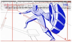
To celebrate Lacoste’s 75th birthday, the company created “Future,” an advert and website that imagines how the game of tennis might be played 75 years from now. Too bad the ad simply jumps on the bandwagon of Nike and Adidas, who pioneered and then institutionalized the whitewashed, ultra-minimalist “future of sports” look long agp. This, I think, is a step backwards, not forwards, for a brand with strong momentum built on its unique history, not some homogenized future.

In terms of craft, it’s a pretty spot, but it’s all been done before by Joseph Kosinski and METAphrenie (among many others). I don’t mean to crap on the work; the studio behind this (Akama with production from Wanda) did an admirable job. I’m just a little disappointed in Lacoste and/or their agency for caving in to their market’s clichés.

Tip and original video source: Fubiz

About the author

Justin Cone

/ justincone.com
Together with Carlos El Asmar, Justin co-founded Motionographer, F5 and The Motion Awards. He currently lives in Austin, Texas with is wife, son and fluffball of a dog. Before taking on Motionographer full-time, Justin worked in various capacities at Psyop, NBC-Universal, Apple, Adobe and SCAD.

21 Comments

noboddy

And don’t forget “the whitewashed, ultra-minimalist ‘future of sports’ look” from Tron – specifically the production cells: https://www.cyberroach.com/tron/tron.htm (scroll down)

The question I have is when does a certain aesthetic, repeated over time, garner the title of “genre” rather than simply dismissing it as “rip-off?”

PS – I love the Lacoste spot.

Marc B.

Well then what is the point in posting this??! :D

I find futuristic stuff like this or Kosinski style really boring. But that’s just my 2 silly cents.

courtstreet

Couple of thoughts.

As is often said on this board, it’s often difficult to really say who started something. I love Joseph Kosinski, but I think that he would be the first to admit that his look is heavily influenced by what was current in the world of architecture when he was an architecture student at Columbia.

Do I think whoever this unnamed studio bit Joe K and METAphrenie? No. Do I think they’re all dipping into the same pond? Yes. Do I think the style is getting a little dated? Possibly.

I think the crux of it is this – did the spot reference a well known style that connotes, for lack of a better term, futuristic luxury? Yes. On that count, it’s successful.

As far as the quality of it goes, the execution and sound design are good. The edit and pacing seem a little haphazard. There’s not much of a story being told, and I had a little trouble following the action. Is he playing with himself, running back and forth across the court? Or is he hitting a computerized wall? Is this the future, playing tennis by yourself? Seems a little bit of a depressing message to send.

Does the spot really say Lacoste to me? No. And here I agree. For such a strong brand, that’s a shame.

justin young

it’s all been done before…there are new stories to tell.

Marc B.

What i’m trying to say is stop giving me the clean and boring crappy future that makes me feel as if i was trapped in a dentists office.

Give me Blade Runner

Simon Robson

For once i agree with you Marc, I’d rather Riddley Scott’s vision of the future than this dis-infected version. It’s well executed, but i don’t think it’s a patch on 1st Avenue Machine’s Adidas Spot.

boca

Haha, hooray!
Epic day on Motionographer, Marc B. and Simon finally agreed on something!
I like it more when you disagree though, but that’s just me…:D
Boca

p.s: Agreed with both of ya, a “Lacoste Blade Runner” would be so much better, I can even picture it…

pj

my question is why post it if there are so many holes in it creatively?

soapeymad

Nobody is asking why Lacoste felt they had to produce this future-look in the first place. Instead of producing something that said the classic Lacoste look is a timeless style that would weather whatever the future holds for Tennis, they seem to think they will produce booties with garish stock ticker like text running across them. Eww.

Not to mention how uncomfortable all that gear would be to wear.

Finally, why is the future of tennis a solitary sport? Did some pandemic wipe out all the other players? That would explain the ugly clothes – there’s nobody to impress.

boca

Agreed man, if playing tennis is going to be like this, I sure as hell wont be playing it, booooooring!
Cheers

justin

That’s exactly the question I was asking with the post. Why go futuristic in the first place? There’s no point—except that every other sports label seems to be doing it.

diver

My first thought was: this guy got no penis.

david lewandowski

I liked it, but it does seemed quite off-brand for lacoste..

martz

yeah i think there are two futures, the uber sterile luxury future(lacoste), and dirt style/blade runner/mad max future, if you really like the second one you should have posted this:

https://www.youtube.com/watch?v=HeW73hv1_ew

Dick Ma

Err… i don’t find it appealing. (I watched the video).

The concept is weak without support to me, as I don’t understand why tennis become “single-play” and not to “compete” with others in the future, I think of people who play Nintendo Wii.

I feel the tennis player is kind of furious man for fight, or look like more than a Ninja. And why rely on the eye-mask for ball position? Is our sight becomes deteriorate that rely on those “technology” in the future, it is so pity for the future human development.

I would like to talk more, what is the “fun” if tennis is just play by single, and with the help of the “eye-mask”, I think he never miss a ball and he is just keep swinging the racket until he use up all his energy. That is no fun at all because there’s just a perfect play with no mistake.

(At least WHY there’s no rival introduced? No interaction, really boring to me as the concept is weak.)

I think I would like to express, the character didn’t pass the Uncanny Valley (although the animation part feedback is quite convinced from the threads, comment by the others).

I think it is quite stupid for the creator of the animation, Why cover his mouth with the mask, because no emotional and expression, he turns into a ROBOT. With the perfect playing, It is just lack of persuasion for me.

mrpeter

this spot is beat. Everything about it.

MHR

Technically its pretty good, but stylistically… as noted vociferously, stale.

In terms of the sport, there are other reasons to dismiss spots not actually portraying the action/rules (esp. if you play them). I would never have picked up tennis like this. Actually, it looks like they’re depicting racquetball more than tennis – though, this would make sense since nobody would have time to react to a 238mph serve. Additionally, the serve – called a ‘Jamaican Jump serve’ – rarely works; no control/accuracy. Again, I suppose that’s why the artist favors playing against a wall instead of another CG human.

To draw the desired response from your audience in this aesthetic, I would think applying real world scenarios to the futuristic style would be more successful – not completely abandoning what you’re audience knows. Looking back, I suppose that’s why some artists’ depictions of futurism are more memorable than others, because they adhere to their era’s ‘rules’.

Again, technically sound, but all in all, this does kind of date the brand.

xpez2000

I dont think gravity will change in the future.

You know this is a MOGRAPH forum when all of the comments and criticism are about the technique and style and nothing about storytelling and emotion.

pshhh. digital artists…lol

Ivan Santic

Actually I like it… a lot. I appreciate an opinion but more or less here everybody just agrees with an editor. The most of the motion today is just After Effects flat 2d/3d graphic and this particular example is still minor part of it.

mrpeter

The editor only speaks for himself. THe reason this piece is unsuccessful isnt the 2D/3D thing. Its poor art direction. The costume (yes costume) looks as about as authentic as technicolor. And the direction is mindless and contrived. The tagline is stale and predictable and the payoff is minimal. Its cool that you like this. But because others dont, you shouldnt chalk one up to “Everyone agrees with the editor” – mrp

Shashank

Lacoste’s future vision of tennis looks more like a game of braille squash.

Comments are closed.