Digital Kitchen for Key Bank

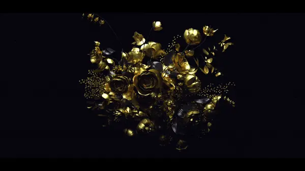
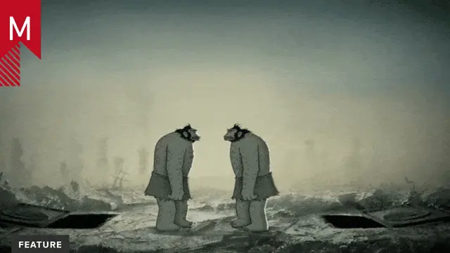
Digital Kitchen recently busted out “Remodel” and “Concerned Dad,” a couple nice spots for Key Bank and agency Cramer-Krasselt that combine folksy illustration, subtly smooth animation and clever metaphors. The voiceover work feels genuine, and the visuals deepen its charm with an aesthetic strongly reminiscent of the Oscar-nominated I Met the Walrus.


In addition to the credits on DK’s project page:

Agency: Cramer-Krasselt/Chicago
CCO: Marshall Ross
GCD: Dean Hacohen
CD: Andrew Meyer
AD: Noel Ritter
CW: Pat Hanna
Executive Producer: Sergio Lopez
Producer: Tammy Auel
Music House: Another Country
Print Art Buyer: Lorraine Harkins
Illustrator: Tim Tomkinson
Interactive Agency: Sapient

Tags:

About the author

Justin Cone

/ justincone.com
Together with Carlos El Asmar, Justin co-founded Motionographer, F5 and The Motion Awards. He currently lives in Austin, Texas with is wife, son and fluffball of a dog. Before taking on Motionographer full-time, Justin worked in various capacities at Psyop, NBC-Universal, Apple, Adobe and SCAD.

14 Comments

Johnny

Justin,

I think you need to get off your high horse and stop referencing every single “inspired” element. At the end of the day some people have real jobs, and don’t have time to realize the whole entire universe of motiongraphics. Chill out, and let the work speak for itself.

justin

Wow, that was totally uncalled for, man. I’ve actually defended the position you’re taking more than most of the readers on this site. And I genuinely like the work. Sorry that I can’t ignore its similarities to I Met the Walrus. That doesn’t diminish its quality; it’s just a tangential reference.

MHR

Hey man, this is what art critics do, and have done throughout time – they give perspectives that maybe not everyone else sees.

If you think that your work’s individuality is diminished somehow because some people think its reminiscent of other art out there, then do your research before you make something. If you don’t have time to research (aka visit Motionographer every few days), then take it with a grain of salt. If Vitagliano didn’t see the similarities (though I’m sure he did), then I’m sure he’d be happy to have a Key Bank ad compared to an Oscar-nominated piece. Aside from that, Justin could’ve compared this spot to numerous other past animated works for a number of reasons (…).

The fact of the matter is that Justin showcased this work and gave it accolades – which usually means it has some viability in this field. If you don’t like it, and repeatedly disagree with him, why torture yourself – visit another mograph site for your daily inspiration (or critique).

Personally, aside from the intro where there is a clear similarity to Walrus, I think this piece is a lot better – Tim’s illustrative style is more personal and defined, the transitions make more sense and are more surprising, and piece just seems to have more life overall.

Great work DK, for collaborating with an artisan outside the mograph realm, to produce something ‘unique’ and enjoyable.

kupon

I am a design student, 2 years into my degree. My college doesn’t teach motion graphics, only print and animation, and none of the teachers really know this area well.

I find the references invaluable, and think this site is a great place to learn about many areas of moving image work. I now know of many of the movers and shakers, and have visted their respective sites.

I can’t see the problem.

habitat

I love the visuals working hand in hand with the audio and the lack of music is a nice touch. Great post!

Anthony

Check out Tim Tomkinson’s (the illustrator for the project) work here.

Matt

Great work, Tim – really dig the site, too!

fanboy

It took 23 people to do that piece?
Great job.
And Johnny, leave Justin be, if is to become a motion graphics critique he needs to come up with words like Tangential, diminish, charm and aesthetics. Letting the work speak for itself is for people who work and understand motion graphics, but since this is a blog, he needs some of the viewers who dont have knowledge of motion graphics to understand and appreciate the work.

Anthony

A very short deadline to do 5 spots so that is the entire credit list for all 5. Still working on the last 3. It also includes the cell animators.

mtgentry

Fantastic piece. Very captivating.

nbody

there definitely is a similarity to “i met the walrus”, which seems be done consciously when you consider the very unorthodox treatment of the audio, which was crafted with reverb and background noise, which was a distinctive aspect of walrus (and was undoubtedly added synthetically in the spots).

but people have to always keep in mind that 99% of the time, the creative hackery occurs at the ad agency (especially on such a big account as this) and the studio who executes the idea would certainly never ever come out and say “the agency is responsible for the plagarism” because it would obviously risk future work from them.

noboddy

Love it! And would love to hear Josh Raskin’s thoughts…

davco9200

Added a third spot: Medals.
Very Olympic :-)

joeyPark

It’s easy to reference “I Am the Walrus” because it’s the most current example we have of hand drawn, silliness. I actually worked on “Concerned Dad” and I can tell you that at no point did Anthony or any of the other guys reference that flick. I can’t say for certain that everyone on the DK team did a fantastic job and their originality and creativeness should be applauded.

Comments are closed.