[qt:http://motionograph.wpengine.com/wp-content/uploads/2009/06/bt.mov 720 405]
Storyboards and Development
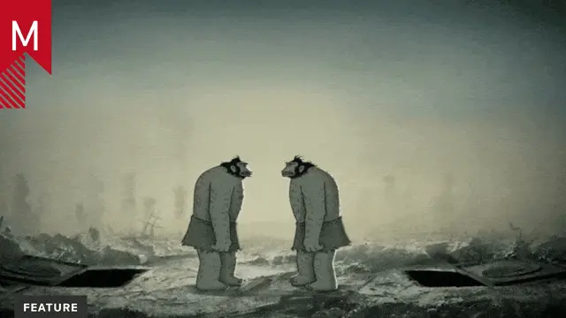
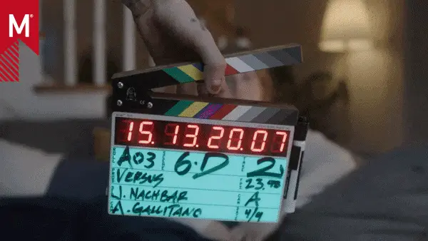
Check out the storyboards and some making-of imagery behind this epic project.
Interview
The following is an interview with the creators behind Nathan Love’s “Blood Trail” and Motionographer’s Lauren Indovina. Big thanks to Eric Eddie at Double E communications for some additional background scoops.
STORY
Lauren Indovina: Nathan Love’s background in edgy, blood soaked character stories like “Rabbitard,” combined with an ass-kicking body of high end CG makes you guys a perfect partner for Blood Trail. Can you tell us a little bit about how you were approached with the project?
It’s funny—a few weeks before this project came to us, we started talking about our next dream-job… something that we had never done before: ultra violent and really gory. Then, out of the blue we were approached by Perspective Studios. They asked us to design and produce a trailer for a feature length script called ‘Blood Trail.’ The initial concept was to create an engaging piece to help sell screenwriter Matt Cochran’s vision of horror. They definitely came to the right place.
How much creative license was given to Nathan in developing the story and the style?
Perspective gave almost complete creative license on this one. They basically introduced us to Matt and said, “Have fun.” Working with Matt was awesome. Originally, he wasn’t sure which approach to take: live-action/mo-cap, or straight-out animation. One thing was clear though, he wanted it to be unique. We were able to convince him that a very stylized, hand-animated approach would really make this piece exciting, intriguing, and powerful.
The collaboration between screenplay writer Matt Cochran and Nathan Love seems to have been an important one. How has working with a writer been helpful to a character animation-based story studio like Nathan?
Working with a writer was like having a map to your destination—in having Matt’s ideas to follow, we were able to concentrate on the characters’ designs and really nail their personalities. He spent years working on the screenplay and developing the world of Blood Trail, so he had a clear idea on where it should go. The structure gave us more room to focus on formal issues of film-making, artistry, and kick-ass animation.
TECHNICAL
One of the most impressive aspects of “Blood Trail” is the tension and cinematic acrobatics that occur between the monsters and the main characters. As a viewer, you feel the weight of the beast as he lands, and the powerful punch as Lee’s body is thrust to the ground. What type of previs enabled Nathan able to achieve this dynamic sense of weight and action?
All of Blood Trail was meant to feel very intimate. It helped us engage the viewer, draw them into the scene, and then BAM! …turn their word upside down. From there we just had to rock-out some bad-ass monsters, and our animators know what’s up. They’re disciples of weight and motion, and payed special attention on this one. There was a lot of research that went into the style of animation. The physics of it had to be based in reality to fit in the world, but we wanted to play up both the strength and ferocity of the creatures. A major reference for us was the work of a guy named Cameron Fielding, who did some amazing animation for the video game “Turok.”
Another source of inspiration was our office mascot, Jethro, a Boston Terrier. There were several games of tug-of-war around the animation department so we could observe the beast in action. Some of his trademark-moves can be seen in the final piece: the initial attack with the monster’s side-to-side, neck-whip body-slams, and later with the jaw-lock of death as Lee is torn in half being dragged up the tree. There’s even a moment where the monster adjusts to get a better grip. Classic chew-toy action.
Blood, lots of it. How does one research body ripping?
Haha, that’s a good question. Fortunately, our fluid effects guru was born into a butcher shop. We were always excited to see what he was cooking up next. The skin-ripping effects were cool too. We actually modeled and rigged the anatomy beneath the parts of the body we were destroying. As Lee’s body is being dragged through the branch, we actually simulated breaking ribs (rigid bodies), tearing flesh (cloth and blend-shapes), and spilling intestines (soft body simulations).
In the end, it’s caught at an extreme angle, but you can clearly see the empty cavity where his chest used to be. The jaw-rip was approached in a similar way, with some good old-fashioned animation to really feel the effect.
The tongue-gag we had to do. Matt (the writer) really wanted us to go for it. It was one of our favorite sounds to make around the office during production. We were inspired by a few brutal scenes from South Park.
How does Nathan breakdown a project? Is there an initial phase of look development where artists flush out the style? Or is it a more organic post process working closely with 3D artists to achieve a final scene?
It’s pretty straightforward. We analyze the goals, listen to the clients, and begin to brainstorm. Initial ideas are bounced around, then we’ll dive into research and begin developing a direction. We compare ideas, create some new ones, refine and put together a treatment.
In this case, extensive research went into the time period, environments, characters, clothing, and props to ensure accuracy in our designs. We looked toward illustrations, comic books and sculpture to find the right look and feel for the story. The goal with the characters was to infuse their personalities into each of their designs. John, chained to the tree, needed a very sorrowful appearance, whereas Lee, the dude with the gun, needed to look tough and mean.
We spent about three weeks flushing out the designs, and once they were approved, moved into 3D. Because of the extreme proportions and detail, the design was evolving throughout the process. Animation wanted to make sure the characters could hit certain poses, so they had to test & adjust the model before handing it off. Once all was groovy, we had our detailing experts go to town in Zbrush. We provided several references for skin type and irregularities, anatomy references for musculature and all of the clothing references for wrinkles. Several weeks later all three characters were done, and it was off to animation and effects world.
Traditionally, we would have worked out an animatic or moving storyboard, but for this project we dove straight into 3D previz. This approach was far more effective, as we really wanted to push the camera work, and leave room for discovery. Sometime it’s hard to imagine everything until you get there. It took about three weeks to get through this phase, and during that time we were running several bone-crushing, skin-ripping, blood-pouring effects tests. The lighting and compositing pipeline was also being developed, as we picked a few key-shots to work up and define the look for the entire piece to follow.
Basically, a lot of work goes into these projects, and every step of the process is deeply interrelated. Everyone was interested in what everyone else was doing, so it was a lot of fun to watch the whole thing develop. Animation ideas would feed effects ideas, which in turn would effect how an entire shot was composed. We all had so much fun with this project, everyone was going the extra distance to bring it to life.
What was the time frame from start to finish to complete this project?
Pretty long actually, about 4 months. The entire first month was spent doing research and design, the next 2 months doing animation and effects, and the final month pulling it all together through lighting, rendering and compositing. Sound design started about three months in.
Biggest challenge?
Not becoming desensitized to violence.
Software?
The usual suspects: Maya, Photoshop, After Effects, Z-Brush, Real-flow, and Corel Painter.
THE NATHAN LOVE TEAM
Someone once compared Nathan to the likes of a small, indie Pixar, where the love for great storytelling and the team triumphs the ego, and the atmosphere is collaborative rather than top down. From your perspective, what is Nathan’s secret to working as a successful team?
Say whaaa? I mean, that’s sweet, but a huge honor! We definitely promote a creative, learning atmosphere, but this company is built on talent. Even with the greatest vision, nothing can be accomplished without a team. Everyone here is awesome, and they all compliment each other really well. They’re talented, dedicated, interesting and funny, but best of all, they’re all great people. Makes a difference when you can depend on your team develop a work flow together, as opposed to creating a new configuration for each project. Besides that, we also play hop-scotch together and bare-knuckle box to settle disputes.
One question that accompanies Nathan is “how did they do that?” whether it be the animation in “Chips Ahoy,” to the oil paint aesthetic in “Suicidal Cabbage.” Can you talk a little bit about your pipeline?
Everyone on our team is multi-faceted, but we’re essentially broken into departments (or what we like to call, islands). We’re always trying to do something new or different, but we rely on our departments to develop the solutions. Animation island works together to solve animation and setup obstacles, and pleasure island (basically our art department) figure out how to transform still-frame designs into something that will work in motion.
All the islands have to communicate with each other, but they know they can depend on one another to bring their expertise to the table. The constant flow of ideas and creative solutions keep us on our toes and thinking outside the box. When a new project comes in the door, we’re like a pack of ravenous wolves – ready to swarm and devour the idea. I can’t wait to share our next projects in the pipeline.
In the past year or so, there has been an increased momentum following the studio based on a consistent outpour of creative work and a studio personality built on unhindered imagination. (At Nathan HQ, you’ll find a faux pirate receptionist, an assortment of pulverized toys, and bathroom walls covered in a variety of bathroom jokes and humorous laugh-out-loud drawings.) Can you tell us a little bit about the role the company personality plays in the work you produce?
A lot of the work we do is fun, and to pull that off you can’t fake it. The people here work their butts off when they have to, but there’s a good balance of down-time too—I heard the official Tally of Smash Brothers games played surpassed 1000 the other day! We believe that everyone should be free to express themselves outside of job production, between free-for-all wall drawing, so called “craft time,” and general office debauchery—this is a fundamental reason we started Nathan in the first place! Having creative freedom absolutely spills into the work we do, in terms of out-of-the-box ideas, a sense of fun, and of course, camaraderie.
Are cinematic game trailers and feature films going to be continuing themes in Nathan’s future?
I sure hope so—this project was a blast, and it feels like we’re just getting started!
Check out the storyboards and some making-of imagery behind “Blood Trail.”
Credits
NATHAN LOVE
Executive Producer: Nathan Love
Director: Nathan Love
Client: Perspective Studios
Producer: Melissa Johnson
Writer: Matt Cochran
Creative Team: Joe Burrascano, Kate Burrascano, Dan Vislocky
Character Designs: Morgan Schweitzer, Brad Johansen
Concept Art: Morgan Schweitzer, Denis Kozyrev
Sound Design: Drew Skinner
Producer: Mike Harry
Production Coordinator: Fayna Sanchez
Animation Director: Dan Vislocky
Lighting / Compositing Director: Mats Andersson
Character & Cloth Technical Director: Sean Kealey
Dynamics & Cloth Technical Director: Ylli Orana
Hair & Fur Technical Directors: Ylli Orana, Mats Andersson
Pipeline Technical Directors: Jesse Clemens, Sarah-Elizabeth Clemens
Animators: Ryan Moran, Kevin Phelps, David Han, Dan Vislocky
Character Model / Detail Artists: Christian Haniszewski, Tony Jung, Ylli Orana
Lighting / Compositing Artists: Mats Andersson, Denis Kozyrev, Richard Kim, Anca Risca, Ylli Orana, Michal Finegold, Sylvia Apostol, Joe Burrascano
Dynamics & Scripting: George Smaragdis
Environment Layout: Dan Vislocky
Environment Models & Set Dressing: Sylvia Apostol
Env & Prop Model / Texture Artists: Sylvia Apostol, Denis Kozyrev, Brad Johansen
Matte Painter: Denis Kozyrev
Fluid & Particle Effects: Mothana Hussein
Compositing & 2D Blood Effects: Chase Massingill
“Dizzy Vision” by Jeff the Dragon


