[qt:http://motionograph.wpengine.com/wp-content/uploads/2010/03/HOS_0223_h264.mov 640 360]
How did this second collaboration between Blind and The Raveonettes come about and were there any differences this time around in the process?
We got a call from Jamie Farkas, the General Manager of Vice Records (The Raveonettes’ label). She and the band’s management expressed interest in working with us again based on how well received the “Black & White” video was. The only difference this time around was we were working directly with the artists as opposed to an agency. Otherwise, not much else was different. I wrote a few treatments. After which, Sune and Sharin connected with the “Inner Workings” concept and we moved straight into production.
As we all know, music video budgets are pretty limited. Were there any clever ways to cut costs without hindering the process or limiting the end product?
We knew going in that it was going to be a very challenging project based on the tight financial parameters. We had to be smart about how we conceptualized the piece so as to not blow the budget. We relied heavily on matte paintings to cut down on the CG work. We were also very disciplined about not using tricky camera movements and instead focused on a more traditional story-telling format. Having complicated visual effects wouldn’t have added anything.
The whole point of the video was to elicit an emotional response from people watching the video. Could we get people to feel some of the sadness and pain even though the main character was wholly digital and synthetic? You’ll have to let me know if you felt anything after watching the video.
How did the concept and style for the video come to fruition?
We have a fantastic team of designers and animators. At the earliest stage of conceptualizing the piece, I asked everyone to look for things they felt could relate to the song and the band. One of my interns, showed me a series of images produced for the Zurich Chamber Orchestra, where musicians are illustrated playing human parts like hair inside the body.
I was inspired by these images and wrote a story about how a female character could play the role of a care taker inside the body. From there, the story evolved. It goes to show you, good ideas can come from anywhere. You just have to be willing to listen.
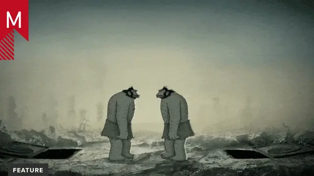
I also love the aesthetic of Steampunk and Surrealists like Rene Magritte. I wanted to combine the two, to get this dark and gritty mechanical world, with flourishes of these poetic and subliminal moments. For example, if you look at the design of the butterflies, the wings and patterns are made up of a woman’s face. By inserting these subtle images, I hope that people are able to uncover additional layers of meaning within the video.
Our last video ended with an old gramophone in the shot. This one opens with one. Not that they were designed to be viewed together, but as a designer, I like to add references like this– not that anyone would notice.
Are there any plans for Blind to direct videos for other bands? If so what bands would you like to collaborate with? And the last part of the question, if you could pick any song from the past to direct a music video for, which would it be and what would you have done or done differently from the other director?
“Yes!” but that we have to be extremely selective about the projects we do since these don’t represent a revenue stream. We look at these opportunities very carefully, considering the music, the artist, the vibe and how we might be able to innovate.
Music videos are good for our creative soul and serve as incubator projects. We get to try out new ideas, techniques, methodologies and work with new artists.
I didn’t have MTv when growing up so my music video references are limited. Having said that, I’d only work on videos where I really liked the music of the band. Right now, I really like the song “Help Yourself” from Sad Brad Smith from the movie soundtrack “Up In the Air”. But this is only my personal inclination. We’re a collective, so I’d weigh the opinions of our creative directors and executive producers to determine the overall benefit for us.
What advice would you give to other artists or studios looking to dabble in directing music videos?
I find the process of creating something within very tight parameters extremely challenging yet gratifying. When you have limited resources, it will force you to be inventive and think more about concepts. I remember a few years back, there was a promo for MTv where the director shot a cardboard break dancer spinning on his head. It was a simple wire rig placed on top of a box. The promo went on to win all sorts of awards. It looked like it cost $5 dollars to produce but the idea was great.
What was the most rewarding part of the project for you?
As a fan of their music, I just wanted to create something Sune and Sharin could see as a companion piece to their song. After we delivered the project, the band was touring in Europe and Dave Kleinman, our EP, got an email from Sharin saying that ‘it was everything that I hoped it would be and more. It enhances and compliments the experience of the song.’ I think that’s pretty cool.
We noticed that on the website there may be an updated version of the video in the works. What can we expect from the final version and when do you estimate to complete it?
We’ve updated the video twice already since delivering. In the final push to complete the video, many things had been overlooked. I couldn’t live with that, so after everyone got some sleep, we jumped back on to fix those glitches. I think there’s some more work to do on the opening scenes of the video. We should be done with it soon. Maybe another 2 weeks or so. It’s hard to carve out time when other jobs take precedent.
Motionographer applauds Blind for sharing the process of each project that is posted on the studio’s website. Why did you decide to pull back the curtain, so to speak, and let everyone in on the behind the scenes?
At the level in which we are working, every studio is capable of creating truly amazing work. There aren’t any trade secrets or proprietary tools that we use, so there’s no point in hiding it. We rely on the talent of our directors and creative team to come up with great ideas, which is always the challenge, not the tools and techniques.
We share what we do because we’re connected to the larger community of motion designers. I think it’s a good thing if someone is inspired by what we show or if it helps in any way. We have some plans on taking this a step further by integrating a new section on our site, which will promote the sharing of ideas and designs in an open format. Sorry if this sounds vague. Check back for more details.
Blind has made transformations in the past from originally beginning as a print and web studio to a full on motion design production house. Considering the progression of our industry, the current state of our economy, and your own personal experience as a studio owner, what direction do you want to take Blind in 2010?
I’m excited about 2010. We’re off to a great start with a variety of interesting projects. We weathered the storm of ’09 and are looking forward to the new challenges that await us. As part of our company culture, we want to remain nimble, embrace change and be capable of tackling anything that’s thrown our way.
Thank you very much for your time Chris!
Related


