Sehsucht: Lamborghini Pacemaker

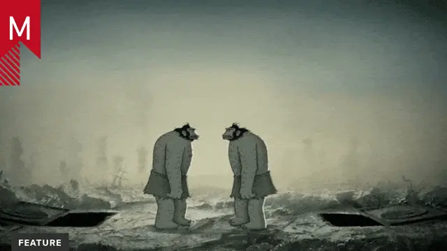
Sehsucht’s latest production is this dark and elegant short film for Lamborghini’s super sports car, Gallardo Superleggera. Lamborghini Pacemaker is an epic journey that follows the transformation of carbon fiber to birth a superior sports car.

Never has the power of carbon fiber been portrayed in such CG excellence, including photo-realistic terrain and debris. These elements, fused with its high-contrast, hyper-realistic lighting, awesome camera work and perfectly-paced animation make this piece as intriguing and solid as any of Sehsucht’s work.

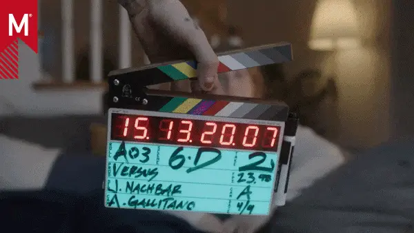
Please check out the Directors Cut and Making of Lamborghini Pacemaker.


Client: Lamborghini, Sant´Agata Bolognese, Italy
Director Brand & Design: Manfred Fitzgerald

Agency: Philipp & Keuntje, Hamburg, Germany
Creative Direction: Diether Kerner, Jo Marie Farwick
Art Direction: Alexander Norvilas
Copy: Dennis Krumbe
AP: Diana Scarfó, Alex Schulte
Consultant: Steffen Schwab

Production: Sehsucht Hamburg, Germany
Directors: Hans Schultheiss, Ole Peters
DOP: Bernd Wondolek, Ole Peters
Concept Design: Axel Brötje, Peter Balicki, Silke Sieler, Mate Steinforth, Lasse Clausen, Helge Kiehl
3D Artists: Timo von Wittken, Maurice Panisch, Peter Balicki, Hannes Geiger, Felix Geremus, Matthias Thomann, Joern Engelke
2D Artists/Compositing: Christian Heyde, Thomas Schindler, Tom Abel, Jan Toensmann, Sebastian Spitze, Moritz Glaesle, Michael Welz, Max Dennison (Matte Painting)
Editor: Ole Bergmann
Producer: Jan Tiller, Jens Monske
Music: DamienDamien

Tags:

About the author

Tyquane Wright

/ www.easein.com
I am a student at New York University. I love motiongraphics.

12 Comments

monovich

I’m curious about how this only gets three stars. I think its top-notch work.

Is it too CG therefore uncool?
Is it “just another car spot”?
Is the overall concept not clever enough?
Someone please enlighten me.

Douglas

The production value of the spot is great (kudos to Sehsucht), it just feels a bit off brand to me. Maybe a little too much in the Hollywood blockbuster sense… I expect Art when it comes to such high end products. Defaulting to Gotham for their title cards also left me feeling uninspired. :)

ocelot

i might have to give it another shot, i saw it a couple of days ago linked on another site, and to be honest about 20 seconds in i got bored and turned it off… i didnt feel like there was a narrative or anything actually holding my interest. the visuals were nice and all but it felt like watching some gods of war cinematic more than anything else really..

jibberjabber

A simple answer: It looks like a whole lotsa work, sure. But execution-wise it looks like their high aims somehow couldn´t be reached. Remember several old tvcs or hollywood stuff dealing with exact the same story – they should have been a good blueprint for the creatives. In terms of dramaturgy: There is actually none! In terms of technical execution: It´s not 100% … watch the debris, the leaves animation, light and all this. Sorry, I think 3 stars is a good vote for this one.

minhang

c´mon guys. sure, in terms of dramaturgy it could be better…so what! Most works posted here and rated better do not have even 1% of this one.
also in terms of execution, ok it is not 100% but Avatar isn’t either. So, this is a commercial for dick driven lamborghini consumers (have a look on lambos older commercials) and therefore it is a damn nice piece of work. And I am no Sehsucht disciple!

minhang

sorry, I don’t wanna say that most work posted here has no drama, but many of them. But this is not meant as something negative, just a fact if you want to judge that piece in terms of a lack of dramaturgy.

ocelot

yeah. if i wanted to make an advertisement for a car i sure as well would show a barren bleak desert world, where the last piece of nature vanishes right at the start. such a positive message.

the directors cut is slightly better since it gets rid of this awful countdown and the horrible type, but still… its just boring eyecandy.

minhang

Yeah, and Lamborghini is so well known for their positive messages.

Ruoyu1

props to sehsucht, hope to see more!

safetyfirst

I have to agree with some of the other comments. I don’t think that this spot is good. Actually it bored me quite a bit.

It tested me very hard in the beginning not to skip the whole thing when the leaf left the tree. How cheesy could you be?

Why was this clip posted to the main section?

Is it outstanding and awesome?

I don’t think so, every b-movie from Hollywood has better effects. This piece is clearly visually driven but the look seems to be very cliché and old fashioned.

Why is everybody trying to be like Hollywood if you could do so much more. Hollywood has far more manpower and money to build better looking CGI. But you have the freedom to create really new stuff or at least try to push the client this way.

What about weird ideas or visuals which open up new doors of perception?

What is the rest of you out there thinking?

It would be great to start a discussion on this…

minhang

ok….you got me with the leaf.

Sue J

I personally think the original cut works better in this case. some of the cgi meteorite/ cliff render is not bad but i think i prefer quick-flash edit of cgi environment in the original than the long lock up shots in the directors cut.

Comments are closed.