Tetro

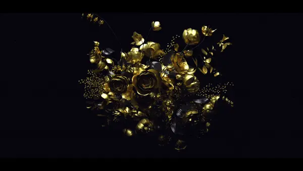
I recently watched this film, and while I have mixed feelings about the film itself, the title blew me away. Made by SFAUSTINA Design last year, it’s a typographical feast for the eyes. Some of the type compositions are reminiscent of the golden era of Hollywood in the 1940s (see above, where director’s name, film title, and main actor’s name appear on the same screen). The animation of the type hints at the key visual device that runs throughout the film (lights and reflections), which in turn relates a key element in the story. Catch the full interview with Stephen Faustina and watch the titles in HD, here.

Tags: , ,

About the author

Lilian Darmono

/ www.liliandarmono.com
Born and raised in Jakarta, Indonesia, Lilian moved to Singapore and eventually Australia for her studies, eventually graduating from Swinburne NID in Prahran, Melbourne. She then worked in print design before deciding to switch to the field of Motion Design in late 2003. Her obsessions include travelling, illustrating, and cats. She is currently in the London leg of her 'Mograph Tour Around The World', and calls Melbourne home.

8 Comments

corcovadogetz

Great work. You are only one year late, Lillian!

Lilian Darmono

yeah being in the UK can really suck sometimes. Toy Story 3 hasn’t opened for us yet. Better late than never, right?

randomthoughtpattern

yup, beautiful stuff right here.

mk

I don’t get it. It looks like the titles to a student film.

Lilian Darmono

You are entitled to your opinion of course..but I like it a lot for the same reasons I like the old classics, like ‘Psycho’ titles by saul bass, or the even-less-dressy titles to ‘To Kill A Mockingbird’:
http://www.artofthetitle.com/2008/09/10/to-kill-a-mockingbird/

mk

But looking at the thumbnails of TKAM vs. Tetro on that site speaks volumes. One is a masterpiece of visual communication, the other is some nice bokeh* and not much else.

* or “bokake” as Stu Maschwitz put it.

mh

“It’s a typographical feast for the eyes” – have to politely disagree with that one. I don’t dislike the type choice, but it runs too close to the overused Trajan to make the typography by itself enjoyable.

I know this doesn’t reflect the individual work and efforts involved – but the whole thing just feels like Trajan and Trapcode Shine slapped together.

defasten

i think this is probably francis ford coppola’s best work yet, on so many levels, one of which is because he produced his own film, effectively leaving compromise at the door in favour of his artistic integrity. i was never a fan of his prior work, but this film changes the game.

otherwise, i think, while nice, the titles could have been better. the references and nostalgia are there, but technically some of the type is just too small, even for the big screen. it can be jarring.

Comments are closed.