Patrick Clair + Elastic: HBO’s True Detective

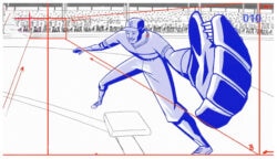
One of our favorite projects from 2013 was Patrick Clair’s launch trailer for Tom Clancy’s The Division, a global conspiracy theory rendered in elegant typography and metaphorical imagery.

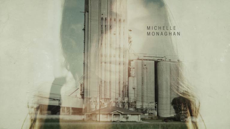
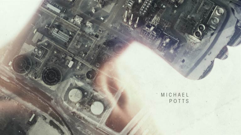
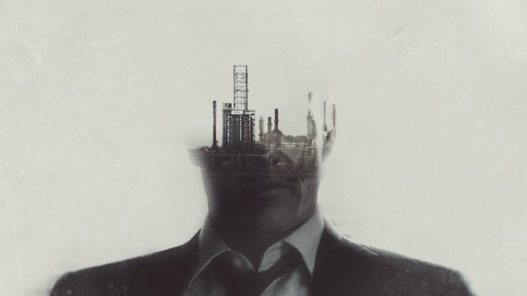
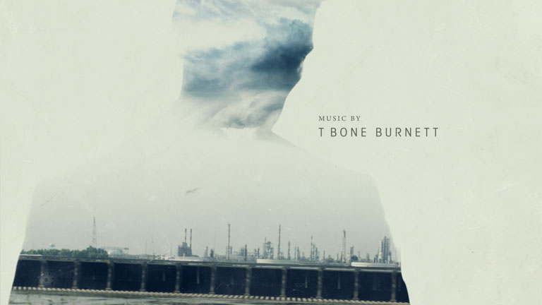
With the same understated poignance that is his hallmark, Mr. Clair’s latest project is a title sequence created in collaboration with Antibody (Clair’s studio) and Elastic for HBO’s new series, “True Detective.”

In an interview with Art of the Title, Clair explains:

As we started to plan the movement and animation, we faced some interesting challenges. We wanted the titles to feel like living photographs. But the footage was too kinetic and jumpy and stills were too flat and static. Many shots feature footage that has been digitally slowed to extreme degrees. The digital interpolation and artefacts created by slowing footage down often looks strange or tacky, but we found that in this case it evoked a surreal and floaty mood that perfectly captured what we were after.

Read more in Art of the Title’s excellent interview.


Client: HBO
Air Date: January 12, 2014
Opening Title Sequence: Elastic
Director: Patrick Clair
Executive Producer: Jennifer Sofio Hall
Design/Animation/Compositing: Antibody
Senior Designer: Raoul Marks
Animation + Compositing: Raoul Marks
Animation + Compositing: Patrick Da Cunha
Production: Bridget Walsh
Research: Anna Watanabe
Additional Compositing: Breeder
Compositing: Chris Morris
Compositing: Joyce Ho
Production: Candace Browne
Production: Adam West

Tags: , , ,

About the author

Justin Cone

/ justincone.com
Together with Carlos El Asmar, Justin co-founded Motionographer, F5 and The Motion Awards. He currently lives in Austin, Texas with is wife, son and fluffball of a dog. Before taking on Motionographer full-time, Justin worked in various capacities at Psyop, NBC-Universal, Apple, Adobe and SCAD.

32 Comments

Ruoyu Li

gotta bring this up real quick

http://artjail.com/index/#/morganstanley/

Lisa Overton

wow. which came first? It’s probably impossible to do something that’s never been done before but there’s a difference between being influenced by something and um, copying. I hesitate to be too judgmental because they are both beautiful. Maybe it’s a complete coincidence.

Lisa Overton

looking at it again I have to say I think that the title sequence does really expand on the idea. They take it much further and build on it. It also seems more appropriate as an opening title sequence for a piece of fiction. I don’t really understand what that beautiful montage has to do with Morgan Stanley.

Joey Ramone

Its really more of a technique than a style

lumerbub

i was just wondering if it was really neccessary to have the photographs projected on 3d objects… But for sure looks amazing

Slz

Was thinking the same, but on the other hand it gives more control on where the projection ends and the footage (3d models in this case) starts.. And cheaper than a shoot?

J.S.

I was researching Nadav Kander and ran into this, too funny.

Jamination

I love the song, searched Vimeo for the band and found this.

Pause

Really beautiful work!

Kris Merc

Yo this show is mad fire. This intro is mad fire. I kind of have to avert my eyes a bit my retinas are burning. Sick.

Ruoyu Li gangsta

its interesting that TV shows are making a comeback, hopefully budgets for TV work will increase…

Gif Motion

Mr Spacey talks about this. http://www.theguardian.com/media/video/2013/aug/23/kevin-spacey-mactaggart-lecture-video

Paul Rand

this is a good lecture. The take away – The golden Era of television was so exciting because nobody knew where the medium was headed and if it was going to last or take off…They were experimenting with the form of TV and this is what Kevin Spacey suggests is what’s currently happening to TV on the internet. It’s becoming another era of exciting experimentation.

Paul

Props to Patrick and team. It’s stunning work.

tuesday mcgowan

Impressive work! Artful and sophisticated, the beauty is the details for sure. The 3D projection is what set this apart from the others . . . no comparison. Congrats to the team at Elastic and Patrick Clair, well done!

Cait

Love the use of images within images. The music is pretty great too.

Ben

Oh come on! This is petty and disrespectful early commentators. It’s a truly inspired piece of work. One of the finest, most sophisticated title sequences I have seen in a long time. Beautiful, beautiful work to all involved. For those of you quick to highlight plagiarism, please give it a rest. We are a product of our conditioning – young ones, this will become clear some day. Its an age old adage. Transcending a core concept to create something that is unique and relevant to it’s subject. Einstein himself highlights this “The secret to creativity is knowing how to hide your sources.”. I’m not suggesting by any means this was influenced, I don’t fucking care either way, why should we be? it’s irrelevant. Does it serve a purpose? Is it relevant to the subject? Does it connect emotionally? Is it a beautiful piece of commercial art? Yes! It’s stunning as I’m sure you agree. It should be respected as such.

Well done done all.

PS For those rare few that missed this please do yourself a favour. This was produced by pioneers of motion design ‘Belief’, well ahead of their time.

Lisa Overton

Agreed. After spending time on the websites of Patrick Clair and ArtJail (who did the Morgan Stanley piece) I know they both do beautiful work. But Patrick Clair is… beyond amazing. I tried to say in the second comment that his work shows all the aspects of purpose, passion, relevance, emotion and beauty that you mention. I didn’t mean disrespect to either of the designers and no, I don’t care which came first. I’m grateful to be able to see both of them. Thanks also for posting the link to the Belief video. It gives voice to the difficult balancing act of trying to create inspired work while needing to pay the rent. If I could conduct my own practice with a fraction of the integrity as Patrick Clair I’d be a better person. Apologies for coming off as judgmental and posting prior to investigation.

Ben

Well said. I’m sorry, my response was really directed towards the first comment, or lack of comment. Just frustrating that some here feel the need or desire to highlight such irrelevant connections and can’t simply appreciate a piece of art in it’s own right. Patricks work is some of the most inspired, ground breaking stuff out there and to me this a stand out. I’ll shut up now and watch it again :)

Ruoyu Li

I don’t think i was being disrespectful. If comparing work is disrespectful, then respectfully all you are going to see are the generic “great work” “nice job” “amazing” comments. which frankly is quite boring. I like both. but I think its important to highlight similarity where it exist and give credit where credit is due. Since this forum is about discussion why not discuss it?

Ben

Absolutely, this is a forum therefor personal opinions and debate are what makes it interesting. So in turn we’re doing just that :)
What I see as appropriate and respectful is an acknowledgement of the actual work you are commenting on. Good or bad. To highlight vague similarities in another’s by simply posting a link especially without discussion is disrespectful in my opinion. Intentional or not. We’re not talking shot for shot rip off here. That would warrant credit were credit is due. This is simply a similarity that can be found in any piece of art and is a stroke of paint so to speak that is unique to it’s own. I feel I’ve made my point and reiterated an age old discussion. I realize you intend no upset and appreciate your reply.

Paul Rand

Unfortuantely, if you dont believe or respect that design is intellectual property and you want to live in a fantasy land of share everything take whatever you like then you may have a point. Otherwise, this is what copyrights were designed for. So artists can prosper off of their work. Your attitude which dismisses peoples concerns over plagiarism is so naive. Let me put this into perspective. People just made a huge transaction of big money to produce that BLACK SAILS work to put on TV. Oh and your artwork was the focal point of the discussion, and OH, you werent invited to the discussion. Anyway, they decided that it was perfect, like choosing a perfect wallpaper pattern from Home Depot. Yup, people paid their IRA deductions, made their mortgage payment, put their kids in daycare off your ARTWORK…HOW BOUT THAT!!! All because so many naive artists are so willing to just let it slide….”thats the way it goes” MEanwhile the music industry has an entire system of payment for using others artists music. For using samples, sheet music, lyrics etc…Those artist’s figured that out a long time ago.

From the attitude and naivety of these people on here telling the other artists that are complaining about plagiarism that they are full of shit and shouldn’t complain….LOOKS LIKE VISUAL ARTISTS WILL NEVER COMMAND THE SAME RESPECT AS MUSICIANS….

Ben

What’s naive is to not see a distinction between commercial art and fine art. We can pick, prod and dissect similarities all day long and we’ll get nowhere. Take the famous Cog ad from a few years back. It borrows directly from an art installation by Rube Goldberg and is considered by many in our industry as the greatest ad of all time. What makes it creatively new and fresh is that it transcends the original idea and smartly makes a link between the two. Selling a car and fine art. It merges two completely different genres to great effect and is directly relevant to the subject and brief. That’s commercial art. Watch the link I posted in my first post and have a think about this. I’m glad we can all have our opinions but think this discussion is now focused on something far bigger than my initial frustration. Patricks piece MAY intentionally or not use an age old design element but is unique to it’s own, fits the brief and deserves appreciation, not this nit picking we are so quick to unnecessarily highlight. It doesn’t even qualify in this discussion anyway. To call out ‘intellectual property’ here is the same as being told I can’t use straight lines with the color blue, it’s been done before. Thanks for your thoughts as ambiguous as they were. I’m out now.

oeuf

I don’t think the initial comments were disrespectful. Just people voicing an opinion, unless i’m missing something and the initial comments were deleted.
I do think Joey Ramone hit the nail on the head with “it’s more of a technique than a style”. Double exposure has been around for a long time.
I am curious though Ben, what are your feelings on the Black Sails title in the quickies section…

Ben

I agree, Joey is right “it’s more of a technique than a style” and I hear what you say but I feel the original post that links to the somewhat similar Morgan Stanley piece is dismissive, disrespectful and undermines the work, intentionally or not. It should be appreciated for it’s individual qualities. I’m not out to attack anyone but feel this comes up all to often and needs to be highlighted. There will always be inspiration, that’s part of what drives us to do what we do. Connections can be made between anything and everything. Creativity grows and mutates between us. We collectively create together, consciously or not. As Lisa pointed out, they are both beautiful in their own right but this is about Patrick’s work and that should be our focus.

I think the Black Sails piece is stunning also. Why do you ask?

Ruoyu Li

I think an important note that comes up is the term technique vs style.I would argue that you can’t clearly define or separate the two as different matters. Technique is a way of carrying out a particular task, while style is a particular manner or technique by which something is done, created, or performed.Both the morgan stanley piece and the title sequence share technique and style, and i challenge you to tell me where the technique begins and the style ends. If you read the actual interview with patrick clair, she specifically states this

” It made sense for the titles to feature portraits of the lead characters built out the place they lived. This became a graphic way of doing what the show does in the drama: reveal character through location.”

This is why i bring up the link to the Morgan standley piece. It too is doing the same thing, revealing the nature of the company through locations. I would say the biggest difference is application, one is a commercial, and the other one is an prologue to a TV show. The actual technique and style are not that different from each other.

oeuf

Just a similar discussion of what is going on in this thread. Have a look at the Art of the Title write-up and look at the comments in the Black Sails thread. Inspiration? Copying?

Ruoyu Li

This is where discussion is most useful on this site. We see tons of work by different people/group and sometimes we point out what we like and dislike. I think for most, inspiration would be encouraged while copying is frowned up on. plagiarism is a crime but evolution isn’t. In the case of black sail. The two work is quiet different. One is a physical object/sculpture while the other is a motion graphics exercise. They are not the same thing. I think one can argue that IF imagination forces had the budget they would have just given the money to Kris and/or used his work for principal photography. As far as an motion graphics piece, black sail is very original, Their choice of “props” is an copy of existing work. To echo the previous statement by ben, perhaps IF could have done an better job of “hiding” their sources.

Paul Rand

References can be useful and are always used to inspire new work. The point in the Black Sails piece where the use of sculpture reference begins to fall apart is that the entire piece is presented as if they are shooting the famous sculptor’s work….The entire sequence is presented as a miniature delicate sculpture ( I STILL DONT GET THAT WHY EVERYTHING IS TINY AND FRAGILE FOR A PIRATE TV SHOW) but anyway, if they had just used that as a starting place and made different dioramas depicting more than just one setting or used the water more or even used a different material (like wood) I think they would see very little complaints of plagiarism. On another site someone paired images from the artists sculptures and the direct imitation in the sequence. They even matched the same skeleton and lace patterns…This is where people start to question who is lacking some imagination!!! SERIOUSLY!!! I mean why do you even need to borrow those tiny details??? that’s just weird!!!

What if you were at your design school final show and someone made a painting of your sculpture. A photo realistic painting of your sculpture. Wouldnt that be strange???

Comments are closed.