


Say hello to the new Nick!
Just in time for the back-to-school season, Nickelodeon, the children’s television network, is refreshing their worldwide broadcast package with a series of bubbly graphics that incorporate their most endearing properties.
On the surface, the approach is deceptively simple, but make no mistake; designing for kids isn’t child’s play.
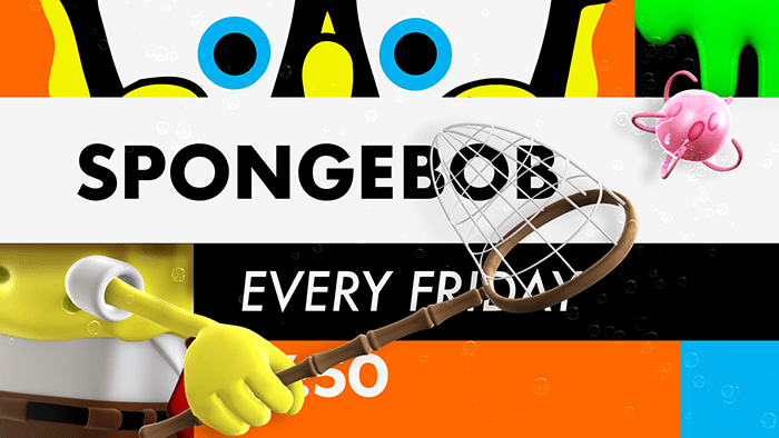
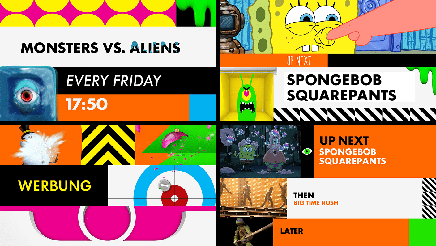
Using an animated grid system, graphic elements squash-and-stretch into place, effectively boxing the type into readable blocks of information. The tune-in lockups are a jigsaw puzzle of texture and pattern, but once resolved, are easy to read, despite the percolating animation.
Courtesy of Berlin based studio, dyrdee, the new package spotlights the networks contemporary lineup—SpongeBob SquarePants, Teenage Mutant Ninja Turtles, The Fairly Odd Parents etcetera—and as a playful design accent, sneaks in Nick’s trademark green slime: a gag then popularized on the networks first hit series, You Can’t Do That on Television.
Although Nick is looking to the future, by no means are they forgetting their past. With some of today’s most trusted brands calling on nostalgia marketing, the network hopes to rekindle fond memories by tapping back into their own catalog of ’90s gems. Now, grownup Rugrats can log in and relive Nickelodeon’s golden age at NickReboot.com.
The website is a time-machine for first-generation Nick fans and a throwback to the days when media brainiac, Fred Siebert, invented the networks “doo-wopp” brand identity—performed by Eugene Pitt and The Jive 5—that so many millennials grew up watching (and singing). Yes indeed, escapism at its finest.
Fast-forward to now.
In the new refresh, dyrdee gets it right—hitting a smart balance between being both playful, yet designed—and tapping into the Nick aesthetic of today. The result is something that appeals to kids but doesn’t alienate parents—folks who grew up watching their own Nick toons in the not-so-long-ago good old days—the 90s. Duh!
We caught up with dyrdee to pick their brain and get a peek into the creative thinking that informed Nick’s new worldwide refresh.
Q&A with Sven Henrichs of Berlin based studio, dyrdee
Conceptually, what drove the overall direction of the project?
Branding a TV channel demands being able to think from the viewers perspective. As longterm Nickelodeon fans it was easy get into that state of mind.
Every Children’s Brand has its own pace, based on the selection of TV shows they offer. Nickelodeon is famous for action driven, fast edited and edgy TV shows. To answer that attitude, we adjusted the animation pace, color palette and sound design of the on-air package to suit the visual habits of the Nickelodeon viewer.
When the worldwide refresh came up, Nickelodeon US provided a great source of inspirational artwork that we used as a starting point for our conceptual direction. We needed to plan our design approach carefully as we had to deliver producer kits for more than 20 languages. The navigational elements needed to be clear and easily readable so it would work for Chinese, Russian and European typefaces.
Animation techniques traditionally reserved for character animation, like squash and stretch, were instead used graphically throughout the motion in the idents. How did your team decide on this approach in as it pertains to the Nickelodeon brand?
Nickelodeon (as a brand) is the birthplace of legendary animated shows. Developing the design elements using traditional character animation principles creates a constant reference to the brand content. A grid itself is defined as a constant and rigid system and is the core of our designs. However we wanted to break up our grid as often as possible, keeping it vivid and lively. It is constantly moving and changing in the most entertaining ways using the basic character animation principles of stretch and squash. It´s safe to say the grid itself was treated like a character.
Through decades Nickelodeon evolved a well known CI, recognizable through a few core design elements like the logo, the orange color or the green slime. Even the content itself, for example Spongebob, needs only a visual hint to remain easily identifiable. Based on that visual groundwork, it was clear the task of rebranding was more a task of embedding the variety of the channel content into a clear system instead of and creating an entirely new visual language. The basic idea was to approach the design as you would clean up a kid’s room, by putting all the toys spread through the whole room in boxes. Whenever you want to play you just choose a box and the fun starts.
By working in the field of kid’s TV and entertainment for several years now, we know our target groups pretty well. All of our experience naturally effects our design decisions and influences our approach.
Although parents often select channels their children are allowed to watch and their perspective on a channel design can´t be completely ignored, our primarily approach follows the nickelodeon motto – “Kids first!”
By using a visual system like the grid, it helps to create the feeling of order instead of chaos, that helps making parents feel more comfortable letting there kids watch. Comparing the characteristics of a Children Channel design to an adult Channel, it is essential to provide a clear visual language. Instead of using subtle, nuanced elements and animation it is better to use a bold animation style to provide clear readability for even the smallest viewers. Typography for example, is used in large bold type emphasizing important information throughout the navigational elements.
To create something fresh and different you need a partner/brand who is willing to go there with you. We have had the luck of working with Nickelodeon for several years now, and not only did we create several On-Air Designs for Northern Europe but we also developed a strong sense for the brand and the creative possibilities.
Nevertheless it is challenging to reinterpret a property that has been presented in countless ways. Since the brand is so well established and known, it is much more flexible when it comes to creating fresh and unexpected material without loosing brand recognition. We were able to fully embrace the channels sensibility except that we were asked to remove all of our affectionately animated fart jokes which were apparently a bit too much for the international markets outside of Germany.
CREDITS
dyrdee Tasks
Concept, Direction, Production
Executive Producer
Sven Henrichs
Project Manager
Sara Saramiento
Alicja Wotzko (nickelodeon)
Imke Rühle (nickelodeon)
Creative Director
Ole Keune
Ljubisa Djukic
Bettina Vogel (nickelodeon)
Technical Director
Mesut Can
Art Direction
Jochen Weidner
Johann Volkmer
Konrad Müller
Stefan Schomerus (nickelodeon)
2D
Johann Volkmer
Konrad Müller
Jochen Weidner
Vincenz Neuhaus
Simone Lehmann
Stefan Hollenbach
Susann Stötzner
Cel Animation
Vincenz Neuhaus
3D
Konrad Müller
Johann Volkmer
Marius Menzel
Vincenz Neuhaus
Maike Engelmann
Alexander Bähr
Stefan Hollenbach
Lars Höft
Sound
Hofkapellmeister