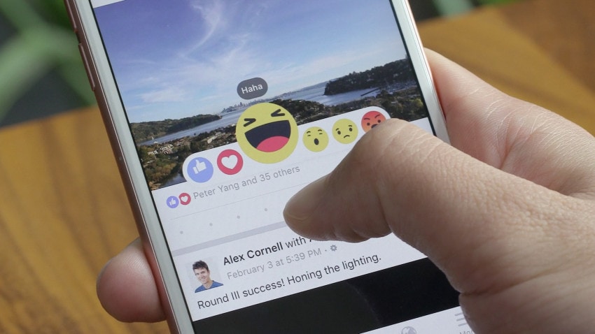
If you’re one of the 1.5 billion people using Facebook, you probably noticed the recently introduced Reactions — alternatives to the old school Like button that express a broader range of emotional responses to your friend’s photos of brunch.

In a fantastic Medium post explaining the process behind the new system, Facebook Product Design Director Geoff Teehan said something that should make motion designers everywhere perk up:
Early versions were static and we knew animation would be key in making them more expressive.
Don’t worry, I won’t go overboard here. But it’s easy to take for granted just how ubiquitous animation is becoming in our digital lives. As tech continues its march towards total domination, one of animation’s key features will become increasingly important: it’s capacity for human emotion.

Just look at the elegant power of the deceptively simple animations above. A tiny flick of the eyes, a quick shake of the head — all at the scale of a few dozen pixels — is enough to conjure a surprisingly wide array of emotions.
Of course, there’s a lot more to making Reactions work than animation alone. But animation is indisputably an essential element to their success.
Check out the full Medium article if you’re interested in the design and technical processes behind Reactions. Kudos to Seth Eckert and the Facebook team for seeing this one through to the end.
Credits
Geoff Teehan – facebook.com/geoffteehan
Andy Chung – facebook.com/aaa
Brandon Walkin – facebook.com/bwalkin
Sean Lee – facebook.com/surlung
Mark Peng – facebook.com/Lozzle
Brian Frick – facebook.com/brfrick
Seth Eckert – https://www.setheckert.com/
Montage music by Wesley Slover


