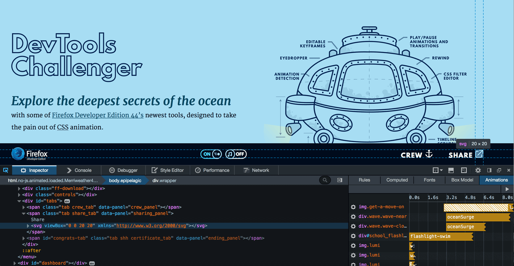
As a follow up to our previous interview with web animation evangelist Rachel Nabors, we dove deep into a project she created for the Mozilla Foundation, Dev Tools Challenger.
The project is one part marine science lesson, one part hands-on web animation tutorial. It’s a fascinating — dare I say “fun” — way to learn more about how web animation works.
Our interview with Rachel brings us up to speed on the current state of web animation and why motion designers should care about its future.
Learning by doing: An interview with Rachel Nabors
Before we get into Dev Tools Challenger, let’s get a high level view of the web animation landscape right now.
We seem to be in a familiar jam: without tools, making web animation is hard(er than it should be), which partially explains why motion designers know so little about it. Is that fair?
It’s fair. Visual designers learn to work with their eyes first, code comes later if, at all.
Right now, browsers are capable of all kinds of animation, but you need to know JavaScript or CSS to make things happen. That’s a big hurdle to overcome for those trained to work with visual user interfaces like After Effects.
At the same time, such interfaces would take quite a bit of effort out of web animation for coders and interaction developers. In past years, Flash served as that interface for both developers and designers. But now we have to move on without it.
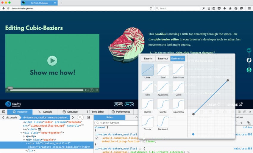
The curve editor built into the Firefox Developer Edition browser
Fortunately, the folks building developer tools at browsers like Firefox and Chrome are growing more and more aware of this need and have started building animation tools into the browsers themselves.
Of course, a knowledge coding is still a must, but we’re finally starting to be able to manipulate those animations in real time. It’s a heartening step forward.
I think many people think that web animation is all about UI-related animation: buttons pulsing, text animating, etc. But that’s just the tip of the iceberg, isn’t it? What’s your personal vision for web animation?
I first started working with animation on the web to tell stories in new and unusual ways (see also Alice in Videoland
Ironically, now when I run UI animation training sessions, I pretty much show people the fun cool stuff I’ve done and say, “Don’t do this. Your corporate web app is not a video game or a Disney cartoon. Let’s look at the science behind…” then there’s an audible “aaawwwww” from someone in the back of the room.
I feel that! But even in user interfaces, animation has so much potential. And I don’t mean just swiping through apps on phones or loading a page using Google’s Material Design: There are entire interfaces we haven’t dreamed up yet that simply aren’t possible without animation and motion design.
That’s to say nothing of the immersive stories and gameplay that animation opens up. The saddest part of Flash’s fall was how many rich stories and games were utterly lost for people accessing the web on phones and tablets — which in some places is an entire generation.
There are entire interfaces we haven't dreamed up yet that simply aren't possible without animation and motion design.
There are interactive web comics that future generations just won’t know about or be able to access. And that loss of art is a real shame.
I think we’ll probably look back at the Era of Flash as a dead zone of some kinds of creativity, where only people running emulators will be able to remember what was there. It happened with DOS video games. They just leave the popular subconscious while things like books, films, stay around for generations because each generation has as easy access to them as the last.
What’s more sad is I still see young people making things with Flash, gorgeous things, and they need an alternative way to express themselves that time won’t forget.
For me, the most exciting thing about web animation, as a creative person, is it will be forward-compatible until browsers stop reading HTML and JavaScript. I don’t know when or if that will ever happen.
So you can make something for the web, and hopefully it will be there for generation after generation to enjoy, minimal upkeep required. You can package it up and distribute it as an app, get it on as many devices as possible, thus ensuring it will survive for an even longer time.
It’s fantastic. It’s universal. It doesn’t rely on one big company playing nice with other big companies.
Okay, so let’s talk about DevTools Challenger. Um, what is it exactly?
DevTools Challenger is an interactive journey under the sea that teaches folks about animals living at the bottom of the ocean and how to use Firefox Developer Edition’s suite of web animation tools. As you “dive,” you pass different creatures and solve animation puzzles.
Why did Mozilla commission you to create the site?
Mozilla had a slew of new animation tools for Firefox and a big promotional campaign coming up. They wanted to give these tools the fanfare they deserved while also reaching out to people outside the Firefox world excited, folks like motion designers and interaction developers.
It's fantastic. It's universal. It doesn't rely on one big company playing nice with other big companies.
They wanted to reach people who really care about these tools and whose workflows are going to change the most because of them. And for that, they wanted to take a special approach.
They came to me specifically because I have a combination of skills: I can get web animations to do seemingly impossible things, tell great stories, and can teach anyone anything. Perfect team up.
What is the ideal experience that a user would have with the site? What’s the dream outcome, in other words?
For Mozilla, the ideal is visitors come, download Firefox Developer Edition, test drive the tools, and it changes their workflow and/or helps them make awesome things for the web they couldn’t have made before.
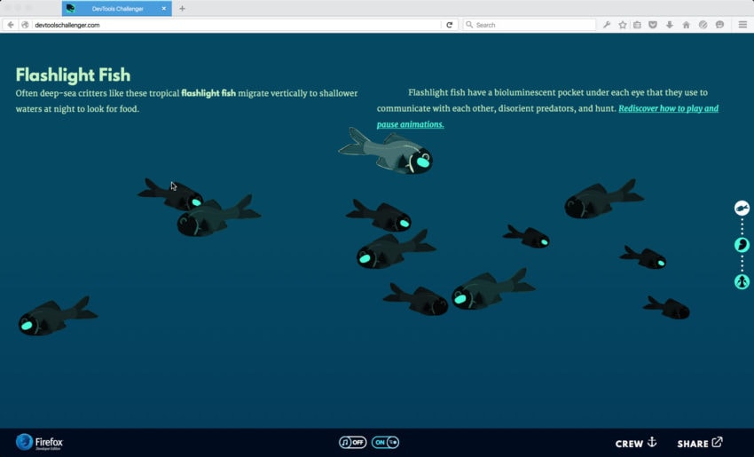
Learning to stop/start animations with flashlight fish
For me, I want people to be able to complete each puzzle and come away feeling empowered to use animation in the browser and have an amazing deep sea adventure.
(As a reward for such brave souls, the ending features a link to the Spotify playlist I composed and listened to relentlessly during the project.)
It looks like you had a lot of fun with this one. The deep sea idea was yours, right?
Absolutely! Originally, Mozilla’s Jenn Fong approached me and suggested a deep space theme. (By the way, Jenn Fong did all the audio design on this, and you should totally put on your headphones and turn up the volume.)
I felt like space had been done already by Google and Microsoft — it was just so tired. I knew Jenn was waiting for me to counter with an idea I could run with.
Given the aggressive timeline and the scope of the project, I needed something I was already familiar with and inspired by.
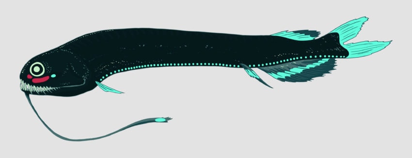
Dragonfish
As we were talking, it hit me: as a teen wandering the library’s kids section, I found an evil looking picture book of deep sea monsters, photographs from submersible missions: blackened viperfish, eery anglers, jellies that glowed red because few animals that deep can see that part of the spectrum.
I ended up reading every book my library system had on deep sea ecology, filing each creature away in the back of my mind for future reference. If those creatures had captured my imagination so completely, what could they do if they were moving?
The Mozillians loved it! Along the way, we ended up weaving in references to The Life Aquatic, Operation Neptune, Treasure Planet, James Cameron’s Challenger submersible (which utterly captures the imagination).
If those creatures had captured my imagination so completely, what could they do if they were moving?
The thing is full of subtle nautical riffs and homages (and a few bad puns). I’ve lost count of them all. But it’s also full of fascinating ocean facts, deep knowledge gleaned from the work of marine biologists over the past fifteen years.
After we finished the project, I thought, wow, here’s this thing that wasn’t here before. A lot of the people using it will never have heard of these fish and “monsters” before. This could change their lives the same way all those library books about deep sea critters impacted me growing up.
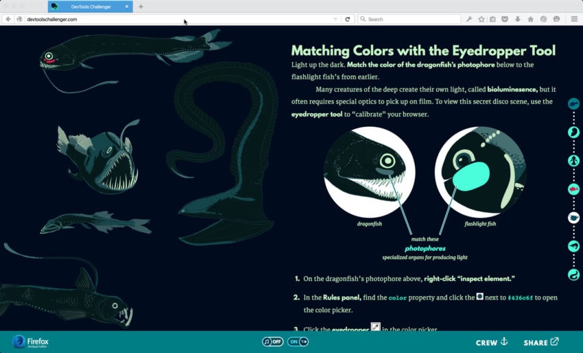
The folks at Mozilla dug that angle, that this wasn’t just a puff piece; that it had a multi-layered purpose, a higher purpose, a reason for existing beyond the politics of browser development. The project was small, but its aim was truly epic.
Are there any easter eggs in the site? No spoilers, just… you know, let us know if we should be looking for something. :)
Here’s a hint: There’s an animation on the page that you can run if you snoop around with the animation tools like the puzzles show you.
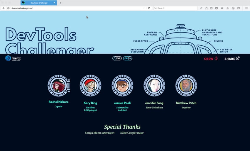
Screen capture of the credits section for Dev Tools Challenger
I’ve promised that the first person to tweet me @RachelNabors me a screenshot of that animation, I’ll draw them as my first mate.


