By Elliott Chaffer, Executive Creative Director, Trollbäck+Company
Them: Covenant is the first season in a thriller anthology about racism, redlining, and supernatural violence. Set in the 1950s, the series follows a black family who moves to the all-white neighborhood of East Compton. The result highlights the real prejudice, fear, and division of that period, issues that continue to impact America today.
After becoming immersed in the show and reading the Director’s bible from Little Marvin (the writer and creator), our team felt so many emotions, from upset to outrage and disgust. These feelings powered our drive to deliver work that both respected and did justice to his vision. We instantly knew this would be a crucial series, and when the brief came to us, George Floyd was still alive.
[sp_wpcarousel id=”72411″]
Our initial concepts
We wanted to capture the complex and emotional tone of the series in the title sequence. After analyzing the shooting styles and visual cues, we were drawn to the shots of the maps and the covenants hidden in the property contracts that restricted black people from buying homes in white neighborhoods. We centered the narrative around the zoning, the maps, and the people affected by it.
Our initial concepts were focused on red lines crossing out and connecting to reflect the real redlining taking place, and the idea of redacting and excluding information, as it’s a central theme in the series.
These were well received by Little Marvin, but he wanted us to create a more palpable feeling of tension. He mentioned Saul Bass’s title sequence for Seconds and his iconic titles for Vertigo and Cape Fear. Little Marvin’s inspiration was evident when he asked us to think: WWSBD (What Would Saul Bass Do) throughout the project.
With this in mind, we experimented further, but the decision was made to return to where we began; leaning into the notion that this should look and feel like a title sequence made in the era, and as such, unleashing unique capabilities that only this type of show calls for.
[sp_wpcarousel id=”72392″]
Behind the scenes
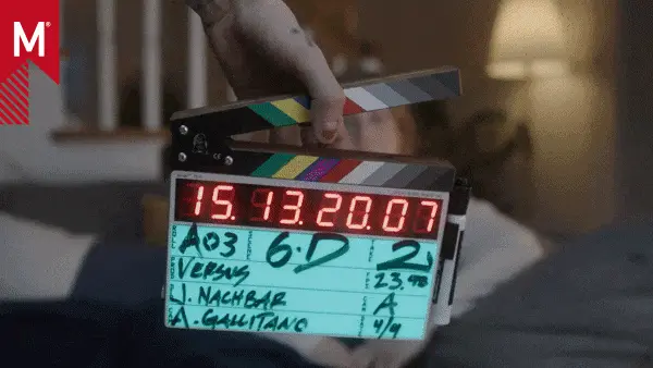
To capture an authentic 1950s feel, we made the credits by hand and shot the sequence in-camera. It was a creative, collaborative process. We worked with our longtime collaborator and friend Christopher Webb at FX WRX – he’s a true master of his craft and has an extensive collection of old lenses and grip equipment that he painstakingly maintains and customizes. He created incredible Lego models to figure out how to get the most out of each camera setup and communicate that to directors and producers. It was a fun way to map out the camera rigs as it’s much more interactive than drawing out each setup.
Together we experimented with stop-motion animation, paper play, shadow work, and film degradation. Old overhead projectors were sourced and brought in, and the text was cut by hand onto butcher paper and other surfaces, so we could play around with textures and create different moods. There was a real synergy between the dramatic elements of cinematography and such graphical work. We set about using the map-scapes to capture a foreboding sense of evil plans in motion; when we swung our macro probe lens low over the giant map and then swung our light towards the lens, it created moving shadows that rushed towards the camera. Chris put it eloquently when he said, “It feels a bit like a wave on the ocean at night. It’s beautiful but equally scary”.
Shooting in-camera allowed us to have human interactions with the scenes, for example, the hand that comes into the frame and puts a pin in Palmer Drive. Adding in the hand-weathered photographs brought texture and kept the sequence grounded in reality. This style extended to the production cards for Amazon and Sony that were animated in a style evocative of the optical printing techniques used at the time.
The finished sequence
It was challenging to create so many elements by hand and shoot in-camera, especially during the pandemic, adhering to all guidelines: limiting staff to ten people and keeping 6 feet apart. But it was exciting to finally see the titles and graphic package in the show and used on trailers and social channels.
We worked on the titles amid nationwide protests and government oppression, so this project felt profoundly relevant. Our team feels so proud to have been associated with a show that tells such an important story.
Check out the final sequence here:


