


ANIMATION STUDIO ANIMADE CELEBRATES TEN YEARS WITH REBRAND BY KOTO
PRESS RELEASE BELOW
When Animade opened its doors in 2010, we set out to make the world a bit more characterful. Now, ten years on, we felt it was a good time to reflect on where we’ve been, where we are now and where we want to go. So, a rebrand project was born!
We brought design studio Koto on board and got to work. But what we thought would be a straightforward refresh became a real journey of reflection and rediscovery – a chance to refocus in our own heads what makes us tick and why.
A lot of it came down to reaffirming what we already knew. We stripped things back to the essentials – that’s what we like to do with animation, after all. We wanted to use the rebrand as a chance to better represent our values: to be passionate and curious in everything we do, to keep learning through play, to be supportive within the creative community, open and honest.
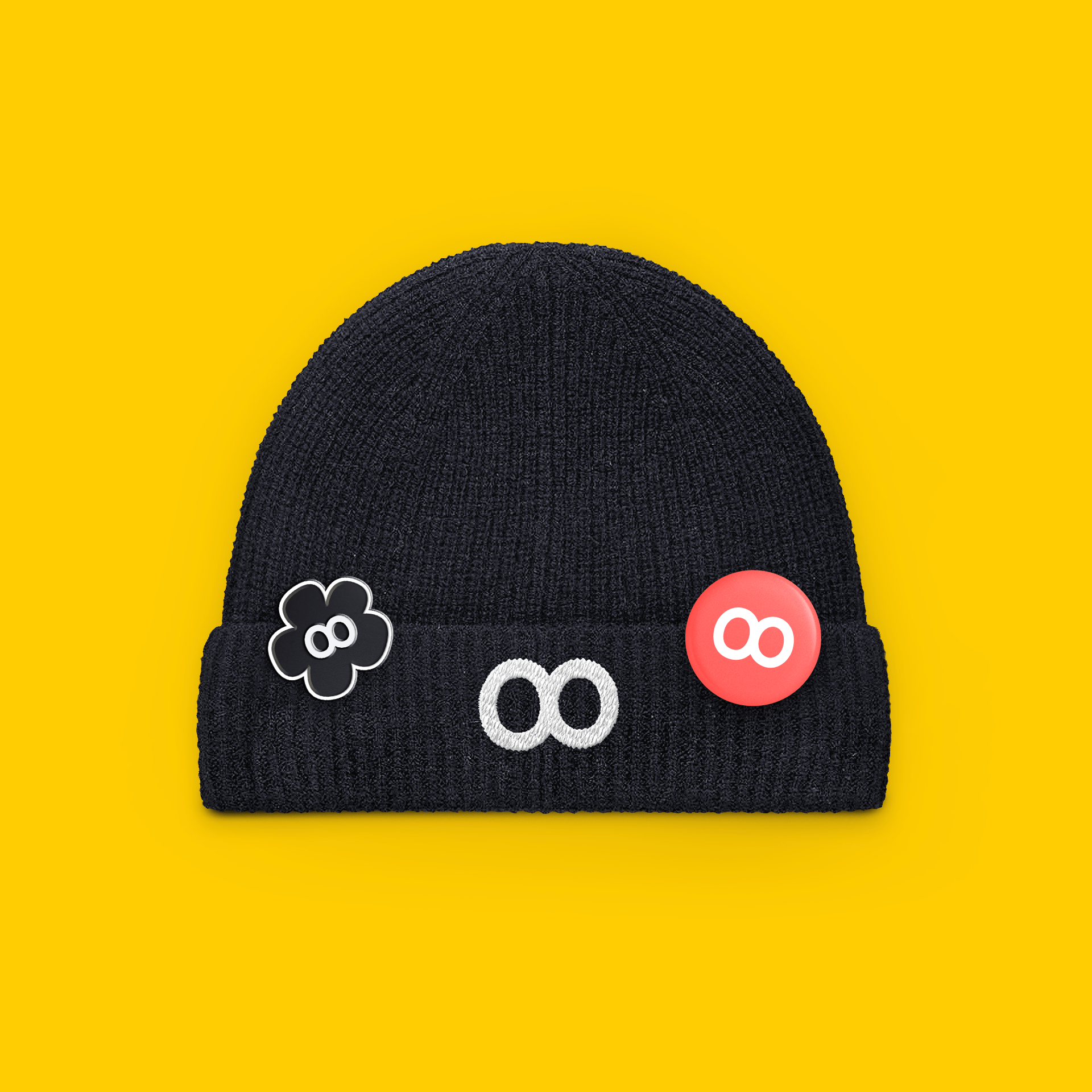
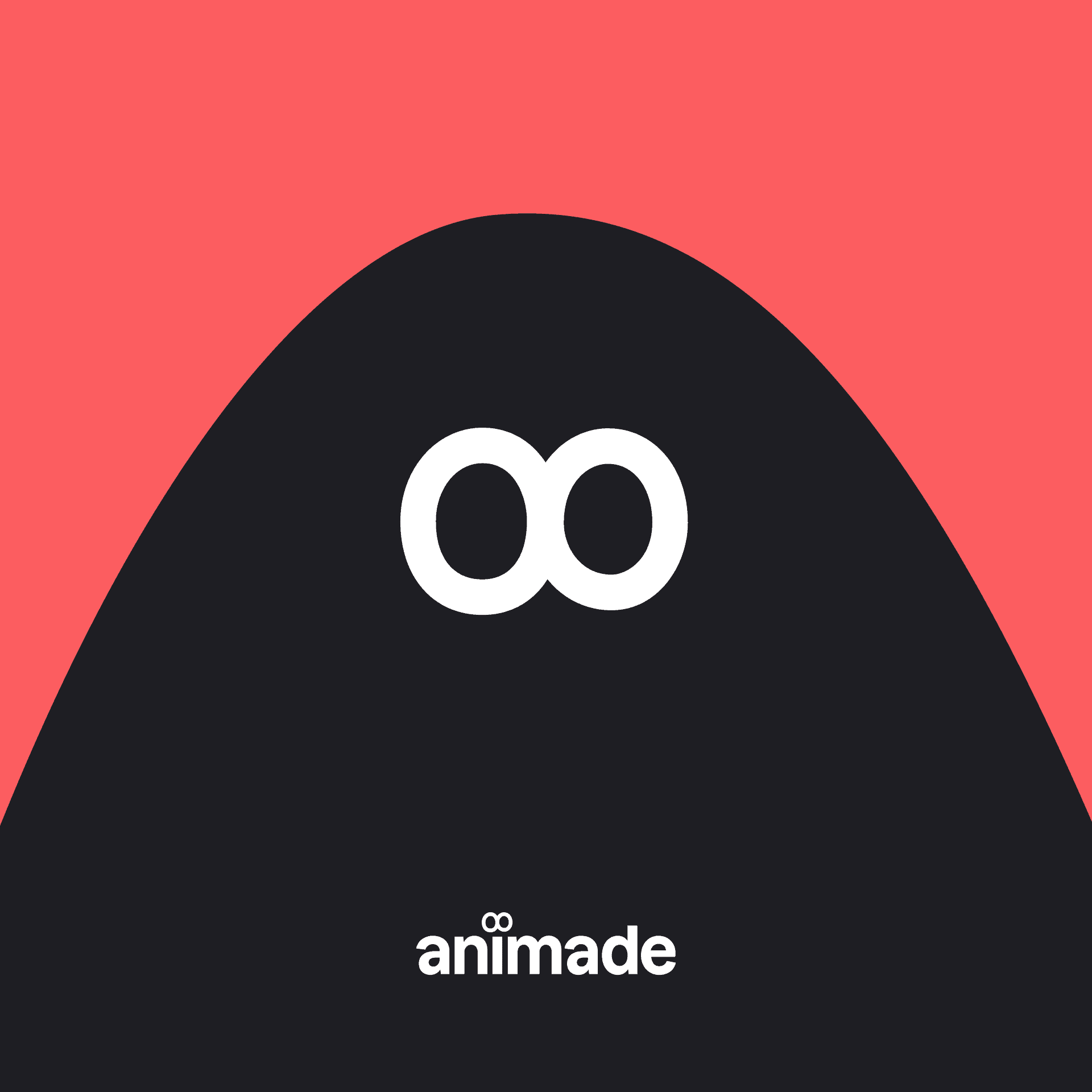
We thought about a totally new logo but decided we didn’t want to deviate too far from the one we’ve grown with – it reflects the natural evolution of us as a studio. So, the old infinity loop has become a looser, more hand-drawn pair of circles which sit above the ‘i’ like an inquisitive pair of eyes. We realised that the eyes were always there, hidden in plain sight. It took this process to finally bring them out to play!
As part of the new logo lock-up, we’re using the sans-serif typeface Dazzed by Prague-based type foundry Displaay. It combines strength and simplicity with more quirky and fun elements – a bit like the typographical version of us.
The new website is a space for us to showcase lots of our projects, and it’s here that people can get a real sense of who Animade are. With the new Play page, we’re excited by the fact we’ve got a proper home for the ‘play projects’ we hold so dear. In fact the whole process has given us a reinvigorated confidence in these projects, and how they benefit our culture and our work in a way that is sometimes hard to measure. We make time for our team to learn through play, and we’re always learning. The rebrand needed to capture that.
We’ve used an adapted version of the Dazzed typeface throughout, while our playful logomark pops up all over the site in free-form shapes, creating a happy cast of characters on every page. The colour palette across the site and all communications leads with the studio’s signature red and is boosted by a playful set of bright colours, balanced out by black and white for logos and text.
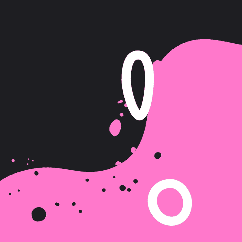
And for the launch we’ve made an animated film to really dial up the celebrations. Acting as a visual introduction to the rebrand, the film bounces with the energy, passion and curiosity that Animade pours into every project, with the stripped-down simplicity that we love. Bringing the logomark to life, the film sees two single circles pinging their way through a colourful world before eventually coming together over the Animade logo.
Tom Judd director of Animade, says: “For us, the rebrand is more than just a new take on our logo and website. It’s the refocus on our openness with the industry and our followers, a renewed energy in our playtime projects, and a realisation of how the work we’re doing always matters, even when it can’t be measured in hits, likes or reshares.”
Koto has also created a set of style guidelines to bring clarity to the rebrand, which we’re continuing to build on. The guidelines combine the more functional elements of our website like the typeface and our tone of voice along with the more adaptable, fluid shapes and bright colours in the brand film.
This is the first time we’ve brought in an external agency for a rebrand and we’ve loved having the opportunity to get a fresh perspective on Animade. Koto’s creative director Tim Williams says of the project: “We’ve been fans of Animade’s work for a long time so it was a pleasure to work with them. Their culture and creative approach aligns closely with ours, which meant we could work very openly and collaboratively.”
Jen Judd, Animade’s managing director says of the rebrand: “Animade’s new bright and bold visual identity puts characterful creative at the heart, which is fitting, because it’s what we’ve been doing since the start. It’s a testament to everyone who has and continues to shape us – from our past and present Animaders to our clients, interns, freelancers, Fanimades and the incredible creative community around us. Your support drives us to be better, so thank you. We promise to make the next chapter as bursting with passion and energy as the last.”