AICP MoMA show sponsor sequence

ds

An entertaining piece of work by the new motion design devision of Version2. Very well executed. It was created for the 15th annual AICP show, the Art & Technique of the American Commercial, which debuted tonight at the Museum of Modern Art in New York City.

According to Lydia Holness, motion graphics and design head of production, ‘First and foremost, we wanted to make this feel like an art piece in its own right, something appropriate for the MoMA and AICP. On another level, this sends the message that there’s a new motion graphics company on the street in NY, a company quite worthy of its peers.’

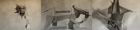
Art Director Federico Saenz commented, ‘As you watch the branding images flow from one in and around the next, it could be stop motion, photography, 3D, 2D, or hand drawing — it’s hard to tell. Our only constraint was time to create and implement interconnection between sponsors and motion. This has been a truly engaging process from start to finish.’

Indeed. The dragon and the millenium falcon rock. Nice job. And welcome to the industry.

Watch it

9 Comments

Sjoerd

It looks so gooooddddd…

I love some of the transistions..

Its really lovely done!

kinojay33

Gorgeous piece; the flow is incredible & I really love the stop-motion/organic look.

david lewandowski

Alof of the folding and techniques used to transistion are very effective & fluid. Great art direction, the tone of it coupled with the music really scoot right along.

Niels Fyrst

I’m amazed, this piece is the best I have seen for a long time.

DLY DLRS

very nice, this thing begins where regina spektor’s thing ended
https://hornetinc.com/samson_flash/flash_samson.html

renascent

pretty cool indeed.
still feel SOL’s aicp piece is the best ive seen for the opens https://www.boardsmag.com/screeningroom/shortfilm/1431/

mark

one of the best clips this year. (my top favorite so far)

mark

oh btw. don’t agree with you on that one renascent. the clip on the link you provided looks rather average, crappy compared to version2. this one is a lot more sophisticated and the way it reveals the logos.

fiercecurry

Its a shame that this technique and style is wasted on something that is nothing more than a sponsor list. Would love to have seen this in a music video or a short film, something with substance. But I guess someone else will copy it and do it eventually, or the studio will repeat themselves at one point for the right project. Thats the way it goes.

Comments are closed.