Leroy and Clarkson for Bio

I’ve noticed that, by and large, motion graphics students don’t “get” network packaging. Yeah, they love flashy promos all blinged out to catch viewers’ eyeballs amongst a sea of shiny, sparkly movement. But when it comes to celebrating solid network packages, the only fans seem to be the crickets.

Maybe it’s because quality network packaging skews a little more towards graphic design than balls-to-the-wall mograph. Legibility is key. Readers need to actually read and comprehend a slate of shows or a lower-third or a mortise in order for them to be effective. And figurative legibility—how clearly the network’s identity can be “read” across its programming—is even more important, regardless of how unsexy it might be.

bio.jpg

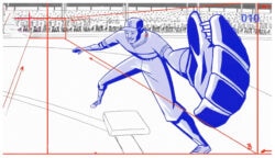
A solid example of what I’m talking about is this new package from Leroy and Clarkson for The Biography Channel’s revamped image as simply “Bio.” L&C rock all the graphic design angles: negative space, scale, judicious use of grid systems, repetition, vibrant but not excruciating chromatic contrasts—you get the idea.

The package’s clean lines and snappy animation imbue Bio with a friendly but sophisticated personality—the kind of branding that’s worth big bucks, even if it doesn’t jump right out and demand them.

About the author

Justin Cone

/ justincone.com
Together with Carlos El Asmar, Justin co-founded Motionographer, F5 and The Motion Awards. He currently lives in Austin, Texas with is wife, son and fluffball of a dog. Before taking on Motionographer full-time, Justin worked in various capacities at Psyop, NBC-Universal, Apple, Adobe and SCAD.

10 Comments

Douglas

More graphic design, less sparkles.

freebertbrown

wasn’t it like TLC or TNT or TBS that started this type of thing?

monovich

nice stuff. it’s tough to cut through all the beautiful noise these days, so perhaps something understated is the best way to set yourself apart.

rizzojn

I love the work. Great typography. It is difficult to hate something so simple but smooth and sophisticated.

kina

I love this kind of work. Simple and good color match ..

THA_DON

i actually kinda like it.
clever. grown up. cool.

THA_DON

Lack of lens flare leaves me wondering if this can be categorized as motion graphics ;-)

dadallas

This is beautiful graphic design. Would be cool if we could see more work like this. The flashy Trapcode shine and lens flare stuff is rad but it easily gets old.

JSGarrett1976

I must agree, very beautiful. Strong typography in the L&C design, but I do know the old internal design team at the National Geographic Channel did a similar style/design/animation to their most recent re-design a solid 3 months ago…with exceptional results.

sc

damn, they’re runnin a clinic on crispy clean here. love it

Comments are closed.