Adam Berg/Stink Digital for Philips

philips
Created for Tribal DDB, Amsterdam, Stink Digital and Director Adam Berg deliver this interactive campaign for Philips’ new CINEMA 21:9 TV. The cinematic proportions of the display became the theme of this piece. Adam responded with an idea for an epic ‘frozen moment’ cops and robbers shootout sequence.

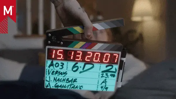
This 2:19 film runs as an endless loop, allowing viewers to control their moves through the scene. The film also contains embedded hotspots, which, when triggered, give us a behind-the-scenes look at some of the shots.

Yes, this film does share some creative similarities with pieces we’ve posted in the past. However, it is the mode of distribution that’s really got me excited as the frequency of these types of projects are increasing.

As many feared the death of the traditional spot, others embraced the web’s potential to distribute longer form content. Not only longer form, but branded stories where directors and production companies had more of a front seat role. Adam had the opportunity to make a short-film which is quite far removed from the brand who funded it — and promotes them better than any product or tech-centric spot. This is an exciting time for story-tellers of all mediums.

AGENCY
Tribal DDB, Amsterdam
Global Creative Director: Neil Dawson
CD: Chris Baylis
Senior Project Manager: John Reardon
Producer: Jeroen Jedeloo, Iwona Echt
Art Director: Mariota Essery, Andrew Ferguson
Copywriter: Carla Madden, Chris Baylis
Account Planner: Sean Chambers
Technical Lead: Jan Willem Penterman

FILM
Production Company: Stink Digital
Executive Producer: Mark Pytlik, Daniel Bergmann, Stephen Brierley
Producer: Simon Eakhurst, Stephen Brierley
Director: Adam Berg
DoP: Fredrik Backar

Service Facilities: Stillking, Prague
Stillking Line Producer: Zuzana de Pagter
1st AD: Jiri Ostry
Production Designer: Petr Kunc
Czech Production Manager : Jiri Kotlas
Stunt Co-Ordinator: Lada Lahoda @ Filmca

Editor: Paul Hardcastle @ Trim
VFX: Redrum, Stockholm
Post Production Supervisor: Richard Lyons
Music & Sound Design: Michael Fakesch
Additional Sound Design: Tim Davis
Colorist: Jean-Clement Soret @ MPC London
UK Production Manager: Jemma Daniel

INTERACTIVE
Production Company: Stink Digital
Executive Producer: Mark Pytlik
Project Manager: Christophe Taddei
Lead Developer: Ian McGregor
Key Developers: Vincent Roman, Jamie Copeland, Matt Sweetman
Additional Development: Pierre L. Thiebaut
Design: Eric Chia
Title Sequence & Trailer: Maximiliano Chanan, Odin Church

Tags: ,

About the author

Matt Lambert

/ www.dielamb.com
NYC / London

18 Comments

Marc B.

Wowie Wow Wow.

That was (censored) impressive!

If making-of’s make sense it’s for pieces like this. I wanna see!!!

StbN

OMG!! This is the best thing I ever seen!!
It’s f****ing brilliant!!!

Tyquane

Yea thats amazing. The production quality dope and the bullet time fx is seamless. They executed this concept well.

Awesome post.

xpez2000

Is this a trailer for a movie?

kentoyam

that is f****ing al pacino…!

bombasticinc

amazing…well done!

ktx

mindblowing :O

ocelot

as much as i hate to be the guy again who ‘doesnt get it’ but… what is this about.
“They executed this concept well. ”
what concept ? what part of this spot (that is produced quite flawlessly though reminiscent of swordfish https://www.youtube.com/watch?v=Z2Zvz1v7Hig ) relates to a tv in any way. besides being able to switch between 21:9 and 16:9

newplasticmachine

Why would this piece have to “relate to a tv” for you to demo its 2 main features? A number purposes have been served here, it gave an incredible team of creatives the opportunity to make an amazing piece of film, it demos the features of the television clearly AND its something I want to watch for the sheer enjoyment of it. The latter reason, that the viewer benefits by being incredibly entertained, will draw more people to the piece therefore achieving the objective of advertising. Smart. Expect to see more of this strategy. Advertising that people choose to watch instead of choose to ignore. So to answer your question, the entire site / experience had everything to do with the TV, the piece that you watched rewarded you for your time.
And piss off on the Swordfish reference. Are you trying to imply an origin to their idea? That is an incredibly off base and petty comment.

ocelot

haha wow. all i wanted to do was start an intelligent discussion and i get told to “piss off”. guess you are all quite protective of your tv ad.
personally i switched off halfway through cause the freeze gimmick had overstayed its welcome.

carry on lads.

500

I think it more about the “viewing experience”. The ambient light that the TV gives off. And watching this clip is an experience. You cant be serious to compare this to swordfish?

xpez2000

The 21:9 aspect ratio gives you LESS picture.

16×9 is better because the picture is taller and more movies are shot for 1.85 projection which is a closer ratio to 16×9 as well as broadcast HDTV.

This aspect ratio is only ideal for a small percentage of films.

MARCREA

When a fantastic concept meets flawless execution, this is what you get. Not only do I feel a strong desire to get a 21:9 TV-set, I also felt the need to forward this to some friends of mine. All this being fully aware that this is shameless advertising. But what can you do, it’s just that compelling! I wish more clients would shell out the dough and give the creative freedom to enable these kinds of productions.

max lee

wow! This is the best thing I ever seen!!

invertebrae

the fact that this amazing piece manages to create a narrative that only reveals itself toward the very end is radical.

bullet time is usually thought of a strictly a “style” thing, but the fact that we learned more and more about the scenario through the camera’s journey, up until the “A HA!” moment at the end.

just brilliant.

also, the 21:9 rectangle is just a nice wider format. it’s not better or worse per se, though it is “cinema proportioned” (2:35). 16:9 is NOT a standard for film, that is an HD standard. 16:9 is close to 1:85 (or academy) proportions. but isn’t this super wide format tasty!?

anyone have a guess on how this thing was done? i can only guess it’s 3D with a TON of modeling and texture projection!? epic!

looking forward to more adam berg work!

…ryan

invertebrae

it actually reminds me more of a sequence from CSI (on steroids) than that silly swordfish reference.

it’s sort of like CSI meets Dark Knight meets Heat meets Usual Suspects.

and yet, not.

…ryan

last-r

i apologize for my poor english level but, i see it like a metaphor about cinema. the aim of the site is to say the 21:9 proportion of the philips tv is a tribute to cinema screens proportions.
and the bullet sequence is showing us that the cop we see first is finally a robber. that is, to me a metaphor of what cinema is : just an illusion.

i’m not sure i’m clear but to my mind, that work is really great.

have a nice day.

Pete

People asking about how it was done – go to the microsite and watch the ‘interactive’ portions, it gives a fair idea, looks like a lot of the actors were strapped into place and particles, smoke, glass shards were added in post.

Pretty amazing though, it’s not often these days that you watch something and think ‘how the FUCK did they do that?’.

Comments are closed.