


About a week ago, we posted the trailer for “Logorama” by H5. As it spread across the globe, it’s been gaining steam and hitting the festival circuit in a major way.
On that note, we’re delighted to bring you a in-depth review of this piece by Mark Webster (journalist, writer and occasional sound designer). He’s a very knowledgeable and all-around stand-up fellow and we’red please to have this guest contribution from him. Thanks Mark!
There’s been a lot of talk recently about the new animated film, Logorama created and directed by the French design collective, H5. Its particularity, as we all know by now, is that not only does it star the evil killer Ronald McDonald, who is pursued by a bunch of fat Michelin Men cops, it is indeed a film created entirely from logos.
Backgrounds, characters and props are all an incarnation of the pervasive commercial sign, the untouchable symbols of the industrial and financial powers. The film has already been well received by the select few, picking up an award this year at Cannes, screened at onedotzero in London recently and set for a number of international tours in the cultural sector. The particularity of Logorama is of course its road to possible success. It’s fresh, provocative and for some, utterly daring. But the burning question remains. Why the hell did they make a 15 minute animated film using only logos?
H5 are three creatives; Hervé de Crecy, François Alaux and Ludovic Houplain. Set up in 1996 as a graphic design studio, they started out making album cover designs for a number of electronica artists, helping to fuel the ‘french touch’ scene which from 1997 was gaining international attention. Their reputation as designers in the music scene soon attracted attention and when their first music video for Alex Gopher, The Child hit the scene, it was the beginning of a love affair with animation and the narrative possibilities of bringing together what they were good at; creating graphic infused visuals with a strong sensibility to music.
Logorama took gestation as an idea, as early as 2003. There is a telling and funny anecdote in the early stages when H5 first approached a producer with the idea. He said, “So you wanna make a film out of false logos? That’s gonna take some time.” “Oh no, not false ones, real ones,” they replied. To which the producer responded along the lines of, “You gotta be fucking crazy!” They went along with the project nevertheless and indeed found an eventual producer via the French company, Autour de Minuit.. More than four years in the making, on and off that is, and despite its non-commercial value, it had received a lot of positive backing. One of which came from the French post-production giant Mikros Image who worked with H5 for two and half years on the animation and compositing.
The film is not just a haphazard amalgamation of commercial symbols though. It is a carefully instigated scenario that took on challenging artistic as well as technical decisions. A number of interesting factors determined their choice of logos. Some were self evident, in their eyes: Ronald McDonald was going to be the bad ass gangster because clowns are frightening and there was a particular inspiration from the Joker in Batman. The Michelin Men were to be the cops because, well, as H5 say, American cops are fat. Others were chosen purely for their graphic form and generic nature. For example, passer-byes were to be represented by AOL, children by the Bic pen logo and van drivers all have moustaches so Mr. Pringle took on that role.
Beyond these initial choices however, there were considerable possibilities for play and of course subversion of these strongly emblematic symbols. The beauty of any personal project like this is that one is free to express oneself. The delight of play however in Logorama is magnified by the fact that logos and symbolism are heavily policed when it comes to working in the commercial world. So, outside of that restraining context, H5 found themselves with a virgin graphic playground that few, if not no one to date has touched upon.
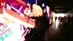
And it is this dimension, the graphic and symbolic, which gives the film a completely new and in this case dominant narrative which has you searching for the subtleties: The Quicktime wall clock; the Energizer street lamps; the 007 guns and homage to Maurice Binder’s barrel shot; KFC getting flattened by the beef jerky store, Slim Jim; and Ronald McDonald being taken out by Weight Watchers. Suffice to say that everyone’s reading of the film is quite different.
So, is Logorama an iconoclastic film or was it simply an artistic challenge? There is an underlying trend throughout H5’s portfolio that has proven successful in their ability to create thought provoking work – The principle of remixing established graphic codes. H5 enjoy the challenge of taking graphic symbols and signs and placing them in new situations. It is exactly what they did for one of their earlier album covers – Super Discount – a simple yet striking image which uses the typographic language of supermarkets as the cover design for an album. The music video, The Child has of course a strong resemblance with ‘ Logorama in that it too was created from purely graphic elements – everything being made up of typographic fonts.
They continued with Remind Me for Royksopp, subverting the graphic language of user manuals and info graphics to tell the story of a worker’s day and cleverly ‘reminding us’ of the multitude of graphics in our everyday lives. H5 like to play with that material, displacing common codes and consequently making us question their meanings or communicative value.
If you took every graphic sign away from a main city street, you’d be faced with a pretty glum scene. Imagine for a moment; road signs, street and shop names, posters, advertisements, logos, signage, – all gone. It’s a difficult thought to process, especially if you are not coming from the visual arts. The exercise proves a point though: Graphic symbols and signs are everywhere. They are such an integral part of our everyday visual landscape yet for the majority of people, the general public that is, graphics are somewhat a bit like the weather – its just there. We can talk about it on a primary level, make it a subject of conversation. Yet how many of us actually stop and try to understand the design that goes on around us instead of simply just consuming it?
In this sense, Logorama is a cleverly instigated critique of our times. We live in a world fueled with the signatures of commerce and consumption, where everyday symbols are imprinted in our collective memories, nagging away on the subconscious, hand in pocket and ready to draw the wallet. It is within this context that H5 go far beyond a simple exercise in artistic defiance. This is the beauty of their work; they transgress the graphic codes of our everyday experience, placing them within a completely different context and one that sufficiently sparks food for thought.
Mark Webster