Pink Panther Title Sequence

Paris-based animators Olivier Kuntzel and Florence Deygas worked with character animators at Nexus Productions in London to produce a witty, elegant title sequence for the recently released Pink Panther DVD.

pink.jpg

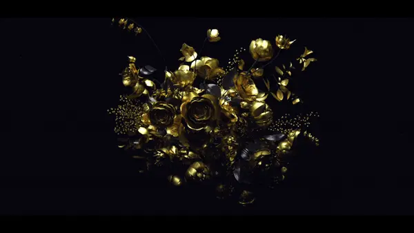
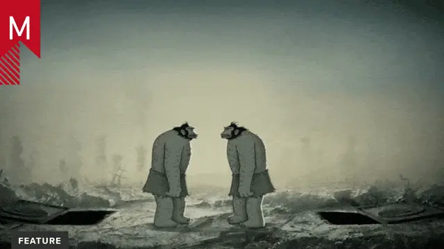
In addition to some excellent character animation, the sequence is brimming with creative transitions and design elements buoyed by a loose narrative as we follow the Panther through a Bond-ish world of European luxury and sophistication. The visuals perfectly complement Mancini’s classic soundtrack.

About the author

Justin Cone

/ justincone.com
Together with Carlos El Asmar, Justin co-founded Motionographer, F5 and The Motion Awards. He currently lives in Austin, Texas with is wife, son and fluffball of a dog. Before taking on Motionographer full-time, Justin worked in various capacities at Psyop, NBC-Universal, Apple, Adobe and SCAD.

6 Comments

maxluc

I find it quite a pity they decided to lose the graphic style of the old TV series & feature film titles. I was surprised to find that Kuntzel & Deygas also produced the opening titles for “Catch Me If You Can” (also to be seen at https://www.nexuslondon.com ). That look & feel might IMHO have been more suitable here.

PlayingKarrde

I was just about to say the exact same thing as maxluc. While this is really great, I don’t see the need to move away from the original style. They’ve proven that the style works with Catch Me if you Can, so why move into 3D? No reason.

I’d have prefered a more classy 2D look like the originals, but I guess, with Steve Martin as Inspector Clouseau and Beyonce in the movie, you can’t really keep the style and finesse the original movies had.

RIP the panther.

PlayingKarrde

OK, I guess you can tell that I hadn’t seen the movie not knowing that the theatrical release was actually more like the original. Or at least it would appear so after reading this on IMDB:

“Originally, the animated title sequence was going to be done in CGI, but the filmmakers decided to stick to traditional, hand-drawn animation instead. The animation was directed by Bob Kurtz, who had worked on some of the Pink Panther shorts.”

powermac

Great work! Old classic in new.

SNDK.NO

Agrea with powermac, Great work anyhow!
Im not sure if I have any arguments on classic or 3d style.

On a side note. My kids (two girls 4 and 5 years old), LOVE Tom and Jerry and they have all the classics on their PSP`s, but they HATE the 3D ones. New is not always better even for todays kids.!

powermac

I hope, that one day will have 3d same impression like cartoon. I think, that all is only about right art style, how to improve cheap 3d.

Comments are closed.