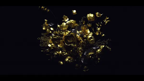
Trace Pictures: Shark Hunters

Sometimes you don’t have to reinvent the wheel, you just have to make the wheel betterâ€â€?say, maybe by adding some broken glass and heavy metal music.

trace.jpg

Trace Picture’s opener for Shark Hunters isn’t using any visual devices you haven’t seen before, but the way they pulled everything together is fantastically effective. The editing, music and visuals all conspire to create a palpable sense of excitement. (And I don’t get excited by show openers very easily.)

About the author

Justin Cone

/ justincone.com
Together with Carlos El Asmar, Justin co-founded Motionographer, F5 and The Motion Awards. He currently lives in Austin, Texas with is wife, son and fluffball of a dog. Before taking on Motionographer full-time, Justin worked in various capacities at Psyop, NBC-Universal, Apple, Adobe and SCAD.

5 Comments

THA_DON

very nice, although i beg to differ on the music… it is beyond garbage, (actual stupidity) although i will say different strokes for different folks i suppose, people actualy listen to that kinda stuff, so there has to be an art form to it i guess.

Graphics are cool however.

Pocky

Graphics are…..nice – afraid it didn’t grab me as it probably did you.

a77

I think a lot of us are burnt out on show openers by this time of year (mostly from working on them). I think metal has a place on tv but I cant imagine that track was more than just some stuck piece grabbed off a cd.. it works with the content but I think its pretty weak.. the use of 3d in the piece was pretty unnecessary as far as I can tell but all in all – its sharks week – so its supposed to be loud fast and edgy.

garryt

The hardest part about creating this open was dressing all our designers up in shark suits for the greenscreen shoot and then convincing them that the sharp hooks and gaffing would only sting for a second.

Sometimes it’s nice to get out of the studio.

spicoli

shardy goodness. dave rawks!

Comments are closed.