PetPunk’s Spring Reel

petpunk.jpg

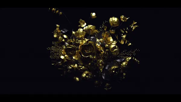
PetPunk’s recently updated spring reel is chop full of interesting work. The most evident aspect of it though is the obvious lack of color. This nontraditional approach to a showreel forces the viewer to be more aware of different things, like composition and pattern, instead of being drawn to popping colors. But does their decision to make the reel black and white work, or does it make the original work less interesting?

You decide.

On a side note, not sure if this is old news or not, but they seemed to have set up some streaming webcams up on their site, one actually giving us a view of the men at work. No picking your noses gentlemen, the world is watching.

About the author

Jon Saunders

/ www.jonsaunders.tv
internet surfer/designer extraordinaire

5 Comments

finn mckenty

It’s an interesting idea, but when I’m evaluating designers that I might want to use, their sensitivity to color is one of the most important things I look for. So while there’s some “gee-whiz” value to this approach, ultimately it makes it harder for me to judge whether I would want to use them or not.

brandj

You can always look at the full original pieces and not just their montage. That might help you judge their approach to entire pieces as well. Reels are really just there to condense a body of work into a bite-sized piece …

oyvindronning

Yea I don’t mind they having it in b/w. I like their work a lot and when it’s all b/w, the reel becomes more of a “one product thing” even though it’s a collection of work.

Nifty music too :)

electric

yeah i’m digging it. i’ve always sort of been against the montage reel thing cause it condenses hard work for those “too busy” to pay attention to anything over two minutes long. it’s a necessary evil, but PetPunk seems to be drawing attention to its usage here- making you watch the individual spots, making it into one solid piece, and essentially giving it an otherwise sterile sampling of work it’s own life and feel. i found myself watching it a few times for the transitions alone. i don’t usually do that with reel montages.

sc

finn makes a good point. however, distilling out the moody color schemes does seem to reveal more of their talent and technique…
this idea may catch on, but when all is said and done, i still think, in most cases, showing off your color skills is very important.

Comments are closed.