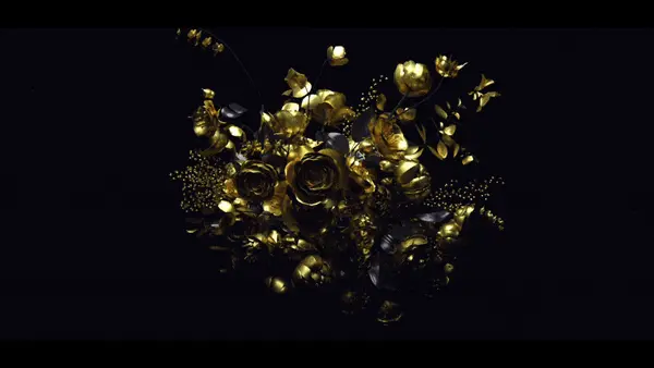
 Superfad just dropped this….umm super rad spot for Playstation 3. Really solid 3d work. Makes me want to break something.
I had a chance to talk with Superfad and get a little background on this project. Here is what they had to say:
What was the original concept that you received from TBWAChiatDay?
The original concept that TBWA/Chiat/Day approached us with was titled, “PlayStation3 Unleashed. The core notion: The PS3 floats in a white limbo and suddenly and explosively releases its hyperbolic inner-potential. Our intent was to create an ever-changing cluster which formed itself out of the playstation itself. We were charged with the task of highlighting the myriad entertainment possibilities of the PS3 from games, to movies, to social networking etc. This idea of seamless transitions form CG to actual game play was a our goal from the beginning. Like many pitches we presented a wide variety of styles we felt were bold solutions for the scenario. Consequentially, the agency gravitated towards two different styles/concepts and we joined them into one.
Alot of this spot is about getting from the 3d shots of the black playstation universe to game footage, and the majority are done in a very seamless method. This must have effected your direction for the 3d world, would you mind explaining some of your pre-planning for these scenes?
The creative process for this project was happily organic. Portions of the sequence, specifically the transitions, were dictated by the actual game-play footage supplied to us. As the editors of the spot, we collaborated with the agency and game developers to craft scenes that integrated seamlessly.
What was the production behind this piece, also how did you get to this end concept and style?
The production of this spot was done using a combination of Maya and After Effects while the crucial editorial process lived in Final Cut Pro. We began with our basic concepts and blocked out the shots using simple shapes focusing mainly on the camera movement and transitions. In this way, we created an rough animatic with a specific edit. After that, we added our finished and highly-detailed models to the 3D compositions. One of our main challenges was creating an environment that was black, glossy and extremely energetic yet still readable. Progressively throughout, designers and animators introduced more and more engaging ideas and elements right up to the last week. As each scene improved, it created a certain amount of one-ups-manship among the team. Each moment of the piece had to live up to the next. Our evaluation of the success of the entire piece was extremely harsh and quite demanding. Thankfully, our partners at Chiat welcomed this organic process, and were quite supportive as they saw it coming to life bit by bit.


