Studio B: Adobe CS6

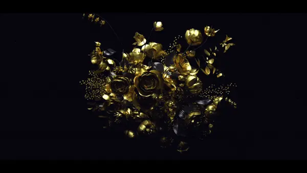
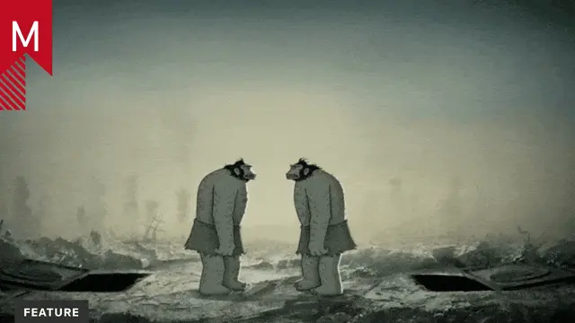
Check out Studio B Film’s beautiful spot promoting Adobe CS6 and Creative Cloud.

UPDATE: One section used in this promo is a spot created by Autofuss, entitled “Adobe: Eternal Return” (viewable below). Thank you to Colin Trenter and Flip Baber!

UPDATE: Autofuss’s official version of “Eternal Return” is now viewable below. Thanks Quba Michalski!

Studio B: Adobe CS6

Client: Adobe
Producer: Jane Selle Morgan
Creative Director: Aaron Barry
Motion Designers: Devin Earthman, Michael Rigley
Original Music Composition: johnnyrandom

About the author

Angelo Collazo

/ www.angelodcollazo.com
I am a doodling high-school artist who became a professional 3D computer animator. (Thanks SVA!) While still doodling, I have been blessed by God to work on large projects such as Psyop's Michelin Man tire campaign, Blue Sky Studio's movie "Rio", and Nick Jr's "Team Umizoomi". I also enjoy working on my own side personal projects (I aspire to be a director). Currently, I am fully enjoying a new life-chapter as a happily married man.

16 Comments

Steve

really, major post for this one? Not much happening over the christmas days I guess.

Just to clarify,this is ok technically solid work, but it’s pretty standard in my opinion

rumplestiltskin

Could you elaborate? 3:1 is hardly standard. Nor is a collaboration between studios like this. (Studio B, Autofuss, etc.)

Steve

Obviously this is just my opinion but I feel that most of the graphic content is, while very well crafted, not that exciting.

The effect it had on me was more like -that’s quite nice but I’ve seen it before.

I don’t think that an unusual aspect ratio makes a clip or film stand out either. This would probably have worked just as well in 16:9 or 1:2.35

The text here did not suggest that there was a collaboration. It just mentions Studio B. Also I feel that while collaborations are interesting, a piece being of collaborative nature does not make it special per se.

As I said, solid work. But personally I did not see it being is as strong as other pieces that got a main post.

Sam Welker

I agree. Well crafted but nothing new. They are following the industry instead of reinventing. I often get bored of what is out there because lens flares and cloned primitive objects have been done time and time again.

I have a hard time watching motion graphics because I’ve seen so much of what is popular and common that I feel nothing is new anymore.

I hope that in the new year we will see new advancements in creativity along with the technology.

rumplestiltskin

I’m assuming that you’re both animators? In which case, almost everything must look cliché? I guess the burden would be on you guys to innovate. :) Here’s a look at one of the contributions if you’re interested: http://www.autofuss.com/work/adobe-eternal-return

Steve

can’t seem to leave another reply, but this is regarding rumplestiltskins response

actually I am more of a director designer, I can animate, but others do it faster and better.

Coming from that background and having said all of the above I also know that it can be difficult to innovate on commercial projects. Lots of times it’s not the studios / art directors / animators inability to come up with something fresh, but a client / agency who wants to play things a bit safer.

In any case my main point was that I felt this was maybe more of a quicky type work than main post

Jon Malkemus

http://dntfckwth.us/haters/

Jon Malkemus

(sorry, meant to be a response to the above thread. )

Steve

wow that’s one sophisticated response. Did you animate it yourself? it’s stunning. Lovely use of realistic lighting. Are the feathers dynamic?

Jon Malkemus

Are the feathers dynamic? Good question. The entire eagle is dynamically generated using a python script that generates points based off of meaningless threads and comments found on design and motion blogs. I then use the data and generate different shades of pixels to create the eagle using Processing. It’s a fairly simple process actually.

rumplestiltskin

Jon Malkemus, +1

ecsdesignsvfx

Totally agree, this was just kind of a mess. A couple decent moments, but it really looks like a slew of designed boards made, then handed off to a motion guy. I can so vividly picture someone with a folder of ai /psd files he’s tasked to animate, import-animate, next one, import-animate, repeat. Hand off to an editor. Just doesnt feel like a collaborative team effort building a cohesive design story from the ground up, but rather another factory product where everyone just did their part in the production line.

DannyJenkins

I always have a bit of a chuckle when Adobe release promo material that quite obviously uses products outside of their suite :P

The piece was ok though, I particularly liked the photo sequence of the guy running with the streaks behind him.

Kyle

That reel at the top was pretty good. Check out mine at: http://youtube.com/0lWkT5LKH0I

Quba Michalski

hey, since we’re on the subject of credit – would you guys mind linking to the proper, official version of “Eternal Return” on Autofuss’ Vimeo account, rather than Colin’s personal one?

It’s in higher quality, too

dennis

ditto to the mundane. i miss xplsv.tv

Comments are closed.