Jonathan Jarvis burst onto the scene (or at least onto Motionographer’s homepage) back in 2009, when he created an extremely helpful 10-minute animation, “The Crisis of Credit Visualized.” The short film used iconographic imagery, concise narration and simple animation to explain how the 2008 credit debacle began. In addition to clearing up a lot of confusion, it was a powerful example of motion design’s ability to inform and educate general audiences about topics that might otherwise be impenetrable.
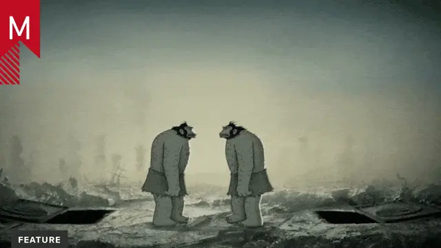
Jonathan is back, this time partnering with Ray Dalio, founder of the investment firm Bridgewater Associates — who, incidentally, had been raising the alarm about the 2008 crisis well before the actual catastrophe struck. At a staggering 30 minutes in length, “How the Economic Machine Works” (above) is based on an educational project authored by Dalio. It introduces general audiences to a cyclical model of the economy, which Dalio says is foundational to his success.
UPDATE: Props to studio Thornberg & Forester, who helped with concepting and handled all the animation, and Big Foote, who tackled the music and sound design. Sustaining the level of detail and clarity required for this project is no small feat.
While prepping for an upcoming article that I’m writing for Computer Arts magazine, I asked Jonathan Jarvis to explain why motion design is so well suited to explaining complex material like Dalio’s paper.
Jonathan Jarvis on motion design, “explainer” videos and the role of simplicity
Motion design works well for explaining complex concepts because it forces distillation. You have these concentrated visuals that communicate very quickly. The distilled visuals serve as anchors that take the heavy descriptive lifting off the narration’s shoulders, freeing it up to focus on the big picture. The narration describes some of the less tangible concepts that are difficult to visualize, and prevents the visuals from having to illustrate absolutely everything.
Pairing graphics with narration gives you a ‘the whole is more than the sum of the parts’ effect. A good animated explainer with have the narration and graphics compliment each other:
The visuals keep the details clear and the narration keeps the big picture clear.
Motion design is more effective than footage of talking heads for explaining complex concepts because the visuals are more informative and provide a better compliment to the narration. Talking head footage is mostly redundant to the narration. Imagine a video of someone talking and describing a collateralized debt obligation vs. an animated diagram of a collateralized debt obligation with the same description used as narration.
The sound design, music, and style of the graphics also play a big role. In an effort to let you focus on the big picture, I try to make every character and action look, sound, and act consistently. As the animation progresses, the characters and actions become familiar and (hopefully) intuitive. I want you to focus on the context and relationships between them instead of trying to remember who they are.
That’s one of the reasons I use very simple, graphic styles. Each character should use as little detail as possible to represent a concept. It’s the relationships between the characters and concepts that I’m trying to communicate: this-makes-that-happen. The characters aren’t the stars, the relationships between them are.
It’s different from a data-visualization. I actually try to keep numbers out of my pieces as often as possible. I try to aim for something more akin to information design or ‘knowledge design’ as I sometime call it.
Anyway, those are a few reasons I think motion design is special and has huge, barely tapped potential to help explain complex concepts, make the intangible tangible and help us understand our complicated world.


