


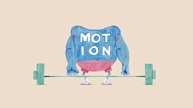
With the word “motion” emblazoned in white block letters on its back, a blue, muscle-bound creature deadlifts a barbell and turns to face the camera, revealing a swinging set of brass nipple rings and a large, triangular nose.
That’s pretty much how the mind of Mill+ Designer Aran Quinn works. Walking the line between cuddly and bawdy, Quinn’s imagination mixes the charming innocence of childhood with the hormone-riddled daydreams of adolescence.
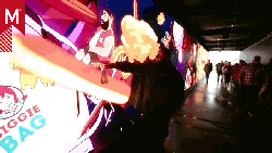
As the director of the graphics package for the Best of Motionographer showcase, which premiered at the F5 festival on April 17th, 2015, Quinn’s voice is perfectly suited for an industry caught in the playful tension created by wanting to stay young while striving for maturity.
But he nearly missed his calling.
We stopped by The Mill to get a deeper look into the process behind the Best of Motionographer package and learn how Quinn went from runner to designer overnight.
Assembling the team
With the support of Executive Producer Danielle Amaral, Motionographer fan Aran Quinn raised his hand for the assignment and was given a green light to proceed. When Mill+ Producer (and F5 speaker curator) Ave Carrillo joined the job, the whole thing quickly started to feel like a family affair. We all trusted each other implicitly.
From runner to designer
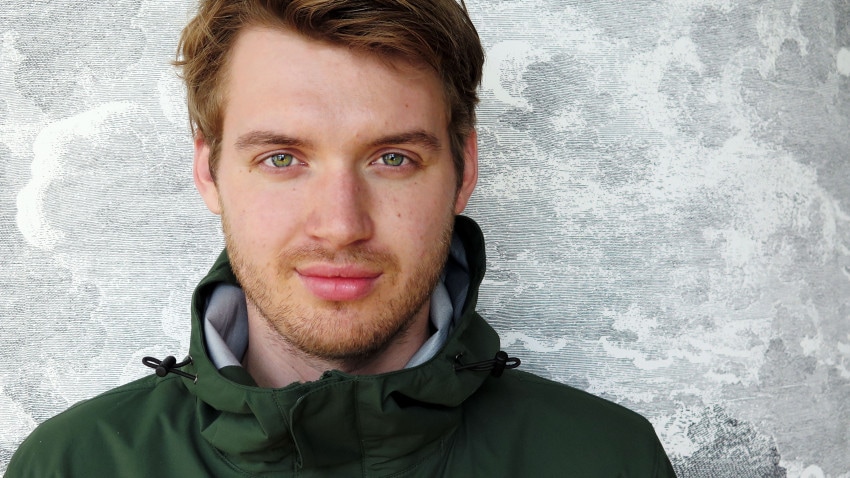
Mill+ Designer Aran Quinn directed The Best of Motionographer graphics package
The National Film School of Ireland, where Quinn attended college, is known for traditional animation. Its alumni include rock stars like Conor Finnegan, Alan Holly and Eamonn O’Neill. Despite their success, Quinn feared he’d never be able to build a career around traditional animation himself.
So he did what he thought was a sensible thing: He made a CG project. After graduation, he showed it to The Mill, and they politely informed him that while he had potential, his CG chops weren’t quite up to snuff yet. Instead of joining The Mill as a creator of moving images, he started as a runner.
A “runner” is a selective training position that involves all sorts of client services tasks, from fetching coffees and snacks to running errands around town for productions (hence the name). The Mill’s runners get a first hand feel for the business and process, and a talented few end up learning from the most senior artists, eventually climbing up the company ladder.
Quinn was one of those few. He began honing his skills with the 3D department — learning sculpting, modeling and ZBrush. But he never stopped drawing.
“One day, I did caricatures of all the other runners, and I put it up on the fridge,” says Quinn. “And then Mario [Stipinovich, Head of the Design Department] saw them and said, ‘Hey, I heard you did those drawings. Do you have any more?’”
Quinn sent his portfolio of illustration and traditional animation work to Stipinovich and got back to training with the CG team. Stipinovich, impressed with Quinn’s portfolio, decided to try him out as a designer on a Norfolk Southern spot. Quinn’s been sitting in a designer’s chair ever since, nearly three years.
Oh, and that CG project from school? Quinn’s axed it from his portfolio.
Process and production
In terms of deliverables, Motionographer needed something that would introduce the Best of the Motionographer showcase as a whole. We also needed a title card template that would present the title and primary creator for each film in the showcase.
The creative brief for all of this was decidedly vague. Boiled down to two words, it was simply: have fun.
Going on a journey (and getting a bit lost)
The original concept for the opening of the package was centered around a journey. Letterform creatures spelling the word “best” went on an arctic expedition that took them through an iceberg and ultimately into the ocean. Along the way, they met other letter-shaped critters, the entirety of which comprised the words,“Best of Motionographer 2015.
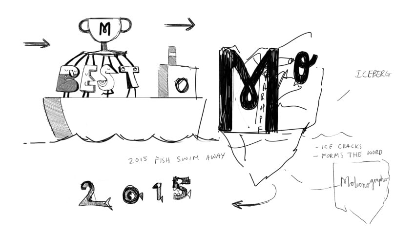
The original concept for the opening of the package was centered around a journey.
“I remember reading on Motionographer that it’s pronounced like ‘oceanographer.’ That stuck in my head,” says Quinn, starting to chuckle. “Then I was like, ‘How did I end up with an iceberg and fish?’ No. No, let’s just get off that line of thinking.”
Quinn started doubting his entire concept, feeling adrift in the very ocean he had dreamed up. Then, Mario Stipinovich suggested that Quinn focus more on the characters themselves, musing that it’d be fun to see one of them skipping rope. That simple suggestion set Quinn off in an entirely new direction.
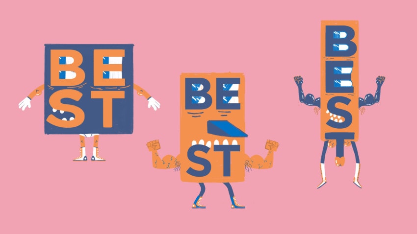
Mario Stipinovich, Head of the Design Department, suggested that Quinn focus more on the characters themselves.
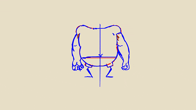
“From that, I decided I was just going to make the characters weightlifters, all sleazy, past their peak — but still trying hard,” says Quinn.
Design dreams and the pressures of reality
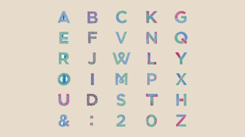
Inspired by an animated birthday card he’d created for his girlfriend, Quinn had big plans for bringing a full alphabet of characters to life using a range of different animation techniques.
Quinn had big plans for bringing a full alphabet of characters to life using a range of different animation techniques.
But pursuing all of those different styles in the time allotted (about four weeks total) wasn’t realistic. Quinn settled on a cel animated watercolor look that he knew would be easier to execute with a team.
Dialing in the boiling point
Quinn and Mill+ animator Damien Bastelica divvied up the narrative shots evenly between themselves.
In animation, the practice of “boiling” or “line boiling” refers to the intentional effect of redrawing the same shape over and over to create a flickering, wobbly effect. It’s a relatively easy way to bring life to otherwise stationary forms, while underscoring the hand-made warmth inherent in traditional animation.
Flash pencil test created by Quinn
Quinn and the team achieved their boiling effect by redrawing elements three times. Quinn dropped his Flash pencil tests onto Photoshop’s timeline and produced the final animations there.
The fully painted sequence (from Photoshop)
A brush is not enough
Art direction is all about controlling details while giving your team the freedom to bring their best ideas to the work. Despite all using the same Photoshop brush (Kyle’s Real Watercolor, recommended to Quinn by Brian Gossett), Quinn and the team noticed they were getting radically different results depending on the size of the brush.
The brush size always had to be 12 pixels, or it wouldn’t look right. In addition to creating rules governing brushwork, Aran also discovered that simply scaling up shots in After Effects for close-ups wouldn’t work as he’d originally hoped. That meant tediously drawing all the close-up shots — and adding a lot more animation time to an already tight schedule.
In pursuit of a perfect palette
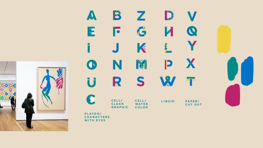
Settling on a palette for the entire package was one of the most difficult aspects of the project. Quinn and the team went through dozens of variations before inspiration struck in the form of a 60-year old work of art hanging in the MoMA.
“I’d been to the Matisse Cut-Outs show three times,” says Quinn. “But it was only when I was brainstorming with my girlfriend that the idea of using Matisse as a color source struck me.”
Specifically, Quinn was drawn to “Blue Nude with Green Stockings (Nu bleu aux bas verts),” a 1952 collage featuring a human figure and classic Matisse floral elements. Quinn found an image of the work and broke out the eyedropper tool in Photoshop. With some modifications, he’d finally locked down his palette.
“It also went along with the theme I wanted: uplifting and bold,” Quinn says of the choice. “I just wanted to have fun with it.”
Bringing the type to life
The mostly uniform strokes of Gotham made it an ideal candidate as the foundational typeface for the titles. Even at its heaviest weight, Gotham worked well as a blank canvas, allowing Mill+ designer Clemens Den Exter to layer on some personality and flesh out a full family of animated characters.
“I told Clem: Think Matisse, think floral. It’s going to be a bit sexy and raunchy in places,” says Quinn. “Clem took it to a whole new level. He added the cheetah print, for example, and rethought the positioning of the eyes on the characters.”
Where to see the Best of Motionographer 2015
A cutdown of the full Best of Motionographer showcase, which debuted at this year’s F5 festival, will be presented with live commentary by Justin Cone at Sónar+D in Barcelona on Friday, June 19th at 12:15pm.
After Sónar, a full-length version will be produced and shared online via Motionographer.com and Motionographer’s Vimeo Channel.