In this Motionographer Q&A, we chat with the man, the myth, the legend, GMUNK, about the eternal struggles of having an online presence, the direction his work has been going, and his 19+ years of sharing work online.

First, congrats on the new work and shiny new site! It looks great. How does it feel to have it out in the world?
It feels SO good – I worked on this site update for waaaay too long and it’s such a relief to know I don’t have to work on the damn thing anymore!
I will say – after it was released, I felt a little empty inside. I just realize that the internet is a lot different these days – Instagram, Behance and social media kind of own everything in terms of viewing platforms, and the time that people spend looking at personal sites is becoming much less – as it’s not a platform of its own.
Don’t get me wrong – you HAVE to do it your own way, have your own voice for your own personal site; and it’s great for the work to be discovered by your peers and to be presented exactly how you want it. But I’m just feeling like the era of personal sites being decorated and celebrated isn’t quite what it used to be – I think people want more convenience and a streamlined content delivery – it’s the reality nowadays as the web has changed.
But I’m chill, just happy to be done with the fucker – it was a gross amount of fairly boring work to get it finished; I apologize to all my compadres who had to listen to me whining about it for the past few months.
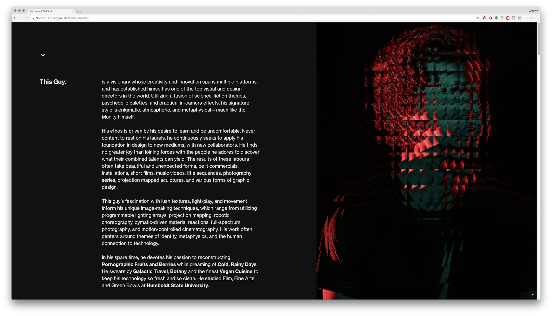
You’ve maintained a personal portfolio site for a long time, I clearly remember checking your work out over a decade ago! How have your needs and opinions of what your site should be changed over the years?
One thing has become the priority – usability. Remember, you’re talking to a guy who used 5px fonts and made weird and confusing flash websites for years and years. One of the coolest sites I ever made was never used, because I released it in 2011 when Flash was dying and nobody could be bothered, but hot damn I loved the design, one of my best – but was still the one of the worst usability standards ever.
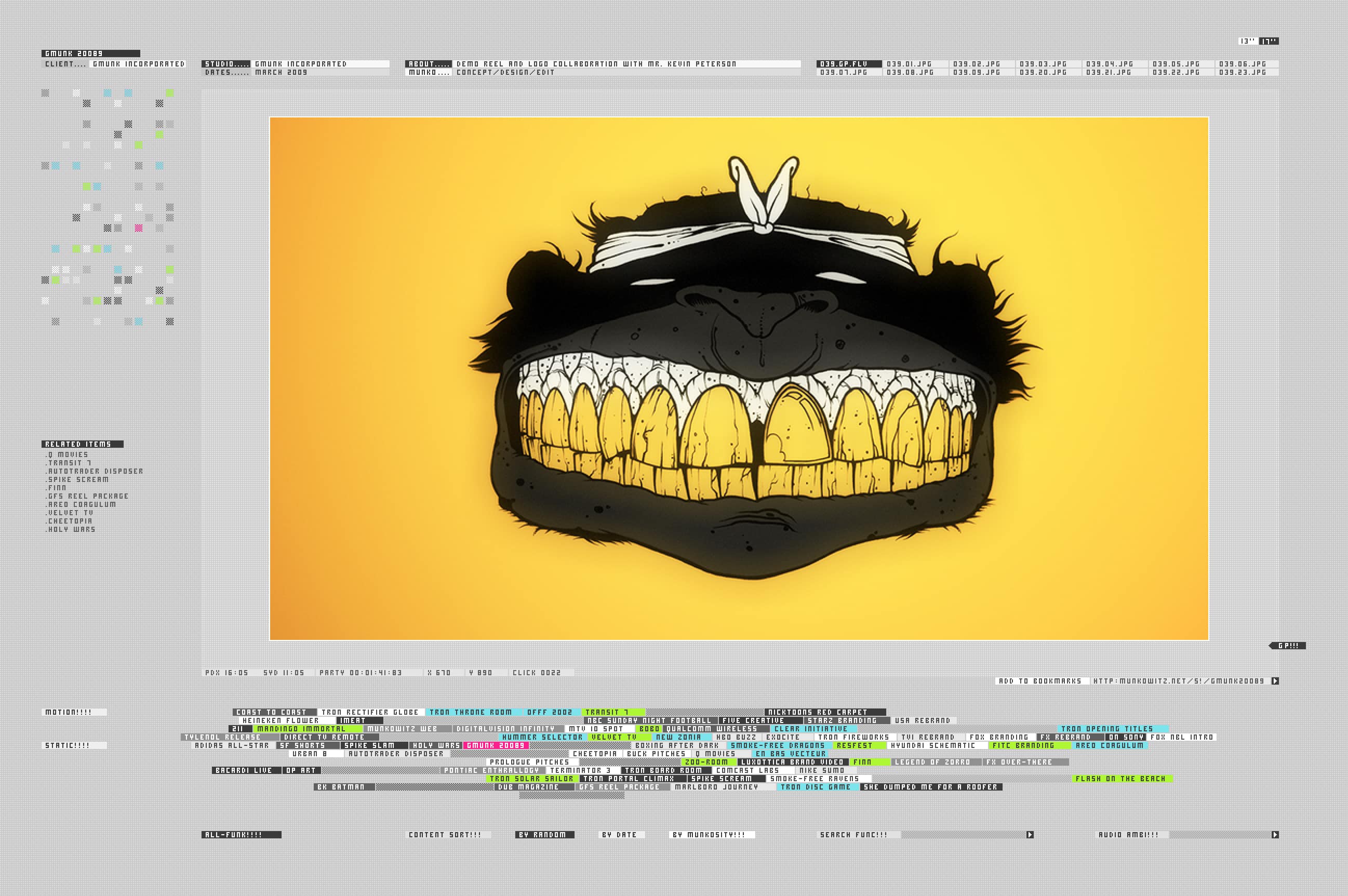
Fast forward to present day, now I just want people to be able to use it – read everything, play everything, enjoy the images – essentially having all the visual elements rendered not too big or small, paying attention to spacing and not letting it be too overcrowded etc. I have a circle of friends that coach me on it, drill me on usability on mobile and desktop, and I try my best to make sure their points are accounted for – I’m very lucky to have their input ( that’s you Andrea, Rowan, and Jake )
Not to say I’m some usability expert – I made Fantasy UI for years after my Flash days, and that was never entirely usable either. But I’m doing my best to make it a nice experience – and every site I’ve made definitely improves in that category, although it’s gonna be a LONG time before I redo this one :)
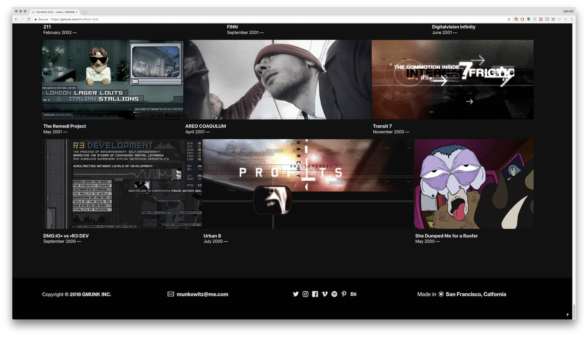
We live in a world where everyone is always pruning their online image. I love that you live in contrast to this. Your site is an ongoing timeline going back all the way to 2000. How do you decide what stays and what goes?
My rule is almost everything stays – and that pushes me to really put my 110% into every project. It helps me keep the quality up to where I’m not embarrassed to show it, and has proven to be a pretty good rule to keeping the standards up to par. Also, knowing that a new project will eventually be a collect is quite inspiring, as it forces you to think about the presentation and how to wrangle the various elements together for a cool case study. It’s the designer in me who thinks this way – the graphic design principles of presentation – and that has applied to my web collects for a very long time.
In terms of the grid dating back to 2002 –– I look at my career as a story, and every project a memory, the most vibrant being about the people and the situations in which the work was carried out. That’s why I present everything – honestly it’s more for me than anyone else because I want to be able to relive these creative stories as I keep pushing forward.
There’s sooooo many fun memories from being in the industry so long; amazing people, places, some of my dearest friends were made during this time span – so I want to hold onto those memories as best I can, because the most fun we had was being creative together in very memorable situations, and these collaborations also defined various eras for ourselves in the industry.
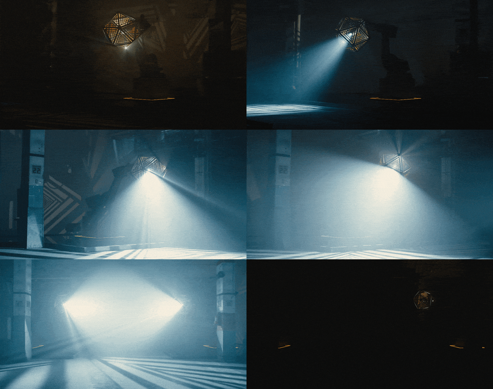
Switching gears a bit, your new film Telestron just released and it looks like it was a huge undertaking! Can you tell us a bit about how this project came about and what your hopes were going into it?
Ha, it sure was indeed. I’ve found a wonderful collaborator in Michael Fullman, ECD at VT Pro Design. We’ve been working together for almost 10 years now – and he’s opened my eyes to the vibrant world of scenic design, every form of lighting tech and fabrication – and has reinvigorated the robotics wave of work as well. We have a very smooth process together, it’s the fusion of two worlds, and we push each other to learn and grow with every project – hopefully this is only the beginning as we’re wanting to push onto bigger ideas and larger venues.
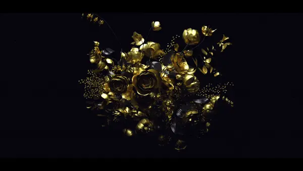
For Telestron specifically, it was one of those golden opportunities – self-funded by VT Pro and made for the 2017 Day for Night Festival in Houston. It was pure installation art, with a small circle of creatives pushing it daily for months. It’s amazing when you look at the credits and see that less than 15 people pulled off the entire thing, I love that – it was just shows when you streamline a process with ultra-talented and focused people, it doesn’t take a massive team to move a mountain – especially if they’re wizards.
And the best part – this was almost full-time, unpaid work for about 3 months. Usually, about half of the projects I work on unpaid, because I see the potential in them for massive amounts of learning – or an opportunity to open new avenues of collaboration and exposure. It’s why Directors make music videos or spec work – they see an opportunity to create something kick-ass and pure, that can capture momentum and the eyes of a potentially larger commission to make a properly funded version of a similar thing.
I speak about this often – it’s one of the pearls – ‘Make Personal Work That You Love, and Turn It Into Work That Pays’ ( –for all the Pearls )
Telestron for us was just that – a studio project of sorts with a groundbreaking art and music festival behind it. We seized on its potential and the opportunity to push ourselves out of our comfort zone, solve problems while learning a ton, and as a result made something completely unique that will stand on its own for a very long time. It’s a very specialized combination of mediums – and the result is rather unexpected. I felt the same way after we finished BOX, we knew it was a uniquely special combination of tech and design that would stand on its own for a very long time – and to this day, 5 years later, it still does – that feels really good to be a part of.
It’s not only the Telestron piece, at a glance it looks like there is a lot of new work on your site exploring quite a few new ideas, care to highlight any of those?
Surely – there’s a lot of new stuff that speaks directly to what we’ve been discussing – the lust for diversity, collaboration, playing in new mediums, and making yourself completely uncomfortable by thrusting yourself into unknown situations and clawing your way out – I guess you gotta practice what you preach…
Let’s focus on my three favorites ( besides Telestron ) –
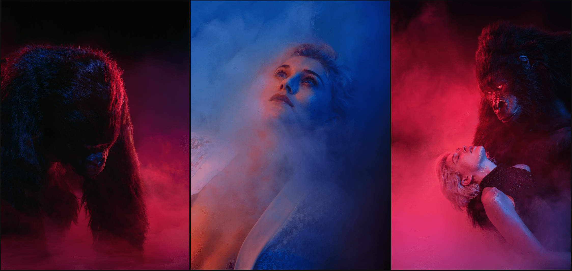
The Munky King has been an obsession for a few years – many people in my inner circle or whom have seen me speak at conferences have heard the stories. At its core, I fell in love with an animatronic Gorilla suit from the studio Animated Extras in southern England. I wanted to create a character in the live-action sphere with these burning hot LED Eyes, doing all sorts of weirdness with other munkys, bunnies, belly dancers, opium ceremonies, and of course – breakdancing, lasers and a masturbatory fiery death. I’ve written it as an epic short film that would’ve cost around 350k, and also a music video for around 100k – and when both concepts couldn’t raise the funding we needed to do it right, I put it upon myself to just get the suit on set and play for a day.
I knew that we could create some compelling work exploring this character using studio strobes, a talented model and a high-end smoke machine – collaborating with a favorite photographer and friend James Zwadlo to make some beauty and a fresh set of images. It was a passion project, a proof of concept to just get the character established, tell a story and begin to explain his emergence. We wanted to get an inspired vibe going on set and most importantly, have some fun with my favorite UK peoples.
I super love this one – and feel SO much better that I got to play with the suit before moving back home to SF in August, 2017.
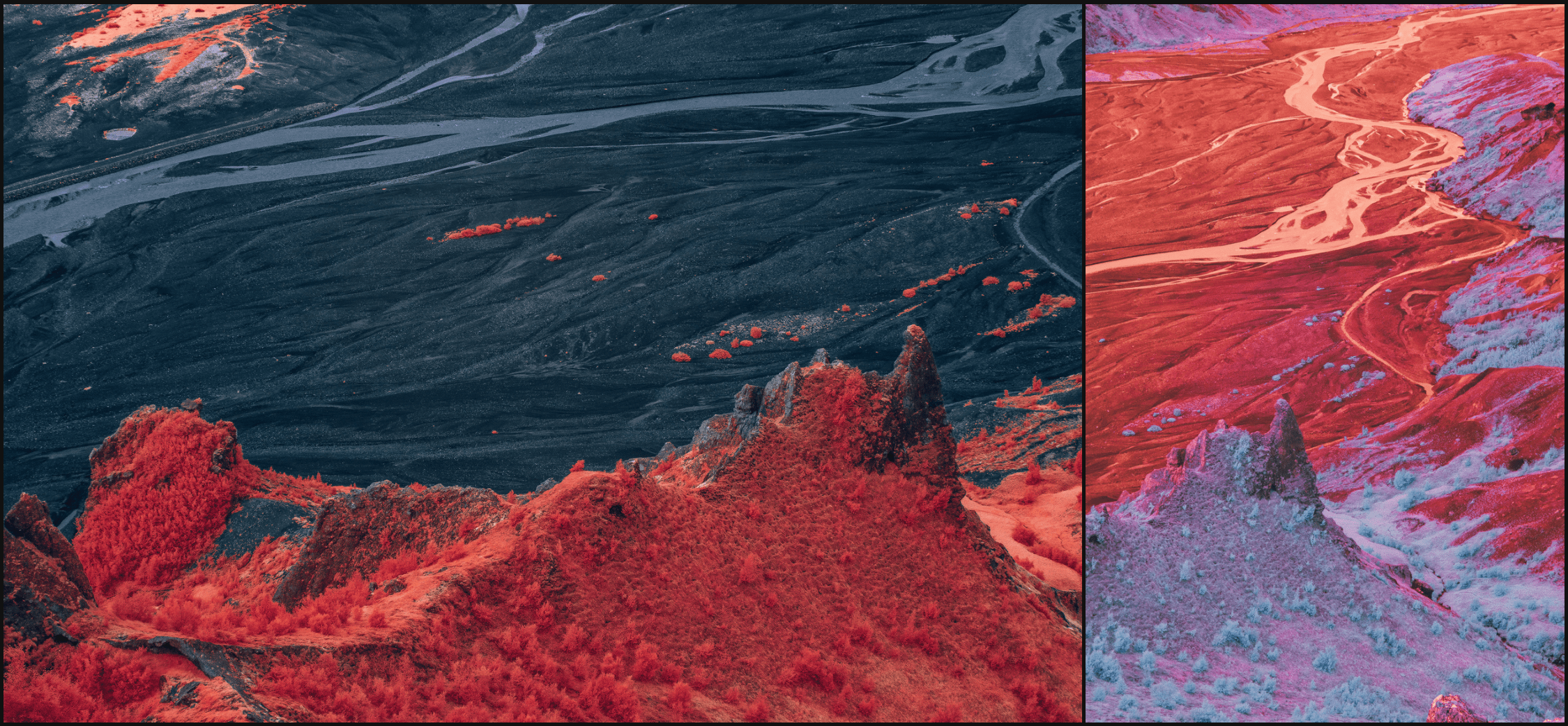
The #InfraMunk series has been a passion project for a few years now. In 2014 we shot a music video for Tycho and my cinematographer Dr Joseph Picard introduced me to a modified full-spectrum RED Epic camera to capture our characters fiery POV – to say the least I was instantly hooked on the wild palettes. It renders a vibrant, incredible world of saturation – essentially taking two of my favorite things ( photography and psychedelics ) and fusing them into one. When you’re looking through the camera, it looks like everything is on fire and has this subtle inner glow – it makes shooting such a fulfilling experience.
So naturally, after an unforgettable trip through Alaska’s Tracy Arm Fjord, the next place to take the InfraMunk was to the most stunning place of them all – Iceland. So this series is a case study of that trip, which was a 10 day passion-fest with my photography homies Jake Sargeant and James Heredia. I’m actually still not done culling through the normal photos, as I shot on the Fujifilm GFX50s Medium Format monster and lots of epic landscapes out of a Helicopter – so updates will be coming out of the oven at my photo website: https://photo.gmunk.com/ shortly !
Infiniti QX50 – Study of Power
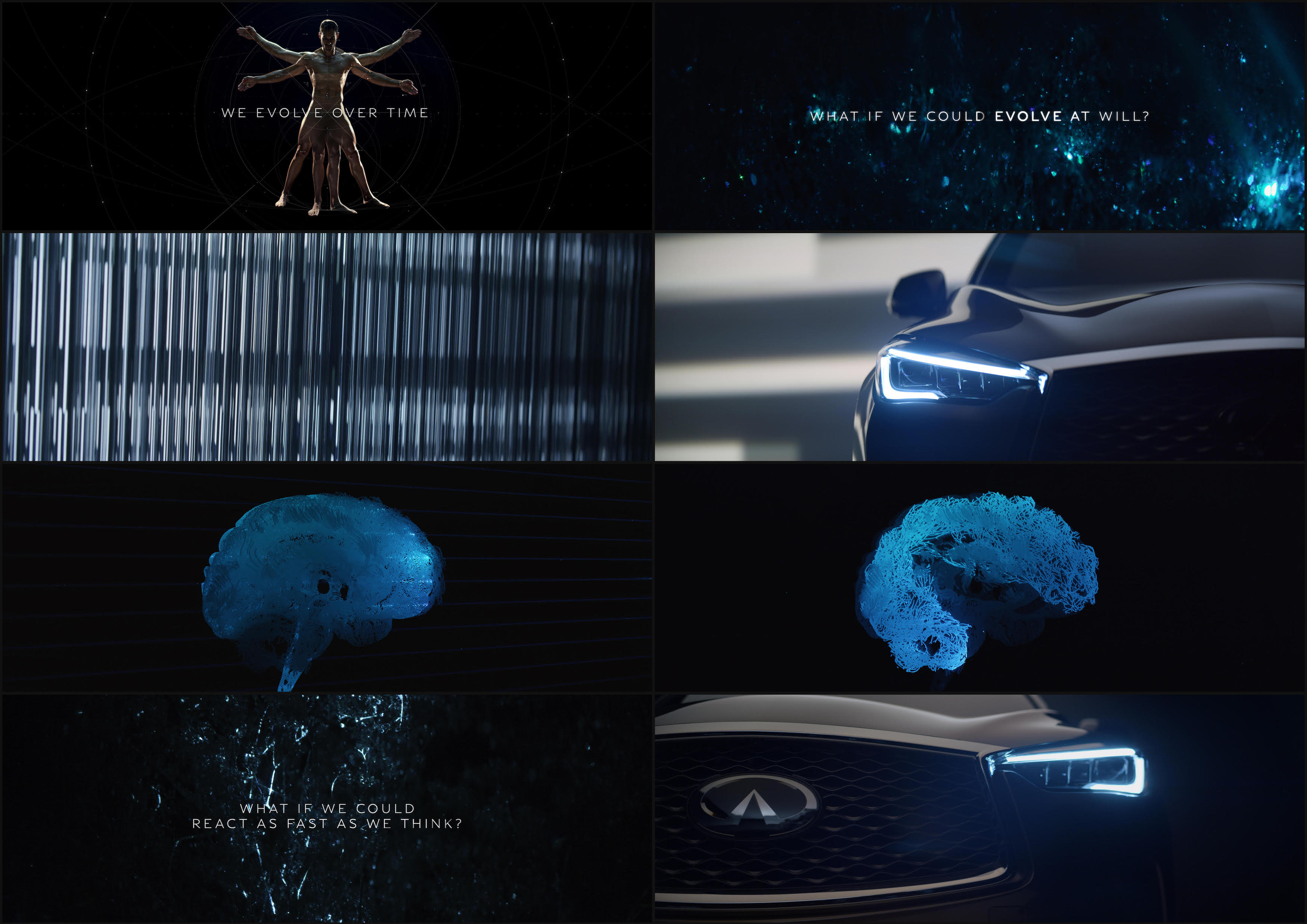
The last project was a commercial and reveal film for the Infiniti QX50. The folks at 72andSunny had a great concept to run with – examining the relationship between humanity and machine – taking the fabric of thought and translating it into data visualizations. So we nerded out on how to achieve this, and came up with all sorts of interesting practical approaches with the Weapon Peter Call Me the Clark, Clark and world renowned production designer Philip Messina. We of course had an insane shot list, as we were essentially shooting footage enough for 5 films in two days. But we had the ‘science lab’ setup for an entire day, and just played and played with various glass, mesh, screens, refractions etc – shot with the Master Prime anamorphic lense on the RED Monstro in 8K.
It was fun to do all the standard technocrane car and driver shots, and all the glossy exterior shots, but while doing all this, having this ultra-experimental lab going in parallel – and as the Director I was bouncing around from set to set, making stuff – moving in fast forward. It was a thrill, I love the energy on set, working against the clock, streamlining communications and making decisions fast. There’s no thrill like it, and over the years I’ve been able to harness the sometimes stressful energy into something I can manage quite well – it’s a craft I’m excited to explore more of as I mature as a Director. I’m essentially starting over in this world and it’s fun to be a beginner at something again – where the only place you can go is UP.
With all this, there has seemingly been a progression in your work, escaping the screen more and more and increasing in scale. What are your thoughts on the direction your work has been going?
I think a lot of us want to get away from the screen and experience Motion Design in a new way – it’s the future we’re heading towards: projections augmenting architecture, as holograms and AR, essentially volumetric displays, real-time tracking and rendering engines, robotics and choreography etc. It’s fun after spending so many years doing motion design for the Monitor to play outside the sandbox for awhile, discover new canvases and controllers.
Funny enough, we haven’t even touched on Artificial Intelligence yet – oh man that’s gonna be a powerful tool and influencer. Some really cool studios like Field.io, Quasimondo and Mill+’s Rama Allen are embracing AI and pushing creative experiments using the technology – it’s really inspiring to see – it’s the new shit. I find myself aligning more with Innovation companies rather than purely motion studios now – because I feel the foundation in motion design has been established and it’s much more inspiring to play with the shiny stuff – where design is always a key ingredient but materialized and interfaced in a fresh, new way.
http://underdestruction.com/2017/07/23/freeda-beast-bringing-things-to-an-end/
Regarding the direction my work is going – well, it’s easy to stay humble because you can just compare yourself to a Spike Jonze or Jonathan Glaser, Christopher Nolan, Alex Garland, Joseph Kosinski or any of the ultra-visionaries – that puts you back in your place REAL fast. So nothing I do is actually very big in scale compared to the masters – so there’s that. I don’t really spend a lot of time self-qualifying the work I’m doing – once a project is done, I dwell more on the story of the process more than I do in quantifying the result, and I move onward.
I just have a burning desire to keep creating in different ways – it’s the diversity that keeps me from getting jaded. If a medium becomes stale, then I move onto another one and immerse myself in it – there’s so much to glean from as a creative. It happened after Oblivion, where I was thinking that if I do another UI / Sci-Fi project I’ll go crazy, so I started playing with lights, then robots, then projectors, then live-action, then photography, then print, then robots again etc – basically everything but UI – and eventually you start to miss it and come back to it with fresh eyes.
One thing I’d like to add – sometimes super small projects are muuuuuch cooler than super big projects. Sometimes with big budget work, there’s too many creative strings being pulled in too many directions and the work gets diluted. Sometimes it’s nice to be in control of the flavor, even if the budget is small. For instance, I LOVE the new Munksterbate, and the treasure Mandingo Immortal. I mean, they’re so stupid, but so memorable, people don’t forget that stuff and it makes a lasting impression – probably much more than Commercial A or B.
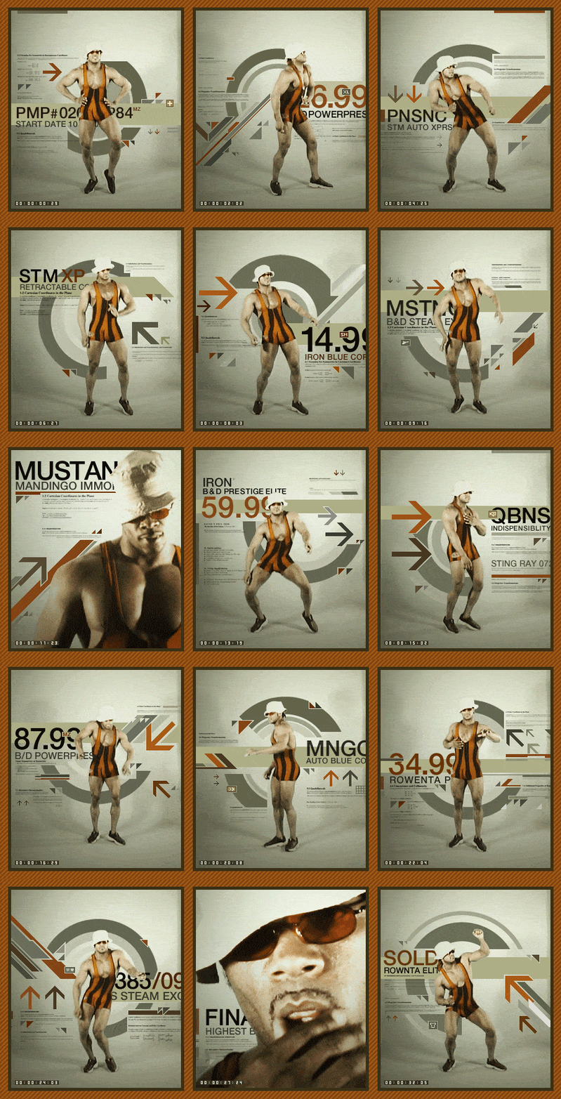
So I’m trying to find the balance – especially in the commercial world – I try to offset larger commercial projects with smaller, creatively fulfilling projects – it’s a struggle for ALL of us as creative individuals and I’m not sure there’s a magic formula to it all.
Finally, for someone who has seemingly done a bit of everything, what’s next?
For me, I find the greatest pleasure in learning and collaborating, which is why my work seems to be so diverse, because I collaborate with A LOT of different people and I learn from them all. This exposure to so many different models of craft then dominoes into interesting hybrids of techniques and creative approaches – which I take great pleasure in.
I think what’s next is more of the same types of explorations, just leveled up in intensity – lots of Robotics and Light installations, more play with big live-action toys like Technocranes and Drones and really pushing cinematographic illusions, more practical setups using Cymatics and other audio-driven stimulus to create new worlds on a macro scale. I’m currently playing with Beat-Matching Software used to edit libraries of shot footage in real-time for a massive audio-reactive content system for a club, for instance.
I’ve made my first VR Film and it was so inspiring – complete immersion and losing touch with reality – like a DMT trip essentially. It’s hard to get that full immersion watching videos on the web with 20 tabs open and a billion distractions in your ear. It’s in the funding phase now, but I really love the medium – so more exploration in that world. I’m keen on more real-time in general, working with Unreal and Unity artists – doing a cool AR Project right now with Dolby with my man Eccoscreen – also very illuminating.
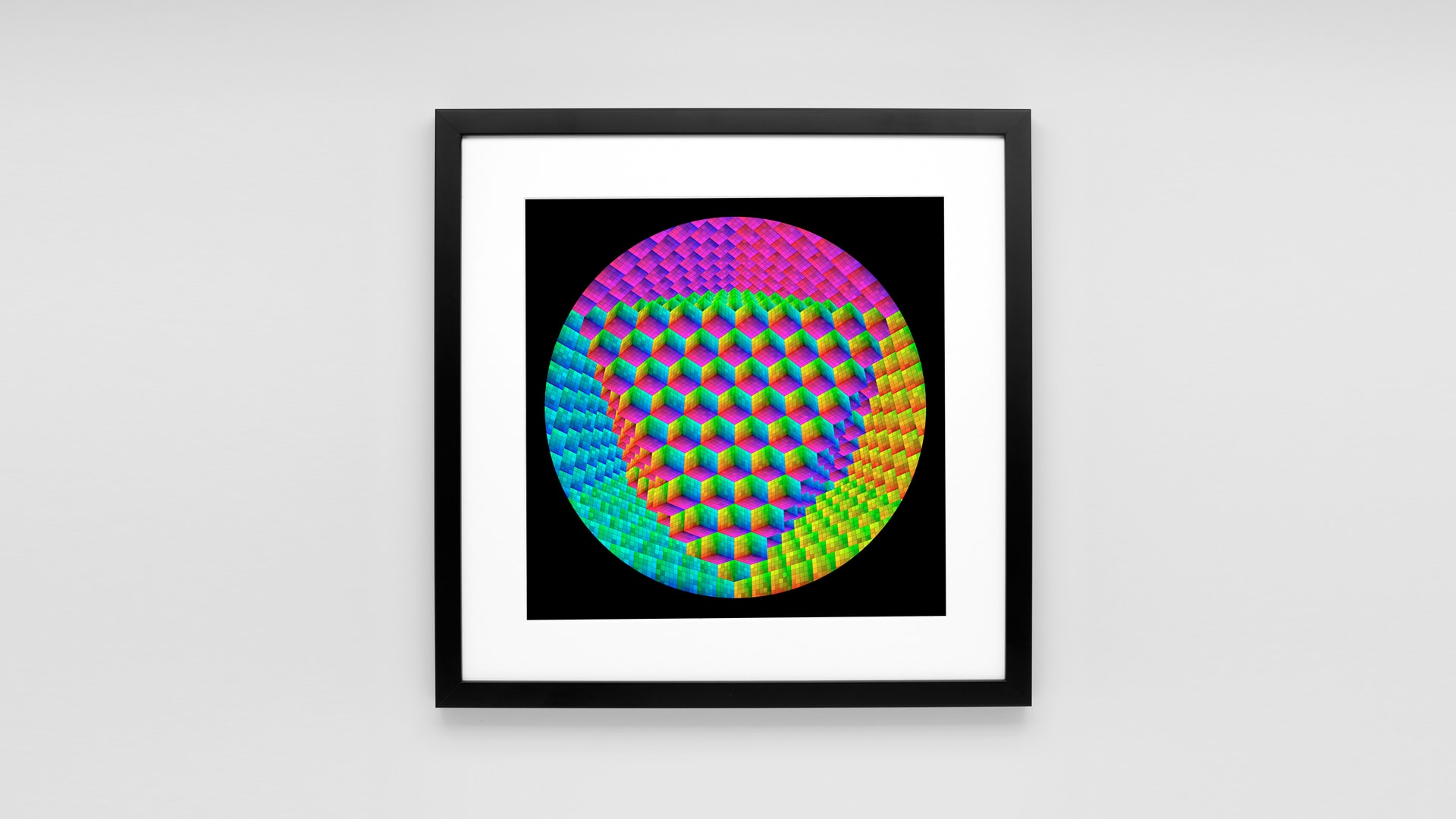
I’m also pushing into Print design, playing with different inks and papers, making the digital more tangible. It’s an influence from my lovely girlfriend simoneone, whom I watch make her wonderful illustrations daily, and it’s so nice to just pick them up and hold them as a tangible piece of art. So that has inspired me to push into print design more – working on exhibitions with her and also with my man Michael Cina in supplying our print store at Cinaart.com.
I don’t know, it never really stops, and the more people I get to know, the more projects arise, there’s always 4-5 projects going on at once and I’m learning how to orchestrate the various collaborators and team so nothing ever feels too stressful or overwhelming. It’s important to stay organized, structure your time, stay task-oriented and focus on breaking off small creative goals at a time. If you’re methodical and disciplined, those small goals add up to bigger and more impressive blocks of creative achievement over time, and from that you can do much bigger projects with your collaborators.


