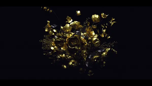
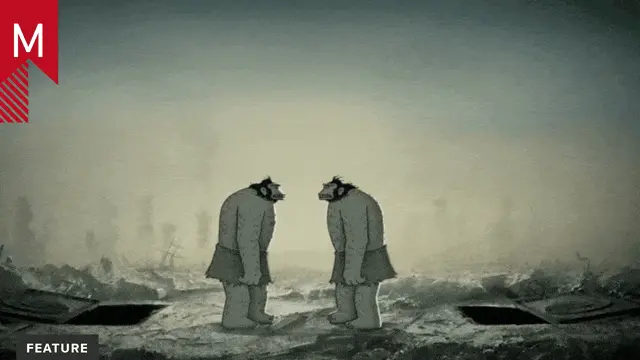
With a very appropriate title, “A Pearl” is a stunning music video showcasing beautiful storytelling and a unique combination of techniques. Motionographer spoke to the creators of this piece to get some insight into their process.
Art Camp is a creative studio founded by Santiago Carrasquilla and Jos Dias Contreras. They directed this project together with Saad Moosajee, a former Pixar intern and Sagmeister & Walsh staffer. Co-director Danaé Gosset is a French artist who moved to New York to study design and animation at the School of Visual Arts.
How did Mitski approach you and what was the initial brief? What was that collaboration like?
SM It was actually Spotify who began the project, they approached Art Camp with the initial brief of creating a vertically oriented music video for Mitski that would play on Spotify. Because Mitski was on tour we wouldn’t be able to film her, so the video would need to be fully animated. Art Camp then approached myself and Danae to work on the video.
DG Santiago and Jos from Art Camp saw some of my animation work where I was mixing cel and 3D animations. They called me in to do a week of tests using some 3D renders Saad had been making. After some promising initial experiments, they invited me to do the rest of the project with them.
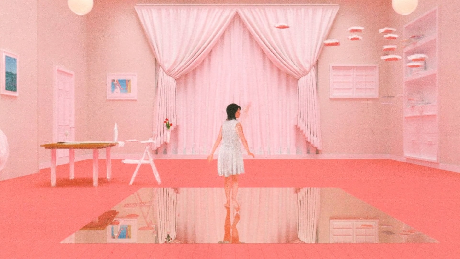
SM The brief was quite open, they listed a few of Art Camps videos like Space People and the U2 book as interesting references because of their mixed media quality. I had recently collaborated on a separate music video with Art Camp called Fruitflies, which was their first time working with 3D animation. That video inspired a desire in Art Camp to create a piece of work that would use CGI but somehow retain the element of the human hand. Whereas a lot of projects begin with building up a mood board filled with all sorts of work, we tried to mainly reference our own projects for points of interest to use as a starting place for tests and experiments.
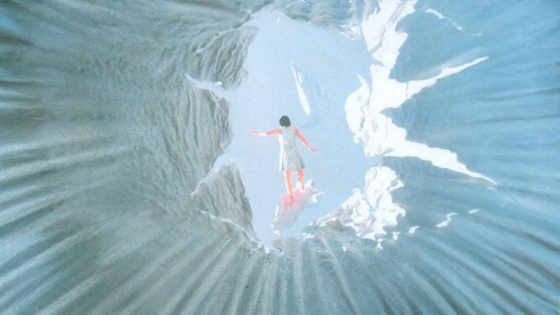
Our contact with Mitski over the course of the project was off and on as mentioned because she was on tour. However, the input she did give very much helped us shape the project. One of the biggest examples of this is the ending scene in the video. Initially, the plan had been to just have the character land directly back into the landscape with her shadow. After seeing our initial round of tests, Mitski asked us if the character could fall through or into the ocean at some point of the story. I tested a lot of places in the edit where this could happen, eventually integrating it into the end with the idea the Ocean would dissipate or transform into the landscape. I think it’s a scene that very much shaped the feeling of the video.
For this project, how were the tasks and responsibilities split between the directors?
SM Art Camp kicked off the project with the initial concept of a character falling off the edge of the world. However, this was a rough framework, so a lot of holes needed to be filled in. In the initial stages of the project, we did a lot of whiteboarding as a team and brainstormed ways to develop the video. What could the camera movements be—the motion—the feelings—should there be one character, two characters—what images could be found and shown throughout, etc.
Eventually, we moved on from brainstorming into the actual production. In the production, I was responsible for the design and animation of the video in 3D, for editing the video and for developing the narrative. Danae would handle everything on the 2D side, and we would communicate closely on art direction, visual treatment, and any places the 3D design needed to change to reinforce the 3D design and vice versa. Art Camp were the producers of the video and also worked on the direction.
I would focus a lot of my time on the narrative direction/concepting, visual design, and animation of the scenes. Art Camp would focus a lot on the musical qualities of the piece, how the overall thing made you feel, and the rhythm and emotion of the character. We’d all come together as frequently as possible whenever Danae and I had finished creating anything new to review and talk about what we’d made as a team.
The mix of techniques and the process involved in this video is something that really stands out. I’m sure there are plenty of stories about the making of this project! Can you talk about the creative decisions you made along the way, the choice of mediums and techniques, as well as the challenges and limitations you faced through such a demanding production?
DG We made about 4000 frames worth of tests prior to even starting the final frames which ended up in the final video. At first, it was all very experimental: scratching film, dripping water on the prints, adding layers of clear paint, tearing the paper, cutting out the background, printing with a broken printer, etc. It took a long time to find the right balance between the 3D and traditional animation.
We made about 4000 frames worth of tests prior to even starting the final frames which ended up in the final video. It took a long time to find the right balance between the 3D and traditional animation.
I would say one of the main challenges for me was to quickly adapt the traditional treatment I was making to Saad’s evolving 3D style. His renders kept getting more and more detailed over time.
Throughout the project, colors and mediums were chosen very carefully. Even if it becomes quite intuitive after a while, I spent a lot of time building color palettes for each scene. It was quite amazing how different the 3D renders felt based on how they were printed. Eugene Lee, my friend and another key team member, was dealing and monitoring all of the printing. He tested so many print settings and papers in order to find just the right print that looked good and which had the right texture for me to work on.
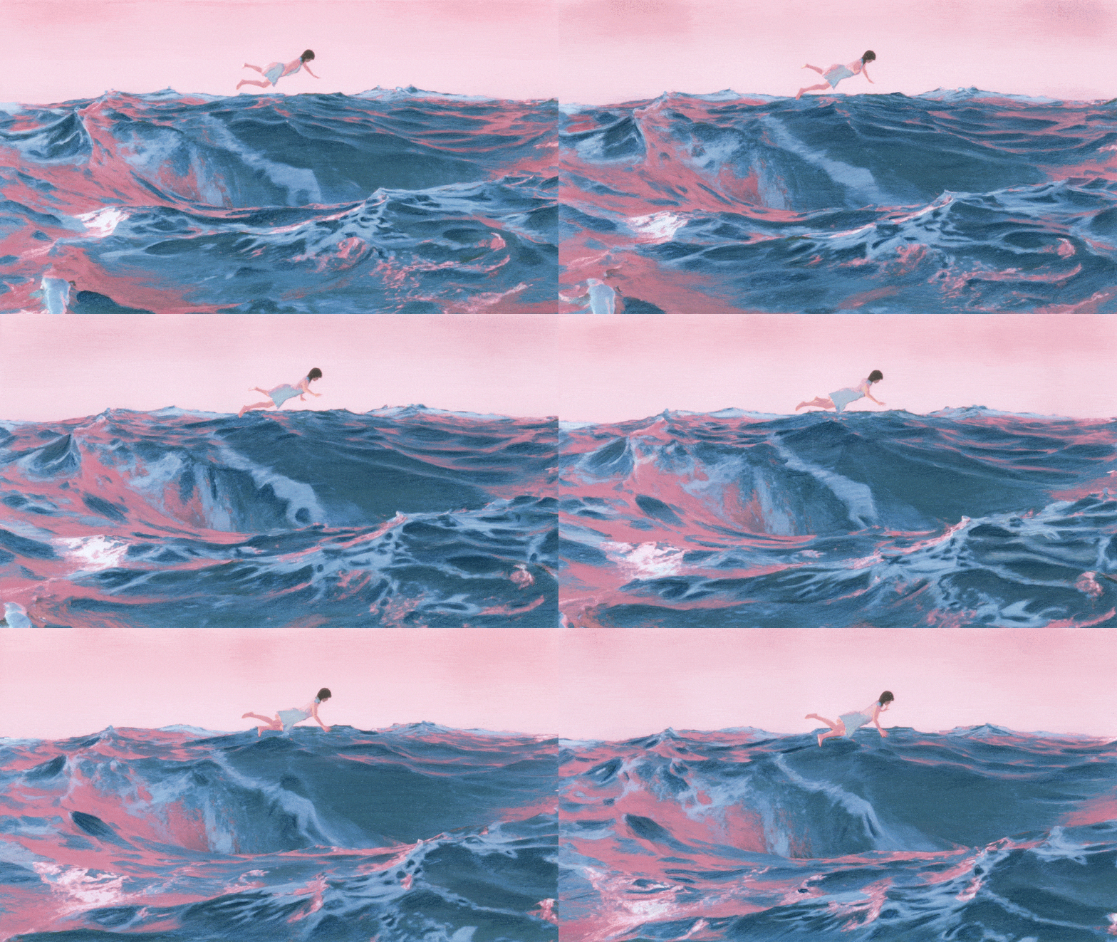
On average my goal was to make about 100 frames per day. But due to the more heavy-handed quality of some scenes, I could sometimes only do 70 or 80 frames per day. The ocean scene, for example, was so intense I could only do 50 frames a day. That meant that I had to catch up with the schedule on the more subtle scenes and produce more on those days. At one point during the ocean scene (the final scene), my hand really hurt. I got really anxious I wouldn’t be able to push through until the end. Luckily my hand got well and we finished everything in time.
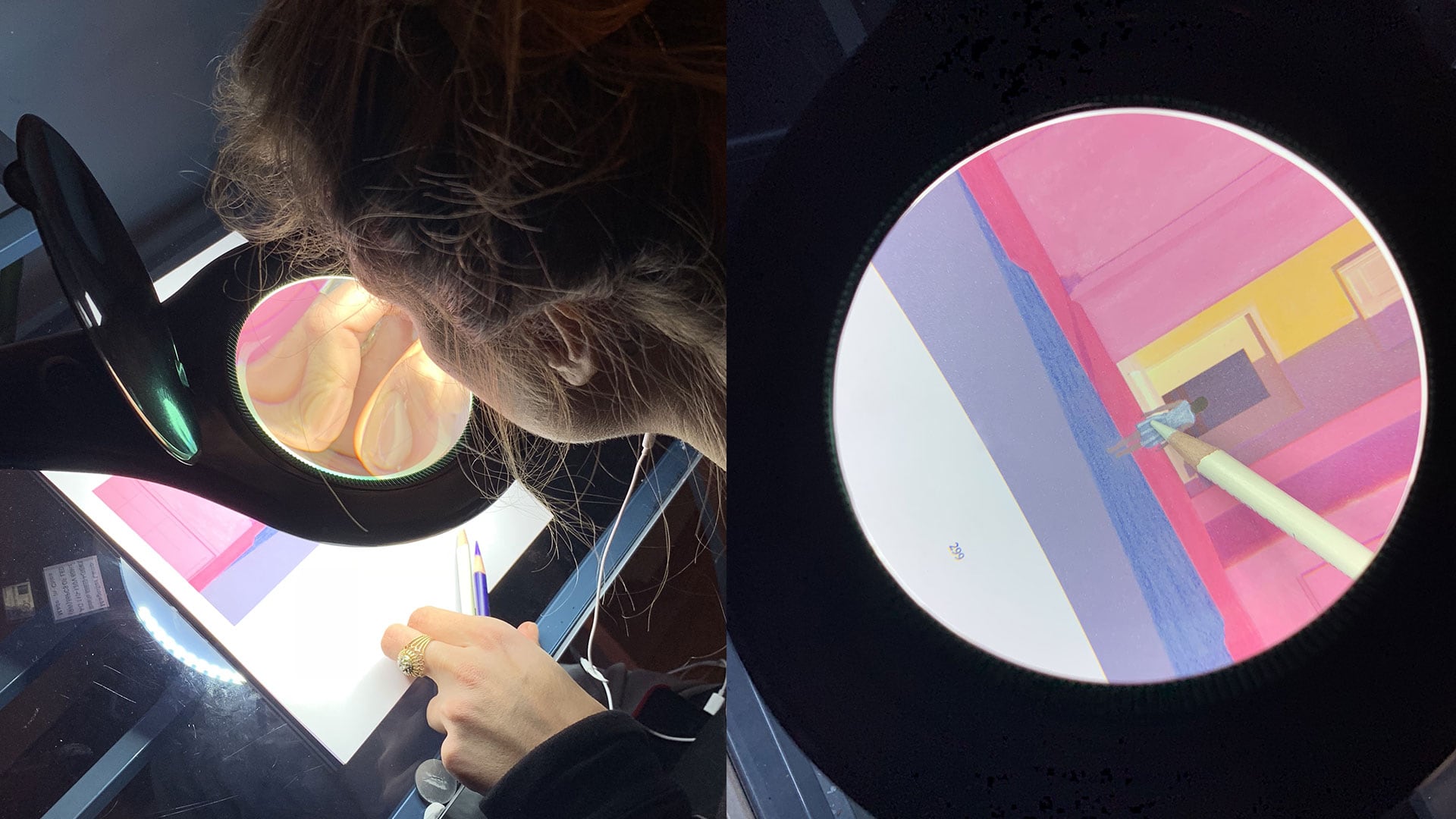
On average my goal was to make about 100 frames per day. The ocean scene, for example, was so intense I could only do 50 frames a day.
SM Danae and I started working on the project based on a desire outlined from Art Camp, which was to try and take advantage of the best qualities afforded by 3D and 2D animation to create a new visual style that retained the quality of the human hand. In the initial stages of the project, the hardest thing was trying to figure out which medium to favor, the 3D or the 2D. When you look at the first tests we made, you can see the two mediums are present in the animations, but sort of side by side, rather than in harmony. You’ll also notice there’s much less detail in the 3D component of the sketches, most of the renders are grey. This was mainly because the piece was supposed to be turned around fairly fast, and was supposed to be at a 1920×1080 format, so there didn’t feel like a huge need for a lot of detail in the 3D renders. There was also concern voiced that by adding too much detail into the 3D, it would detract from the human quality added by the 2D.
As Danae and I continued to produce tests, we began to make more and more promising results. After we made the first test of her passing through the white paint house (below), I noticed that the 3D lighting and color palette actually had a pretty big influence on the final visual quality of the piece.
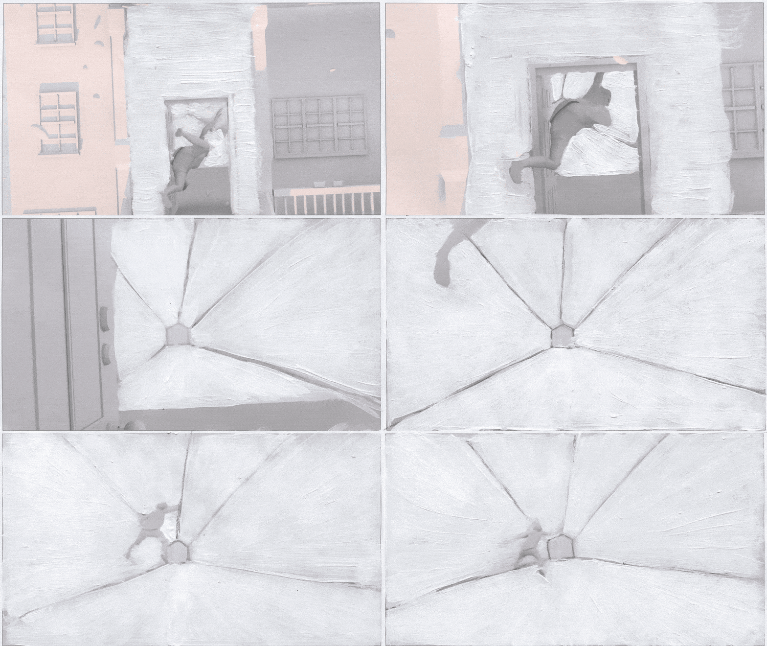
Up until that point, we’d been using a grey character; the plan had always been to make the character resemble Mitski but we weren’t sure at what capacity and detail. Based on that test, I created a fully colored Mitski character with skin tones and explored different ways to light the skin in 3D that I felt would translate well into the physical process. The first real test of this technique was in this gif of Mitski falling into the flowers as a closeup:
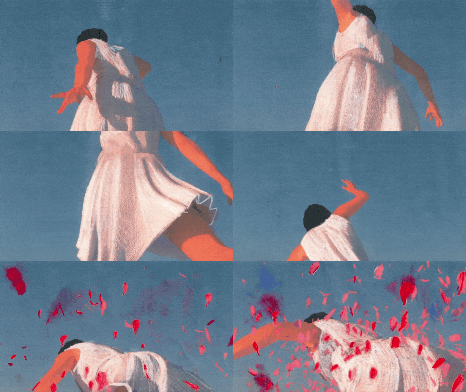
Danae also changed her process a bit for this tests—in the earliest tests she had drawn and painted on top of or around the character or scene, whereas in this test she drew into the tones of the characters skin, dress, etc, matching and enhancing the pre-existing colors. This test was the first time we achieved a more “painted” effect in the animation, where both 3D and 2D lived in harmony rather than opposition.
To me it was a turning point in the project, from there on out I started to spend extreme lengths of time on the modeling, lighting, and coloring of each scene to try and push the painted effect. As I added more detail on the 3D side, Danae would then have more detail to work within the drawing. The end result was that it dramatically increased how long everything took, but also allow us to create the moving painted style. The culmination of these techniques and explorations is in the Ocean scene at the end.
Thank you Danaé and Saad for this interview and congratulations for such an amazing undertaking!
A Pearl
Made at Art Camp.
Directed by Saad Moosajee and Art Camp
Co-Directed by Danae Gosset
Designed by Saad Moosajee and Danae Gosset
3D Animation by Saad Moosajee
Cel Animation by Danae Gosset
Technical Direction by James Bartolozzi
Junior Designer Eugene Lee


