From the first time I met Austin Shaw in my Design for Motion Class at SCAD (Savannah College of Art and Design), I could tell he was really determined to not just prepare students to become great artists, but to become great artists in the real world of production. His passion for process, thinking and design really came across in his style of teaching. He reinforced the importance of process and planning, the way you got to your final piece was just as important as creating the piece itself. A lot of the teaching I gained in that class I still use in my production process today. Austin took those great teachings and created one of the best books in our industry, Design for Motion. Today we’ll be chatting with Professor Shaw about the release of the 2nd Edition of the book.
Q&A with Austin Shaw
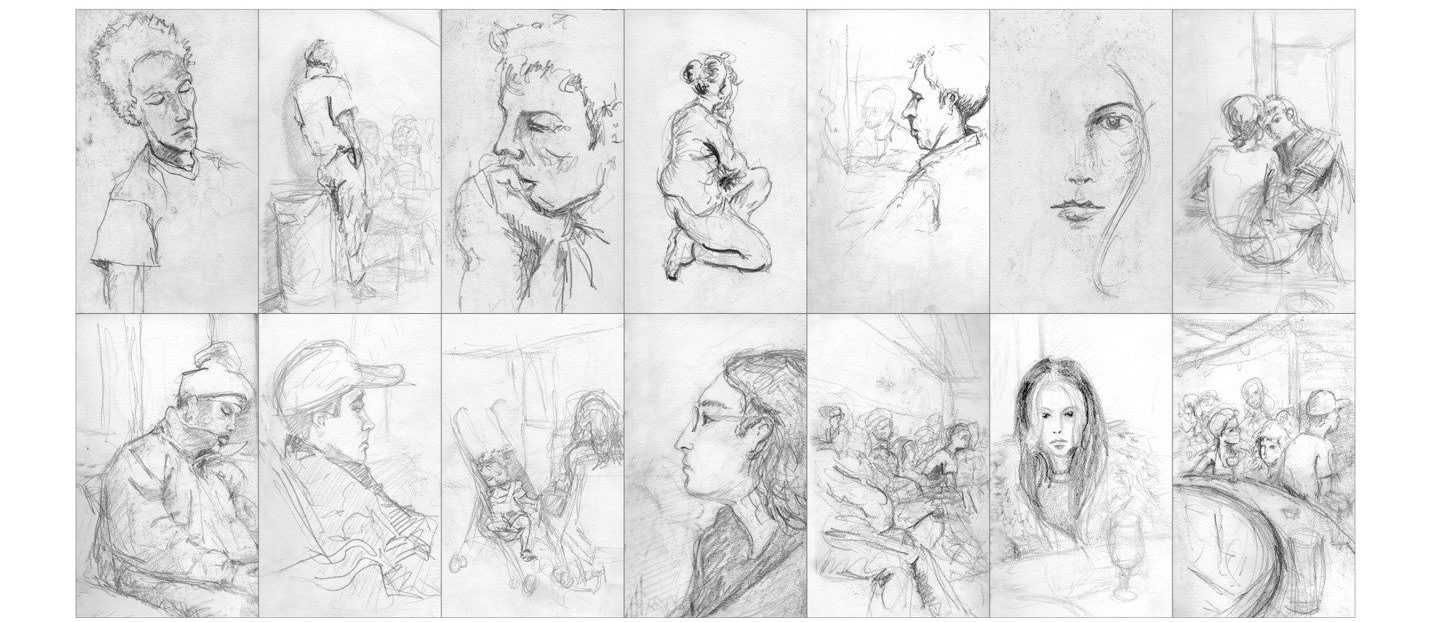
Sketchbook studies by Austin Shaw.
Hi Austin, can you tell us a little about yourself for those who may not be familiar with you and your work?
In my undergrad, I studied studio art. So, I spent my time doing a ton of life-drawing, printmaking, and oil painting. I was not introduced to computer art until graduate school, while studying graphic design. I also took a class in After Effects in grad school and fell in love with being able to make my drawings and designs move! I was really fortunate to have studied both traditional analog media in addition to digital methods, and have always been very comfortable combining organic materials with digital production.
I have been working as a Motion Designer since the early 2000s. I got my start doing hand-drawn storyboards for music videos and was lucky to land an internship at an animation studio called Curious Pictures. I freelanced around New York City for a bunch of years at studios like Loyalkaspar, Perception, and Brand New School. I am a total generalist, so I worked as both a designer and animator, bouncing back and forth between creative pitches and animation production. In the mid 2000s, I started my own company called Right On and worked direct-to-client doing broadcast projects for companies like VH1, The National Geographic Channel, and ESPN. I have always been interested in teaching, and was super-fortunate to have the opportunity to teach part-time at the School of Visual Arts from 2006-2009. In 2009, I took a position at Superfad as an Associate Creative Director. Then, in 2010 I took a full-time job as a Professor of Motion Media Design at the Savannah College of Art and Design. After 10 years at SCAD, I am on my way to the west coast to begin a new position as an Assistant Professor of Design at Western Washington University.
I teach a range of courses to both undergraduate and graduate students. My Introduction to Motion class covers basic Motion Design principles and techniques. This class goes deep into After Effects, getting really comfortable with keyframe based animation and project structure and organization. I also introduce frame-by-frame (cel) animation and compositing techniques such as shooting and keying green screen.
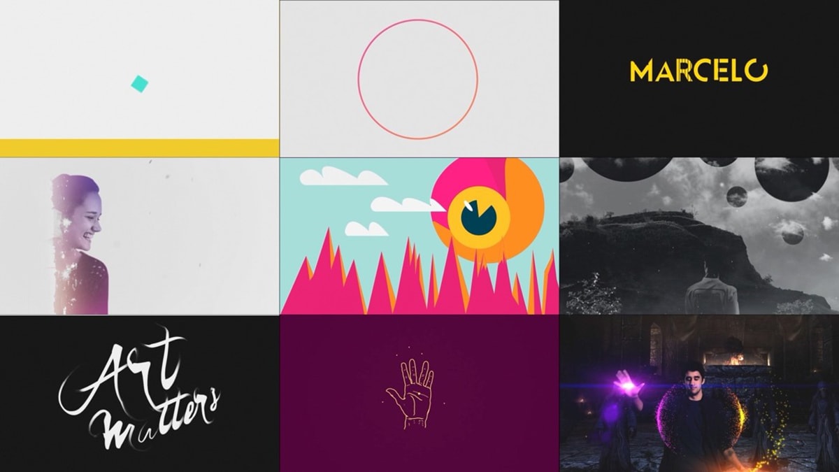
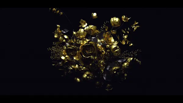
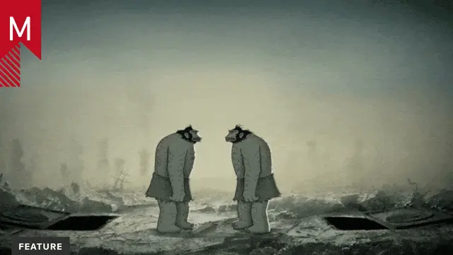
Examples from Introduction to Motion Techniques course.
I also teach Motion Branding, which is a senior and graduate level class. My students say, “This class is like Design for Motion, but where you also animate”. I believe they are referring to the intensity and expectations I set for this class. Again, I try to simulate real-world project timelines and creative briefs. We do a variety of brief-driven assignments that teach students how to effectively communicate brand qualities through projects such as logo animations, idents / promos, and title sequences. At this stage of their education, students should have solid design and animation fundamentals in place. So, I tend to see a lot of portfolio projects created in this course. Another important aspect of this class is embracing design and delivery for multi-platforms. With the rise of Mobile / Social, demonstrating an understanding of how to version for multiple sizes and constraints is a critical skill for students.
I also teach a Professional Development course which focuses on portfolio refinement, professional outreach, and creative business practice. I really enjoy this class because it allows me to reflect on all of my experiences as a creative professional, from internships to creative directing. Lectures and discussions examine topics like studio culture, various creative and producing roles in the industry, and career sustainability. This course motivates me to stay connected with my industry contacts and alumni to maintain my awareness of industry needs and changes.
Of course, I stay busy with my own professional practice, working directly with clients such as Ralph Lauren, Anthropologie, and Madison Square Garden. I continue to create Motion Design projects for either small screens, social campaigns, or really large screens, multi-screen arrays for stores and digital signage. When I am not teaching, freelancing, writing, or raising my two daughters, I create illustrations and animations inspired by meditation or social issues.
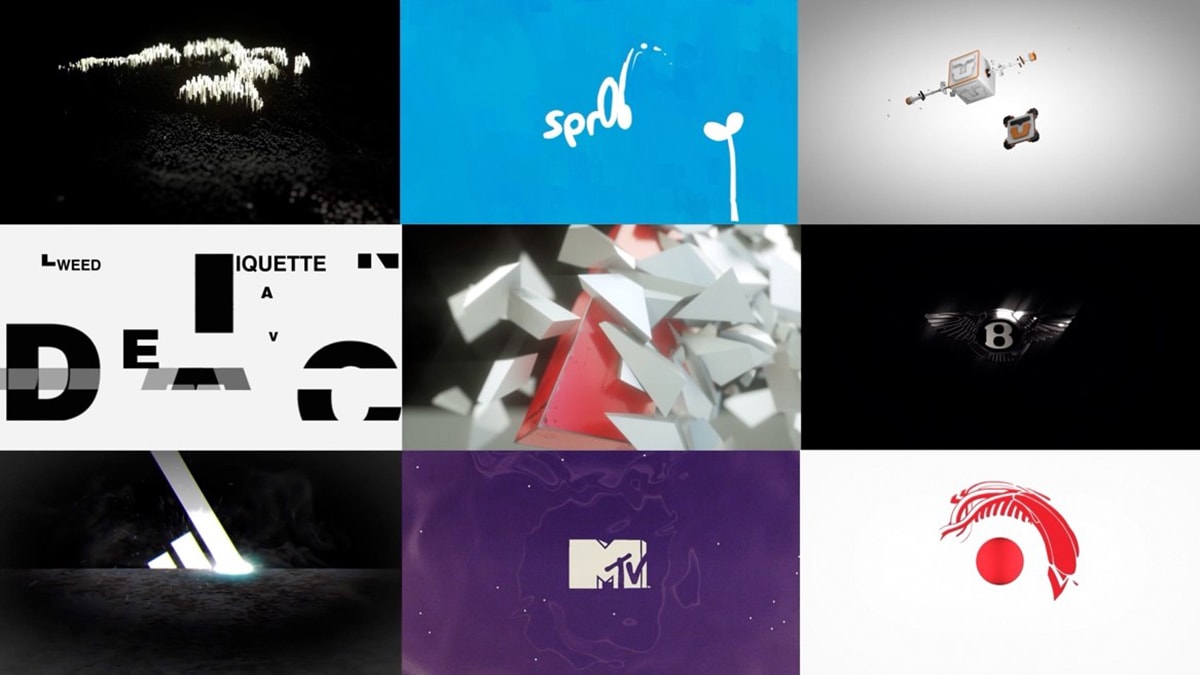
Examples from Motion Branding course.
What inspired you to write this book?
The inspiration to write Design for Motion came from teaching the Design for Motion class. I introduced the class after my first year of teaching at SCAD. When I arrived at SCAD, the Motion Design program was already quite robust and had a variety of motion-focused courses. However, I thought we could improve our program with an additional class that focused entirely on the design side of Motion Design. For both the class and the textbook, I reflected on my own experience working on creative pitches at a variety of studios in New York City. I wanted to teach how to design stellar style frames and boards, but just as important—how to navigate the creative process from the initial brief all the way through a completed design deck or process book.
Prior to becoming a Professor, I found that creative pitches could be quite stressful, and I often rushed through the concept stages of projects because I wanted to arrive at a strong design style as soon as possible. However, teaching afforded me the opportunity to examine my own process and make adjustments that I could workshop in the classroom with my students. Ultimately, I redesigned my process to embrace the varying degrees of ambiguity and uncertainty at the start of any creative kick-off. It is not easy, because sitting with “not knowing” the solution or answer to a creative question (or any question) can be very challenging. However, I encourage my students (and myself) to build a tolerance to uncertainty and to remain curious as we explore creative briefs through research, a variety of writing and drawing techniques, and visual inspiration or mood boarding. Rather than running with the first idea and design style that pops into our heads, we carve out some time (and mental space) to dream and play in the creative sandbox. It is a curious balance, the needs of the creative spirit and professional deadlines. I find that both need to be nurtured and practiced.
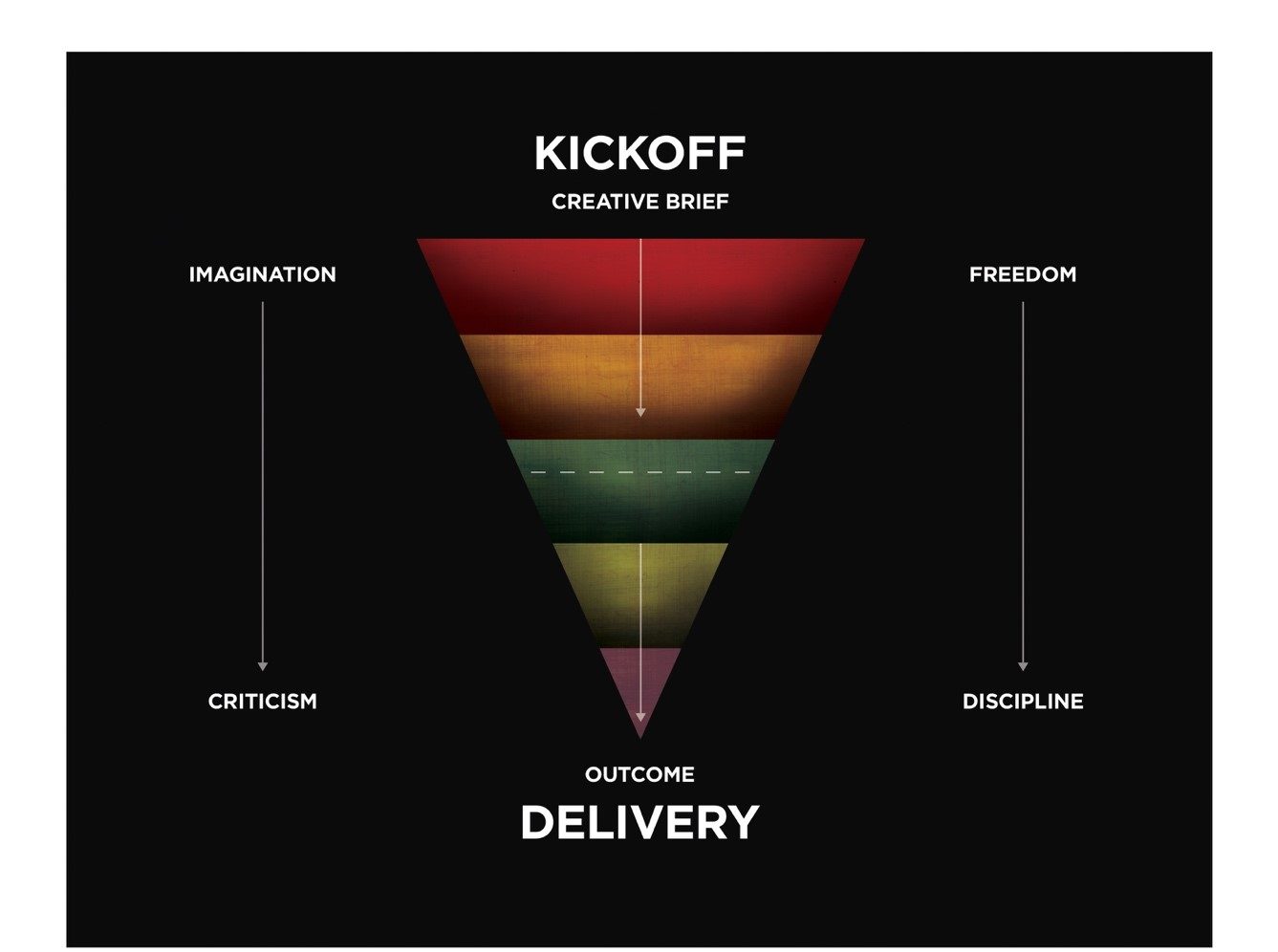
Kick-off to Delivery Information Graphic.
So, the book naturally emerged from the class. It started with PDFs that supplemented lectures and assignments. As the PDFs grew, I realized the potential for a textbook existed. Fortunately, I was naïve enough to not know exactly what I was getting into when I pitched the textbook! It was a mountain of a project. However, I applied the same lessons and approach to creativity I teach about in the book to my own writing. Also, I received tremendous support and contributions from my colleagues, students, and a host of industry leaders spanning generations of Motion Design.
What’s new in the 2nd edition?
When I wrote the 1st edition, I intentionally stayed as software agnostic as possible. I thought, if I keep it to concept, design, and storytelling principles, the textbook will have a long shelf life. However, I did not account for the total takeover of Mobile / Social first. Although I had been working on client projects for platforms such as Instagram, Facebook, and Snapchat for a number of years, I had not really explored what made these channels different from traditional broadcast design. The 2nd edition presented an opportunity to research, learn, and update with an eye towards new platforms and emerging technologies.
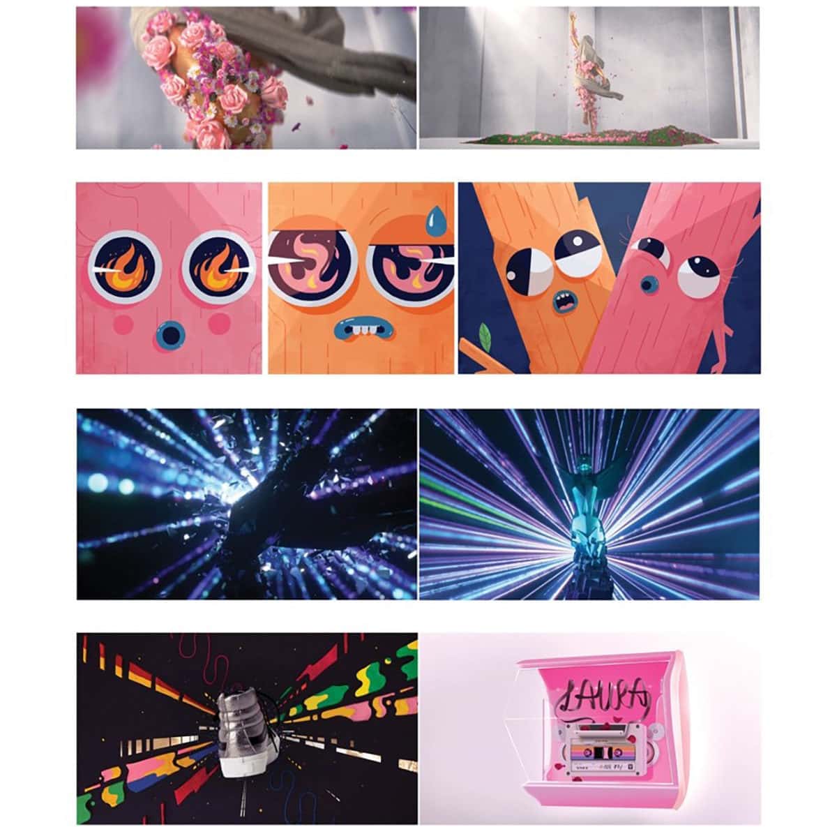
I began by talking with my students and letting them teach me about how they used social platforms. It was humbling at first, but I like to think of myself as a life-long student. I began reaching out to industry leaders and asking questions about how they are adapting to new platforms. It was very interesting to see how well-established Motion Design studios were evolving their production pipelines as well as being introduced to a new breed of Mobile / Social first agencies. I was also fortunate to connect with talented individuals like Pablo Rochat and people who are carving their own niches in these social spaces. I compiled all of this research into a new chapter titled Social / Mobile First, dedicated to best practices for digital platforms.
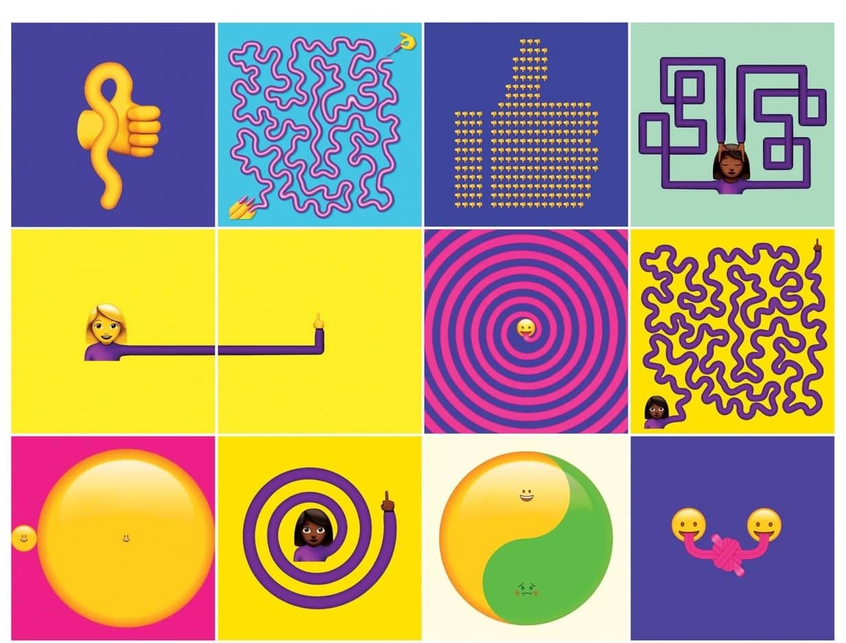
Examples from Pablo Rochat.
The 2nd edition also gave me the opportunity to re-write and re-structure the entire textbook, to be more concise and streamlined throughout. I also beefed up the 3D-design section of the book with an interview of Mike Winkelman (Beeple). I expanded my original interview with Patrick Clair, who contributed invaluable information about creative pitching and presentations. Additionally, I added a bunch of new interviews with studios such as Animade, as well as a few young guns such as yourself (Sekani Solomon), Sarah Beth Morgan, Peter Clark, and Audrey Yeo.

Examples from Beeple (Mike Winkelmann)
Examples from contributing Design for Motion alumni in order of appearance. Sekani Solomon, Sarah Beth Morgan, Peter Clark, and Audrey Yeo.
What do you think differentiates this book from other motion design books?
I have on the ground experience working in the field and a network of artists to speak with about real world changes, and how to navigate them as they come up. I also have experience in the classroom, working with and training students to become effective creative problem solvers. The textbook is a synthesis of this combination of both practice and theory.
Although Design for Motion focuses on concept and design development, it also defines the relevant framework of Motion Design as a professional practice. There is a lot of information included to teach students how to work with and interpret creative briefs and understand the importance of pre-visualization. The second half of the book is dedicated to helping students become well-rounded designers by expanding their creative aesthetic through chapters covering a range of visual styles and mediums.
The textbook is threaded by interviews with industry leaders in sections called Professional Perspectives. The 2nd edition has 30 of these interviews, curated to enhance the chapters with which they are paired. I spoke with each interviewee about their backgrounds, inspirations, creative insights, and suggestions for students. In addition to hearing from industry professionals in their own words, highlights of their creative work are showcased within the textbook. For me, the lineup of professionals is really exciting as it spans multiple generations.
The textbook also features a multitude of work created by students in my Design for Motion class. I am a believer in the adage “the proof is in the pudding.” It seems only natural that a book that emerged from a class should showcase the fruits and lessons of that class. Student work illustrates the ideas and exercises proposed by the textbook.
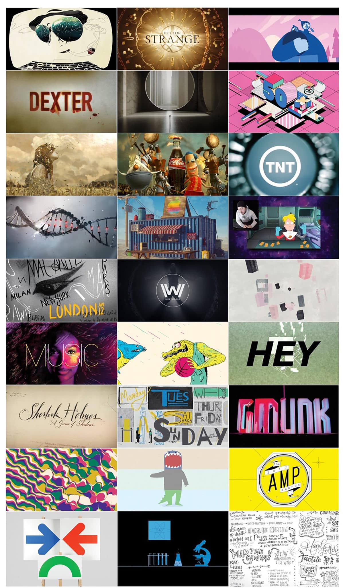
Examples from contributing professionals in the order of appearance in the Design for Motion textbook. Joshua Harvey, Erin Sarofsky, Animade, Lindsay Daniels, Karin Fong, Brian Michael Gossett, Alan Williams, Kylie Matulick, Greg Herman, Lilit Harapetyan, Beeple (Mike Winkelmann), Robert Lester, Melanie Abramov, Patrick Clair, Carlo Vega, Lauren Hartstone, Gentleman Scholar, Beat Baudenbacher, Danny Yount, Matt Smithson, GMUNK, William Arnold, Lucas Zanotto, Daniel Oeffinger, Stephen Kelleher, Chace Hartman, and Chrissy Eckman
Being an educator, have you seen your teaching style change as we see changes in the industry, such as there being a greater emphasis on design for mobile?
Absolutely. I have spent the last few years adapting the syllabi in all of my classes to reflect the emphasis on design for mobile and social platforms. I have become more flexible in my assignments in relation to aspect ratios and sizes. Square, vertical, and portrait are just as important as horizontal. Students also enjoy creating shorter projects that play off the idea of memes, so I encourage them to experiment in that space, while they are learning tools and techniques.
The Design for Motion class has always been very adaptable as it focuses on the initial stages of concept and design development. I have become less rigid in my assigned deliverables, provided students can articulate the reasons behind their choices in terms of size and platform. Ideally, this class will continue to evolve to provide a solid foundation in not only designing for motion, but also user experience. Mobile platforms require Motion Designers to consider user agency and interactivity, even with simple affordances such as clicks and swipes.
The greatest changes have come in my Motion Branding class, as I have redesigned this class to persistently have an eye towards mobile and social. Working on the 2nd edition of the Design for Motion textbook pushed me to ask a lot of questions about social platforms. Without fail, the number one suggestion for that came up over and over was “Capture attention quickly.” I learned fun terms from another professional contributor, Robert Lester. Snackables, short-form projects that give viewers / users a quick taste, then let them move on. Thumbstoppers, a social post that is engaging enough to get viewers / users to stop their scrolling. The good news for Motion Designers is that motion is super-effective at capturing attention quickly and creating engagement. Another important best practice I have incorporated is the need to design for sound-off. While on social platforms, most users prefer to scroll without sound. This constraint makes typography and creative captioning super-important, and this challenge sets up another need for effective motion and communication design. Bringing it back to my Motion Branding class, I have incorporated all of these best practices into my lectures and assignments. Students are required to design and deliver at various sizes, as they would in professional practice.
How does your real world experience influence your teaching style?
In addition to being a generalist, I am also very much a freelancer by nature. I enjoy working on different types of projects with a variety of creative collaborators. Having spent the first half of my career perma-lancing at various studios in New York City provided a wealth of knowledge from how productions operate to tips and tricks in Photoshop and After Effects. Continuous practice, these days direct to client has allowed me to evolve and sustain my creative career. I have also grown tremendously in my ability to navigate the business side of my practice. Again, the external structures provided by studios such as producers and creative directors in the early part of my career, are now internalized and used in my studio today. I have learned how to manage and nurture creative relationships, while still delivering with expertise and efficiency.
As a Professor, I readily share all that I have learned with my students. I let them know they are receiving years of knowledge that I learned from other freelancers and creatives in the industry. I hope this encourages them to share what they learn, and to help each other as they progress in their studies and careers. After all, the production side of Design-Driven Production speaks to collaboration and the ability to play nice with others.
What type of responses have you gotten from readers of the book?
One of the most meaningful responses I received from readers of the book came via Facebook Messenger. A young designer from India messaged me one day, thanking me for having written Design for Motion. He told me that he could not afford to go to design school, so for him, the textbook was his design school.
I have also heard from other Design Educators who have adopted the textbook in their classrooms. These types of responses are extremely encouraging.
What do you think is missing in motion graphics education today?
At SCAD, we had an extremely comprehensive Motion Graphics education program. From a survey in Motion Graphics History course taught by Michael Betancourt, author of History of Motion Graphics to projection mapping, cinematography, 3D design, typography, and robust motion techniques classes. All that being said, I think more deliberate integration of Motion Design and User Experience would be helpful. It is hard to tell exactly where the industry is headed, but I think we are only going to see more cross-over between motion and UX. The Design department at Western Washington University already has this integration between Motion Design and User Experience in their curriculum. So, I am excited to see how I can contribute to the program.
What impact do you hope to have with this book?
I teach a course called Design for Motion (same title as the textbook), which I created to introduce students to the process of research, concept and ideation, and design development of style frames and design boards. This class is basically a design bootcamp. It gives students a sense of industry timelines, how to prepare a professional process book / design deck, and builds a foundation for being a visual storyteller. Each week, I give the students a conceptual prompt and an aesthetic constraint, such as typography, tactile design, or illustration. Rapid concept and design execution pushes students to expand their creative range.


