


I would like to share my experience as Art Director for this project, beyond just the challenges of the process. I do this not only because I believe we achieved an interesting result but also because the creation process revealed relevance for the times in which we live.
The Movie
Based on the 2018 adaptation and staging of Ta-Nehisi Coates’ book at the Apollo Theater, this HBO Special features powerful readings from the book, with documentary and archival footage and animation. Focusing on the author’s experiences growing up in inner-city Baltimore, the narrative explores Coates’ bold notion that American society structurally supports white supremacy.
The Main Title
The Briefing
My participation in the project started with an invitation from Elastic and their creative director, Hazel Baird, with whom I have developed a great partnership in recent years. We worked together on films like Velvet Buzzsaw, Shut Up and Dribble, and the most recent one for Google, Trillions of Questions, No Easy Answers. I love working with Hazel because, in addition to the great creative freedom I am allowed, she always offers me support at crucial moments.
The initial briefing had the following points:
- We would be responsible for animating the film’s opening title, a piece of no more than 20 seconds.
- The client was working with an illustrator for a section of the film, Molly Crabapple, and liked the idea of using illustrations in the opening.
- We should rely on reading the book and the script of the film to create the proposal.
- It would be interesting if we could use the book, in some way, in the title.
So, to start the development of the project, I put together the first round of ideas.
The First Direction – The bullet
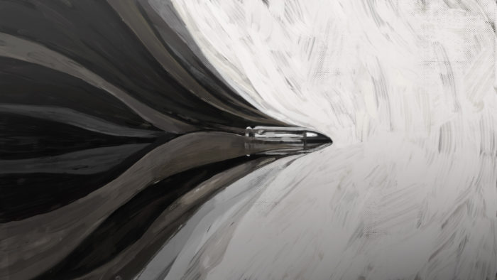
Initially, I was significantly impacted by the book; it was short but very powerful. After that, I read the script and immediately understood how strong the relationship between the two is.
The book begins with Coates expressing his frustration at seeing his son learn a harsh American reality with the news that Michael Brown’s killer would be released.
My initial desire was an attempt to do something as impactful as the book. This proposal would start with a white screen. Then, we would hear the sound of a shot, and right after, we would see a bullet cutting through the screen.
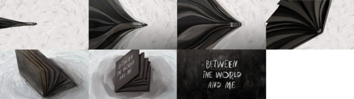
The trail of the bullet would slowly transform into the pages of the book, which in turn, after closing, would display the title of the film on its cover. The relationship between the racism that killed Brown, symbolized by the bullet and the creation of the book would then be established.
The Second Direction — The black bodies
“… in America, it is traditional to destroy the black body.”
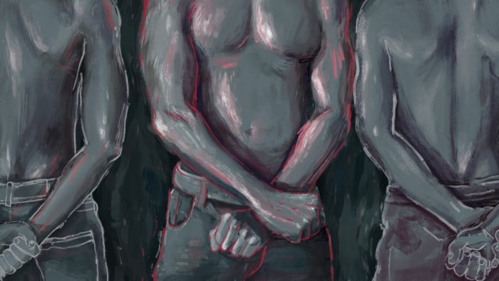
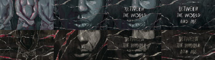
The book is full of passages referring to the relationship between Americans and the abuse of “black bodies.” Based on that, I thought of illustrating them in suggestive poses. During the animation, the pages with these illustrations would be torn to both show the violence against them and reference the book.
Initial Feedback
“Black is beautiful.”
After presenting these concepts to Kamilah, the film’s director, she had some interesting feedback for us:
- Black is not just black: there is a huge range of black skin tones. Despite liking the illustrations, she didn’t see this diversity represented there.
- Tired of seeing blacks being shown only in oppressed roles, beyond that representation of denunciation, which was already in the frames, she wanted the idea that to be black is to be beautiful, and in addition to the many cultural manifestations, there was the human affection.
- She liked the idea of using torn paper because it had a very close relationship with the book.
- She also liked the possibility of keeping something closer to the style of Molly Crabapple’s illustrations. All other materials, such as the titles and subtitles presented in the film, were already being developed with a visual proximity to watercolor.
In addition to technical issues, I believe it is valid to share a more intimate perception on my part. As a Brazilian living in LA, I have always identified myself as an “immigrant Latino,” as part of a minority. The limited perception of some people who summarize Brazil as an exotic place, full of attractive women and corrupt men, always bothers me. And finally, there is Brazil’s new stigma of being an “ex-soccer” country after the 7–1 loss to Germany during the 2014 World Cup.
However, this time I saw myself in the opposite role to the one I used to identify with. When Kamilah explained more of what the movie was about, I understood that my proposal was limited in that sense. I felt like my empathy had fallen short of what reality demanded. Although I already knew the relevance of the project, it gained new meaning, raising in me a greater awareness of the dimension of this subject.
In the meeting, I also asked Kamilah for some references that could exemplify the vision of her expectations for the project; this would enable me to get a clearer sense of what she was trying to say. She loved the idea, and she already had material she could share.
The Experiment
Upon receiving it, the project began to expand. There were more than two minutes of material to be edited. At first, it seemed the editing wouldn’t involve much graphic intervention. It is worth mentioning that up to that moment of production, the budget was only adequate for a smaller project, which determined a simple solution for all the work.
Because of this, I decided to create a treatment that could be easily applied to the whole edit. There was a strong connection between this treatment and the illustration style, which has thin pencil lines over watercolor strokes. As you can see below, each splash of ink is a frame of the film, and the sequence of splashes creates the illusion of movement. Also, note the use of a lot of texture, continuing the attempt to maintain the appearance of paper.
The Second Feedback
This first test was very well received. Kamilah liked the collage-like work very much because, for her, there was total harmony between that and the film.
The only observation was that we were relying too much on one technique and that this could be expanded. From this idea, I developed the direction to something based more on collages with a great mix of visual aids.
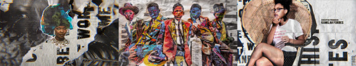
The Final Concept and Approval
After receiving an endorsement from producer Michael Ross regarding the change of the project’s scope, I developed something that I believed to be the solution. According to previous feedback and the selection of videos and photos sent by Kamilah, we should maintain moments of denunciation of racism and historical suffering interweaved with moments of everyday life, including scenes of affection, beauty, and art. This is apparent in the project if we pay attention to the content of the final edition. For example, at 00:35, right after the smiling couple, another couple is crying.
Creating Contrasts
America was practically born with racism. Therefore, to display the photo and video records of these abuses, a part is archival footage in black and white, and another part is recent and colorful. I created black-and-white language that served as a basis because, in addition to highlighting and focusing on the main content, it also brought coherence to the whole piece. In some frames, the highlight was achieved using the contrast between black and white, in others between black and white and color.
The Human Aspect
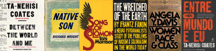
To make explicit references to the book, we used two resources. The first was the book’s original cover, present as texture in various parts of the opening.
The second was the use of blocks of text composed of paper textures. We did this to evoke the sense that one feels when in contact with a real book.
The use of paper textures, however, goes beyond just a reference to the book. This is part of a larger strategy of the project that, through the gestural, spontaneous, improvised, tactile, and imperfect, we would have something organic and necessarily human. After all, that’s what the opening and the film itself are all about.
Following this approach, I used paper in its most varied forms: wrinkled, folded, torn, and shredded. Another element was the splashes of paint; sometimes beautiful and smooth in a transition, sometimes aggressive. I also continued using pencils, scribbling over the footage, thereby adding another layer of human gesture.
Kamilah had the idea of using other book covers relevant to the film’s subject as texture, thus adding even more meaning to the collages.
This was a project without exuberant resources. As you can see in “Behind the Scenes,” due to the pandemic, the production took place in the kitchen of my apartment. I don’t think that makes it any less professional. On the contrary, I believe that the sincere dedication to this project, shown by the team and me, resulted in something of quality with a true and profound message.
I would like to end this article by mentioning the collaboration of Rafael Morinaga, a great friend, and very talented animator, in scenes: 00:36, 00:39, 00:43, and 01:06.
Thank you very much for allowing me to share my creative process.
You guys can see more of my work at www.diegocoutinho.com or on instagram @colts.design.
See you on the next one!
Main titles credit list:
Creative Director: Hazel Baird
Art Director: Diego Coutinho
Designer: Diego Coutinho
Animators: Diego Coutinho, Rafael Morinaga.
Producer: Michael Ross
Coordinator: Mitchell Fraser
Executive Producer: Luke Colson
Deputy Head of Production: Zach Wakefield
Head of Production: Kate Berry
Managing Director: Jennifer Sofio Hal