


To celebrate 20 years of Perception, we recently asked founders Danny Gonzalez and Jeremy Lasky to participate in our Studio Stories series, so we could better understand not only what it takes to build a brand but to achieve longevity in such a dynamic and evolving industry.
Well, now it’s time to bring in the rest of the team as we ask them about their favorite projects. I can picture them sitting at their desks, cycling through all those years of work, agonizing over which one to choose.
Black Panther Main on End Title Sequence
“One of my favorite designs that our team at Perception has done is the Main on End title sequence for Marvel Studios’ Black Panther. The entire sequence was incredibly detailed, between the colors, patterns, and movements. Plus, the rhythmic dance between the “Smart Particles,” or Vibranium Sand, and the music by Kendrick Lamar was something that I enjoyed and related to from my days as a DJ matching to different beats to flow in sync while going from one track to another.” Danny Gonzalez, Co-Founder of Perception
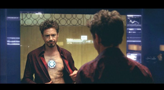
Iron Man 2 Technology
“The technology that we conceptualized for Marvel Studios’ Iron Man 2 is definitely one of my favorite projects. Iron Man 2 was the first major feature film we got to work on with Marvel Studios. We were part of history in those earliest years of the Marvel Cinematic Universe, and the technology we designed was truly iconic and became a trademark of those films. It manifested the realization of a dream and goal that we set when first opening Perception many years earlier. In addition to all of that, it became a paradigm shift for all future work we would do from that moment forward and changed the entire path and destiny of the company. Plus, Tony Stark and RDJ are always a win!” Jeremy Lasky, Co-Founder of Perception
GMC HUMMER EV
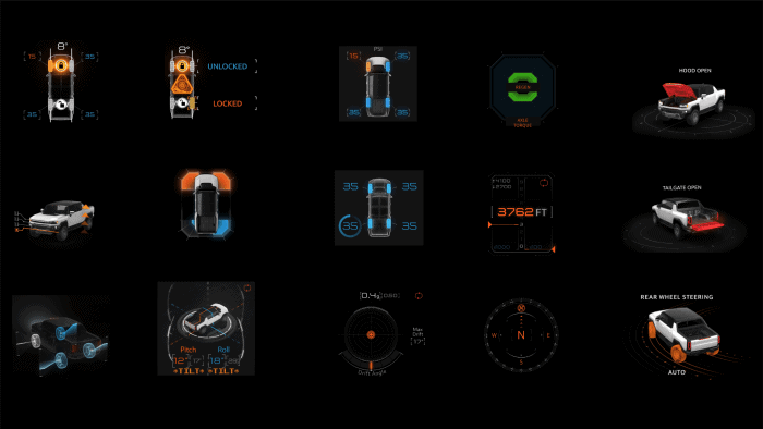
“Over the years, I’ve had many ‘favorite’ projects— tech-centric VFX, epic title sequences, and a bunch of top-secret R&D. Most recently, I’ve been very proud of our work on real-world products including all of the digital systems contained in the new GMC HUMMER EV. Our team and our friends at GM worked very hard to design something that would capture the spirit of this wildly advanced vehicle. It’s really rewarding to know that it is an integral part of the vehicle as a whole and will be a permanent part of automotive history.” John LePore, Chief Creative Director
Spider-Man: Homecoming Main on End Title Sequence
“The title sequence for Spider-Man: Homecoming. From concept to execution, the entire job was a blast to work on. I loved that we got to step away from our computers for a while and create something with our hands, playing with clay, markers, paint, and construction paper, and pretend to be a kid again. We really channeled our inner art class students, and it was great to revisit those roots as a team. It was a unique project for us and something that I am incredibly proud of.” Doug Appleton, Creative Director
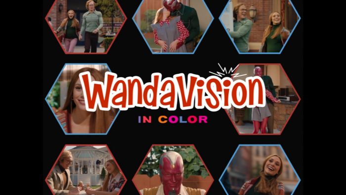
WandaVision Main on End Title Sequence
“The Emmy-nominated WandaVision Main on End title sequence. The aesthetic is, of course, beautifully executed, but it’s the concept behind the sequence that makes it my favorite. The idea is that just like the show, the pixels of the programming, in fact, carry a whole other story behind the screen in front of you. As we shrink down to the size of a pixel in a macro view, we get nuggets of the storyline, the real story, revealed to us as the pixels flowingly assemble into clearly recognizable objects from the show. I love design concepts whereby an everyday thing – an RGB pixel – is used to represent something completely unexpected.” Arianne Wotzka, Senior Producer
WandaVision Opening Episode Titles
“I am a sucker for nostalgia, and I grew up on a steady diet of all the shows that the series was referencing, whether they were from the ’50s or the ’90s. In making all of those titles, we had to be flexible as designers, illustrators, and animators. Because each was unique, they also required a different approach to production. A lot of research and studying television shows went into developing those titles because we wanted them to be as accurate and authentic to their respective time periods as possible. It was also Marvel Studios’ first big step into the streaming series, so it was very cool to be a part of that.” Eric Daly, Senior Producer
Black Widow Opening Title Sequence
“Even though I personally didn’t get the chance to work on it, my favorite piece that Perception has done is the Black Widow opening title sequence. It is a storytelling device that gives us insight into Natasha’s childhood while evoking a strong sense of emotion. It allows the audience to see the harsh realities of Natasha’s past through compiled video and imagery that feels raw and authentic. It brings the audience on a journey of feeling heartbreak, fear, and sadness meant to help create empathy for Natasha and help the audience understand her character’s motivations. We can also get a glimpse into the powerful, evil forces in Natasha’s world. The design and execution of this title sequence are extremely effective in setting an incredibly dark, eerie tone for the film while manifesting an emotional reaction from the audience, which makes it unique to other Marvel Studios title sequences. I believe that it is a really special and memorable viewing experience for many people, including me!” Jamie Young, Junior Producer
The Falcon and The Winter Soldier Main on End Title Sequence
“I really enjoyed creating the Main on End title sequence for The Falcon and The Winter Soldier. It was the first major title sequence I was able to be a part of, and it was something I got a chance to be involved with from the ground-up, from the pitch process all the way through production and delivery. It was also a great opportunity, I had to really push my skills forward with the software involved. One piece of software we utilized was working on shots that required Houdini sims for the torn paper effects to bring some extra oomph to our Senior Art Director, Ryan’s, awesome design frames.” Seiji Anderson, Art Director
GMC HUMMER EV
“Being a UI designer, creating Tony Stark grade functional UI’s for real-world tech had always been my dream. It turned out to be one of the most challenging yet satisfying projects I have ever worked on. It was a real learning opportunity as well. Designing UI’s for real-world tech can be very demanding. Everything you create needs to serve the purpose; the UIs need to convey the information very clearly at a glance. You have to follow strict rules to ensure safety and functionality in your designs. Working with developers to execute those designs is a whole different ball game, but you gain a deeper level of satisfaction when you finally see it working and realize that it will be part of people’s fantastic driving experience.” Sanu Sagar, Designer/Animator
Black Panther Technology
“I really like the technology concepts and the UI design for Black Panther, in particular. I think it has a unique look that reflects that it was created based on a civilization that evolved far from anything we know. I enjoyed seeing the sand-based holograms and the way Perception made them based on the cymatic pattern experiments at the University of Tokyo. One of the things that I found to be most interesting was all the tribal elements added to the UI in Shuri’s lab and all the different color schemes that vary throughout the movie based on her outfit. And my favorite element of this movie is the reveal animation of the Black Panther suit emerging from the necklace; I think that it’s amazing the way they combined microparticles animations with some holographic elements to create a very organic transition.” Sergio Rincon, Designer/Animator
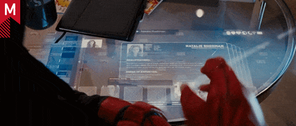
Dreykov’s Map in Black Widow
“The technology in Black Widow. In particular, I love Dreykov’s Map seen in the Red Room. This type of work fascinates me. Dreykov’s Map can showcase an important narrative while being an intricate and very detailed hologram. It has a sense of depth created by multiple layers that, put together, display a visually interesting map. Its complex level of animation and design amazes me, and I just love how I am able to notice something new every time I watch this scene.” Vivian Amaro, Junior Designer/Animator
Loki Main on End Title Sequence
“The Loki Main on End title sequence is both my favorite design and favorite title sequence that Perception ever worked on. It was a fun and interesting challenge to find the balance between the seriousness of the TVA and the quirky, sneaky, playful personality of Loki (aka Trickster of the Marvel Universe). The creative development and organization of the end piece is something to marvel at, and different parts always stand out to me as something fascinating. Each title card was thoughtfully created based on the name associated with it. Queues were taken from the episodes and redefined or redeveloped, adding a sense of playfulness or magical quality to them while making subtle references to details of the show. The final frames of the sequence, the Loki title, was a combination of approximately 325 frames with 46 different fonts, creating a strong need for organization in a creative world.” Kris Barone, Managing Director