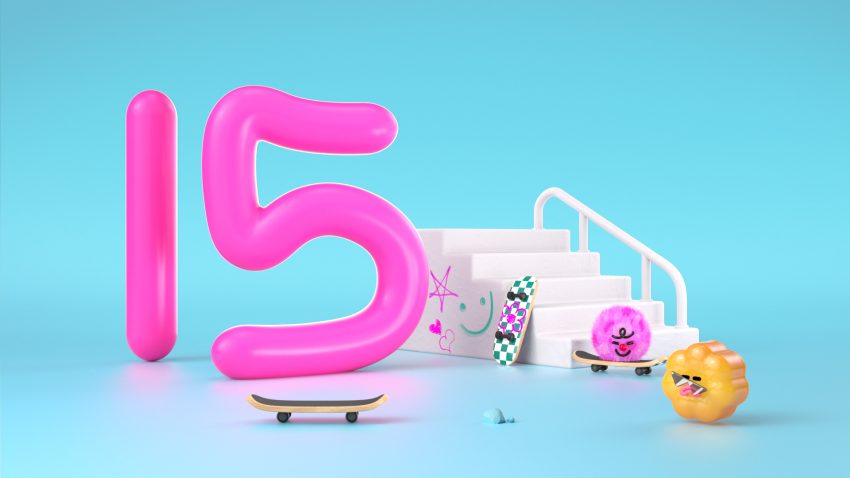
Super Very More has transformed the children’s channel 어린이 TV into a playground of playfulness with its rebrand under the slogan “you and I play.” Central to the refresh is Motion Design that bursts with creativity—the logo itself becomes a shape-shifting hero, morphing into textures like fluffy clouds, glittery goo, or bouncy rubber, inviting kids into a world where imagination has no rules. Each animated character boasts a unique personality, crafted from quirky materials (think velvety monsters or glossy robots) to make every interaction feel tactile and alive.Bold, candy-colored gradients collide with dynamic transitions, while looping animations and whimsical scene shifts—amped by upbeat audio—keep young viewers hooked. Though SVM hasn’t spilled all the details, their signature style suggests a balance of chaotic fun and subtle structure—think mascots that guide navigation or animated icons sneakily teaching ABCs. With cross-platform consistency (because tiny humans toggle between tablets and TVs), this rebrand it’s proof that Motion Design can turn a screen into a sandbox of endless fun.


 Email
Email
 LinkedIn
 X
X
 Threads
 WhatsApp
 Telegram
 More
More
Super Very More has transformed the children’s channel 어린이 TV into a playground of playfulness with its rebrand under the slogan “you and I play.”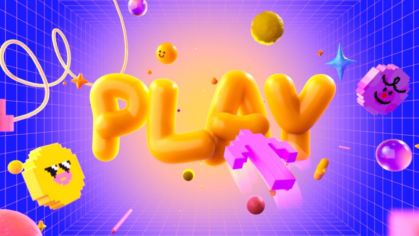
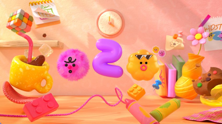 Central to the refresh is Motion Design that bursts with creativity—the logo itself becomes a shape-shifting hero, morphing into textures like fluffy clouds, glittery goo, or bouncy rubber, inviting kids into a world where imagination has no rules. Each animated character boasts a unique personality, crafted from quirky materials (think velvety monsters or glossy robots) to make every interaction feel tactile and alive.
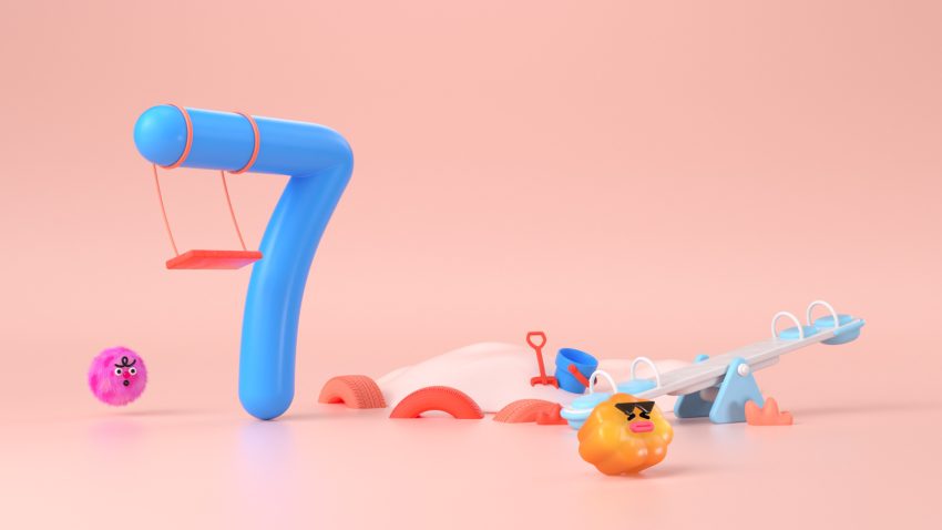
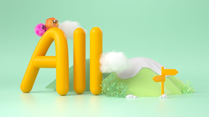 Bold, candy-colored gradients collide with dynamic transitions, while looping animations and whimsical scene shifts—amped by upbeat audio—keep young viewers hooked. Though SVM hasn’t spilled all the details, their signature style suggests a balance of chaotic fun and subtle structure—think mascots that guide navigation or animated icons sneakily teaching ABCs.
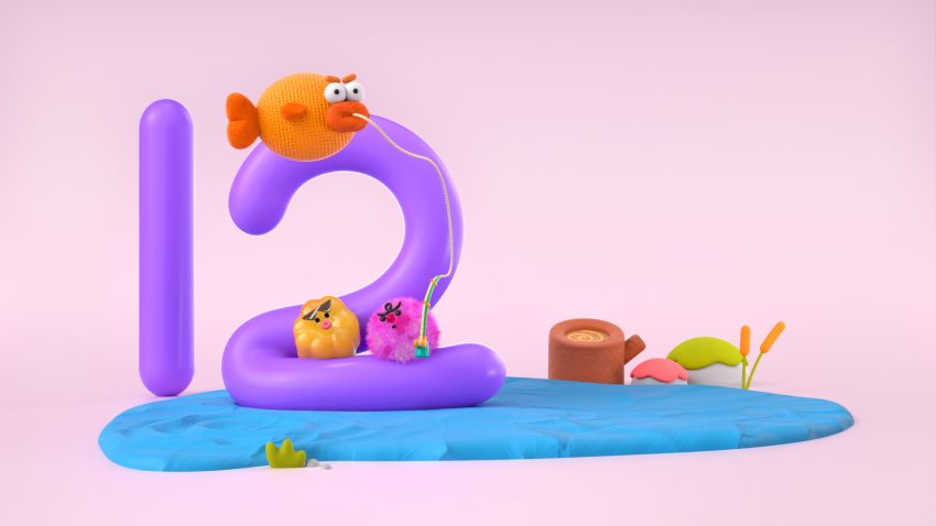
 With cross-platform consistency (because tiny humans toggle between tablets and TVs), this rebrand it’s proof that Motion Design can turn a screen into a sandbox of endless fun.
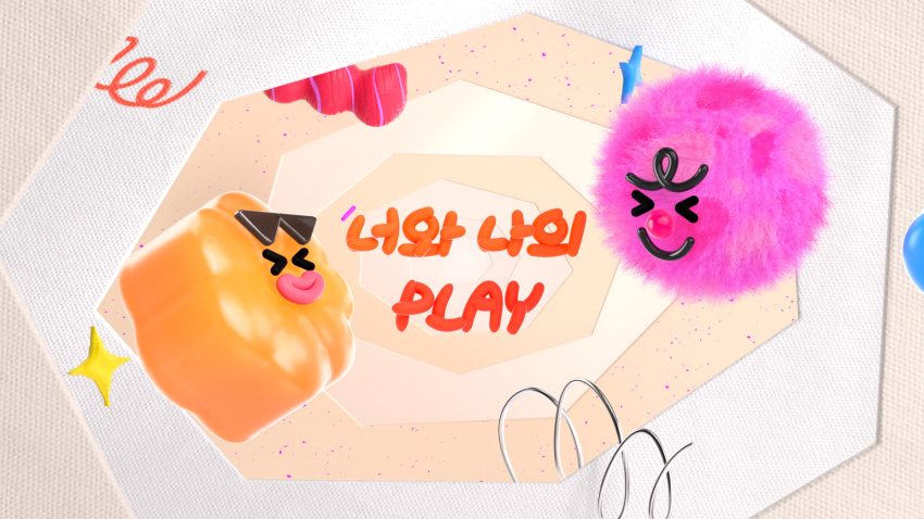
By Super Very More
Client: Daekyo Co., Ltd
Creative Director: Youngmin Kim
Concept Dev. & Styleframes: Doyoung Kwon, Sanghee Choi
Motion Design: Doyoung Kwon, Sanghee Choi
OAP CG Element: Hyunwoo Shin
Sound design: ROIAUDIO