The Mill for Pokerstars

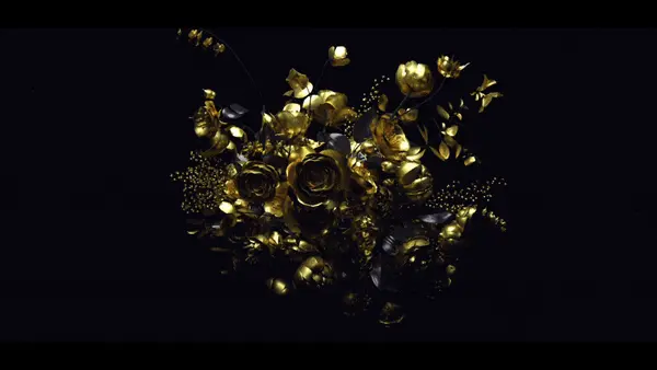
The Mill visualizes data in the studios latest spot for Pokerstars.

Tags: , ,

17 Comments

Nick Forshee

Well executed. However, the visuals seem to be more of
a distraction rather than complementing the “All-In” decision being made by
Daniel Negreanu.

Also,
The sound designer should get a slap on the wrist.

whatever

this looks pretty familiar. mk12. 2007. stranger than fiction. just saying.

Dook

Stranger Than Poker? and yeah the sound design was a bit ’90’s computer interface’

ktx

Less Mill-ish and way too mk12-ish. Bad call I say.

joshveds

will farrell is an amazing poker player!

mrblong

Sound design was on point. Nice variation of the solar flares use. The solar flare can be over used at times, but looks good when its done right.

_james

I wish people who push this simple idea further — it worked in context of the movie but really folks, we can beyond it now ;)

_james

excuse my poor typing. haha. we can move beyond this idea now :)

monovich

Looks great but its got to be embarrassing to have ripped MK12 without ANY evolution of the technique. At least send them a royalty check.

jasfish

I kind of disagree with the general consensus here. I agree it’s very similar to MK12’s “Stranger Than Fiction” titles, but it’s been done so often now that I consider it a technique … a style, not a rip. Consider it an homage maybe, I don’t care. How is this different from a Saul Bass style animation? Yes, you know where it came from, so what? I’ve seen this style of type animation numerous times in the last couple of years. Sure it’s not that different from what MK12 did, but it’s just another small step in the evolution of motion graphics. It’s a style that fits the subject perfectly. My two cents, feel free to disagree :)

henry grey

I couldn’t agree more with jasfish. If you’re gonna be harsh on overlay information visuals then do the same with every other video of, say, abstract Cinema 4D physics simulations out there (especially those featuring big and black metallic surfaces). I feel like the audience is being too harsh on the piece, mostly because it comes from The Mill.

_james

kinda sad to hear the last 2 views — physics and a concept that was tailor made for a film are apples to oranges. Perhaps your view on what “motion graphics” are is the limiting box. guess that’s the best thing about working at a studio that tries not to replicate past work and constantly seeking to develop animations that are backed by solid concepts. everyone has their take on what they do and how its applied though, just another 2 cents. we can’t make art out of everything, its true — especially when ad agencies are involved :)

jasfish

Depends on your perspective, I guess. As much as I respect MK12 I don’t deify them as many do. And if anyone thinks they were the first to pioneer this technique, I highly doubt it. No question, they were among the first to do it, and take it to a whole different level, but to act as if nobody else can ever do this style? Really? My idea of “Motion Graphics” is a continually evolving thing. If you think that’s limiting, or that people should do only “original” work, so be it. I would argue there hasn’t been anything truly original done in a long time, we’re all riffing on other people’s work through the centuries. But that’s just my take on it. I understand we’re all going to have different opinions. I’m not going to condemn anyone for not agreeing with me, nor do I expect everyone/anyone to agree with me :) It is what it is. In the end, none of this matters anyway ;)

jasfish

And please, don’t take this as any disrespect towards MK12. I respect them highly & realize I’m not in their league. I’m only defending this animation by The Mill, another place I respect a great deal :) I just get frustrated when people sense any kind of similarities, intentional or not, and immediately start crying “rip.” Maybe it is, maybe it isn’t, that’s not for me to say. I’ve worked with enough ad agencies and other people who can be very blatant or very subtle in their “influences.” It’s a balancing act at times. Maybe because I work at a post-house and turnaround is generally a week or less I have a different viewpoint. Take my comments for what they are, someone on the internet who’s not personally invested in either place. Just trying to have a civil discussion :)

Maybe it’s like the old saying “Dwarfs standing on the shoulders of giants” (Latin: nanos gigantium humeris insidentes) a Western metaphor meaning “One who develops future intellectual pursuits by understanding the research and works created by notable thinkers of the past.” Or maybe I’m just full of shit ;)

_james

heh. I think pieces should create conversations, i’m sure everyone appreciates constructive criticism. I understand there is a fine line to walk when talking about creating original work, perhaps I just think being original in how the individual approaches the project beyond technique. Reference is foundation in all of our ideas here, without it you can’t move forward. MK12 is a bunch of nobodies — collectively clashing our heads and happy that things are coming out.

jasfish

@_james “I understand there is a fine line to walk when talking about creating original work, perhaps I just think being original in how the individual approaches the project beyond technique.”

Agreed. I see where you’re coming from.

Comments are closed.

The Mill for Pokerstars

[qt:http://motionograph.wpengine.com/wp-content/uploads/2010/09/TheMill_Pokerstars_Quickies.mp4 640 360]

CREDITS:

Agency:  PokerStars

Creatives:  James Vigar

Producer:  Ben Exley

Production Company:  Partizan

Director:  Niall Downing

Editing Company:  Marshall Street

Editor:   Charlie Roberts

Post Production:  The Mill

Producers: Dan Dixon & Andrew Sommerville

Colourist:  Seamus O’Kane

After FX:   Bob Wolf

Smoke: John Thornton