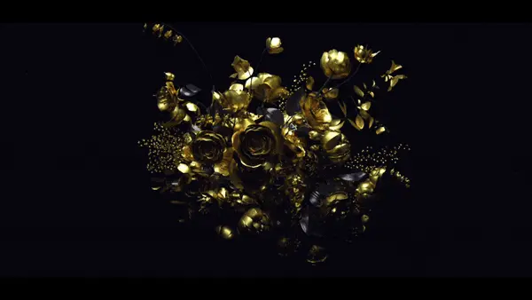
The good people at Current TV put up a reel of their graphics work in hopes that they can attract a totally BA designer to come work for them. (More details here.)

I’m posting partially to help with them with that, but mostly I think their reel is great. Current’s design aesthetic is a tasteful blend of Swiss/International graphic design with the trends of the day—an appropriate choice given their audience of educated 15-30 year olds. (I totally pulled that demographic out of my butt.) I’m also a big fan of most of their typographic choices. Clean, simple and understated.


